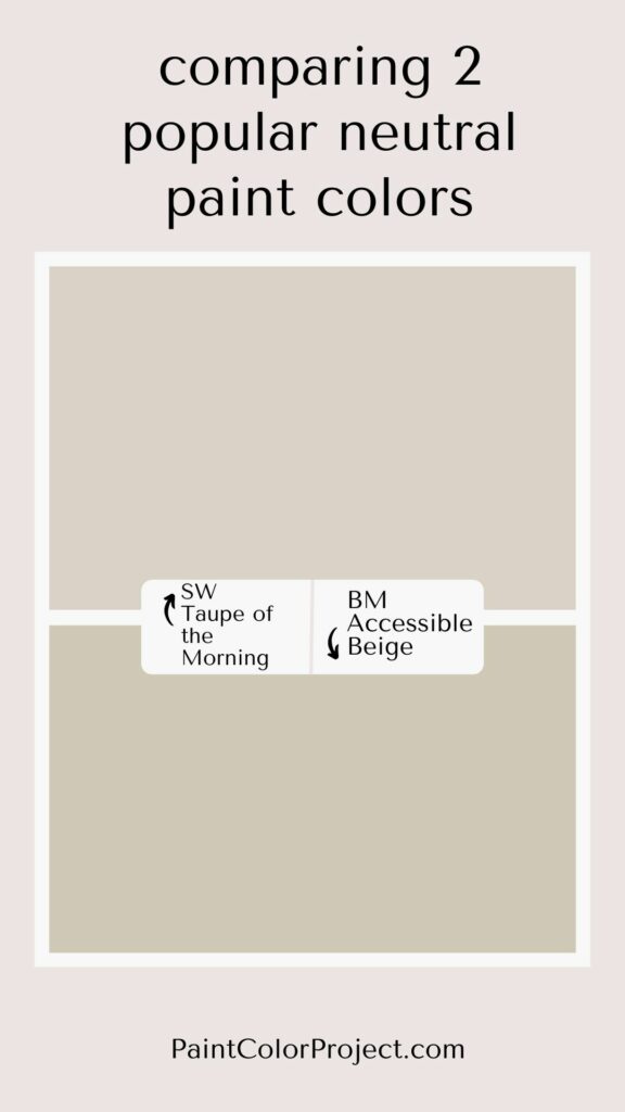
Looking for the perfect greige paint color for your home? Let's compare Taupe of the Morning vs Accessible Beige to see if one might be perfect for your space!
If you can't decide between beige walls or gray walls, a greige paint color just may be the right choice for you!
Greige paint colors are popular because they pair well with virtually any color (warm or cool), any decor style, and any finish. It can make a space feel cozy and calm, or it can be paired with bolder colors for a brighter look.
Greige sounds easy, right? Except there are so many greige paint colors out there. Some lean warm, some lean cool. Some are light, some are dark. Undertones can vary greatly, too.
Today I want to compare two super popular shades of greige paint – Taupe of the Morning and Accessible Beige.
Let's talk about the difference between these two popular shades.
Read my full review of Taupe of the Morning
Read my full review of Accessible Beige
Taupe of the Morning vs Accessible Beige
Taupe of the Morning and Accessible Beige are both fairly neutral greige colors that are light and bright enough to work well in a lot of homes.
But they are very different colors! Taupe of the Morning is a true neutral greige, and Accessible Beige is a beige paint color with warm gray undertones.
What is similar about Taupe of the Morning vs Accessible Beige?
Taupe of the Morning and Accessible Beige are both popular neutral paint colors. Both are often described as greiges, a cross between gray and beige.
Both colors are neutral enough to work as a whole house paint color.
Taupe of the Morning and Accessible Beige are both considered mid-toned paint colors in terms of their LRV.
What is different about Taupe of the Morning vs Accessible Beige?
Taupe of the Morning, with an LRV of 65, is lighter than Accessible Beige, which has an LRV of 58.
Taupe of the Morning is a neutral with minimal undertones but has been known to show a slight pink or violet.
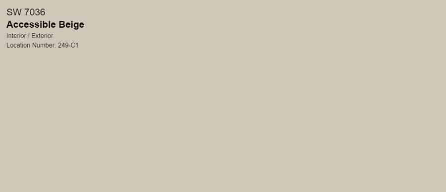
Accessible Beige is a beige paint color with warm gray undertones, as well as slight green and yellow undertones.
| Taupe of the Morning | Accessible Beige | |
| LRV | 65 | 58 |
| RBG | R: 218 G: 210 B: 198 | R:209 G:199 B:184 |
| Undertones | minimal undertones, subtle pink and violet | warm gray, slight green, and yellow |
Light Reflectance Value
Light Reflective Value is the measurement of how much light a color bounces around. This is on a scale of 0 to 100, with 0 being pure black and 100 being pure white.
These are both mid-toned neutral paint colors, but they are not equal in color depth.
With an LRV of 65, Taupe of the Morning is lighter and brighter compared to Accessible Beige (LRV 58).

Undertones
Taupe of the Morning and Accessible Beige vary in undertones.
Taupe of the Morning has minimal undertones, but it can show subtle pink and violet.
Accessible Beige, on the other hand, has warm gray undertones, with a hint of green and yellow.
In south-facing rooms with lots of natural light, Taupe of the Morning will look warmer. But in dark rooms, like north-facing rooms with very little natural light, it may look a bit dingy.
Similarly, in a north-facing room with little light, Accessible Beige will seem more gray. But in a south-facing room, it appears warmer and more beige.
It's very important to swatch colors on your wall to make sure they look good – day and night – in your actual space before committing.
Click here to get removable peel & stick paint samples to easily swatch with!
Overwhelmed trying to pick the right beige?
Choosing beige paint can feel impossible — too yellow, too gray, or just not quite right.
I created a simple, no-fail guide that shows you exactly which beige paint colors to choose from — plus when to use each one so you can feel confident in your decision.
How do I decide between these two colors?
Taupe of the Morning and Accessible Beige are both fantastic greige choices!
If you want a lighter wall color, go with Taupe of the Morning.
However, if your room receives ample natural light, I recommend considering Accessible Beige too. Strong light can fade colors, so shades with more depth tend to fare better in such spaces.
Accessible Beige has a little bit more color to it, so it’s going to still feel warm even in a well-lit room.
In particularly dim rooms, Taupe of the Morning might appear lackluster, making Accessible Beige a better alternative.
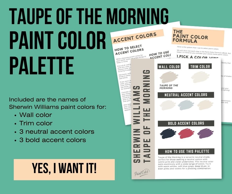
Taupe of the Morning color palette
Want to use this paint color in your home? Instantly upgrade your home's aesthetic with our exclusive paint color palette. Unlock the perfect trim color and six stunning accent colors, a combination of neutrals and bold hues for an instantly harmonious space!
Get your perfect paint color palette by clicking here!
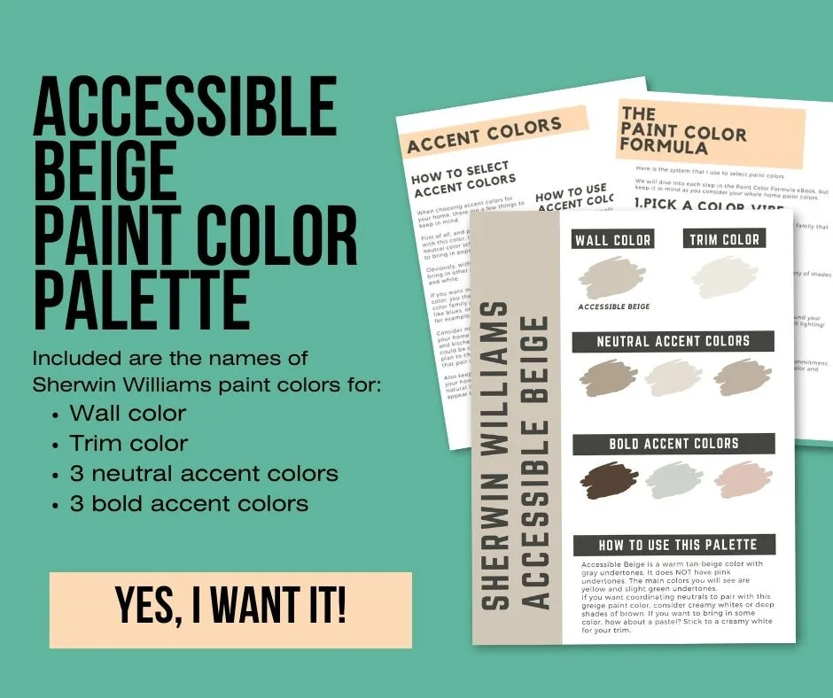
Sherwin Williams Accessible Beige color palette
Want to use this paint color in your home? Instantly upgrade your home’s aesthetic with our exclusive paint color palette. Unlock the perfect trim color and six stunning accent colors, a combination of neutrals and bold hues for an instantly harmonious space!
Click here to get the Accessible Beige pre-made paint color palette.
Still unsure which paint color is right for your space?
Choosing paint doesn’t have to be stressful! My free Paint Color Planning Quick Start Guide walks you through the exact steps to confidently choose the perfect color — without the overwhelm, second-guessing, or endless swatch testing.
👉 Click here to download the free guide!
DIYing Your Paint Job? Start Here.
Choosing a paint color is only half the equation — the tools you use matter just as much. I’ve rounded up the painting supplies we rely on for clean lines, smooth finishes, and less frustration overall.

My Paint Color Formula course walks you through the painless process of expertly testing paint swatches to ensure you have the perfect color for your home.
The best way to sample paint? Samplize!
Get peel-and-stick removable and reusable paint samples here!
Thanks for reading!

Meg Hemmelgarn is a freelance writer and home decor + DIY blogger who loves to talk about paint colors. She and her husband are currently renovating their third fixer upper. You can see their projects on her blog, Green With Decor.