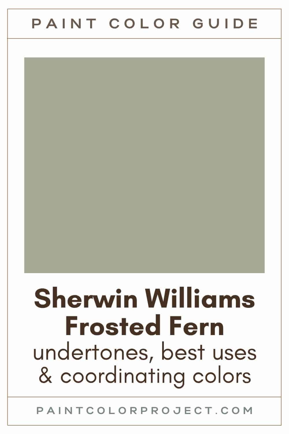
Need just the right green-gray paint color for your home? I review Sherwin Williams Frosted Fern to see if it's right for you.
Green is quite the popular paint coor right now and I'm loving it. I’ve always enjoyed how green paint can make a space feel calm and connected to nature.
And when you mix green and gray? A space can feel timeless, organic, peaceful and calming. They work well with lots of other colors and fit right into many decor styles.
Frosted Fern is a soft green gray that can act like a neutral or add a subtle hint of color. It’s easy to live with and easy to style, so lets take a closer look.
Frosted Fern, Sherwin Williams, SW 9648
Frosted Fern is a a muted green-gray that blends warm and cool tones really nicely. I think it’s perfect for creating a timeless, calming look in any space.
Click here to get a peel and stick sample of Frosted Fern
Color Family
Frosted Fern is in the neutral family.
Light Reflectance Value
38
Light Reflective Value is the measurement of how much light a color reflects on a scale of 0 to 100. This goes from pure black to pure white.
With an LRV of 38, Frosted Fern sits right in the medium range. It won’t fade into the background in bright rooms, but it also won’t make your space feel dark or heavy.
RGB Colors
R: 167 G: 167 B: 150
RGB shows how much red, green, and blue are mixed to create the color. This combo shows why Frosted Fern feels soft, balanced, and easy on the eyes.
Hex Code
#A7A796

Undertones
Frosted Fern is a green-gray with yellow and subtle blue undertones.
In south-facing rooms with lots of sunlight, I notice it looks warmer and greener. It feels fresh and a bit more lively in these spaces.
But in north-facing rooms with less natural light, it cools down and leans more gray with a soft blue hint.
This kind of color really changes with lighting, so I always recommend testing it on your walls and checking it during the day and at night before committing.
Click here to get removable peel & stick paint samples to easily swatch with!
Best Uses
Frosted Fern is a versatile gem! It works beautifully as both a neutral base and an accent color.
Here are some of my favorite places to use Frosted Fern:
- Living room: Makes the space feel inviting and cozy.
- Bedroom: Perfect if you want a restful, relaxing feel.
- Kitchen: Adds warmth without overwhelming the space.
- Small powder room: Try it on the ceiling, too!
- Built-ins: A subtle way to add character.
- Accent wall or fireplace: Bold, but not too loud.
- Furniture: Works beautifully on a dresser, bookshelf, or coffee table.
- Interior doors: A fun way to bring in color without committing to a whole room.
- Front door or shutters: Adds charm with a hint of color.
- Home exterior: A soft, gorgeous color.
Similar Colors
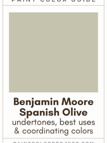
- Sherwin Williams Escape Gray
- Benjamin Moore Oil Cloth
- Behr Woodland Sage
- Sherwin Williams Clary Sage
- Benjamin Moore Nantucket Gray
- Behr Simply Sage
- Sherwin Williams Willow Tree
Click here to get a peel and stick sample of Frosted Fern
🤯 Too many color choices?
Download my free Paint Color Planning Quick Start Guide — it’s the exact method I use to help readers choose a color that works the first time.
📥 Grab it here!
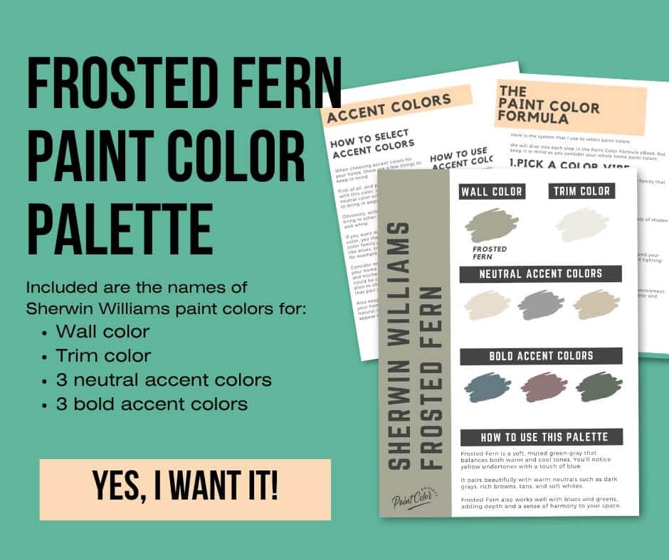
Coordinating Colors
I love how Frosted Fern works so well with warm neutrals! Think dark grays, rich browns, tans, and soft whites.
It also plays quite nicely with shades of blue and green. These mixes can really add depth and harmony to your space.
Dark browns:
- Tungsten
- Muddled Basil
- Status Bronze
- Enduring Bronze
- Best Bronze
Warm neutrals:
- Threaded Loom
- Relaxed Khaki
- Universal Khaki
- Favorite Tan
- Ramie
Warm whites:
- Greek Villa
- Shell White
- Alabaster
- White Flour
- Dover White
Trim Colors
I think Frosted Fern works best with warm, soft trim colors.
Frosted Fern Paint Color Palette
Want to use this paint color in your home? Instantly upgrade your home's aesthetic with our exclusive paint color palette. Unlock the perfect trim color and six stunning accent colors, a combination of neutrals and bold hues for an instantly harmonious space!
Get your perfect paint color palette by clicking here!
Click here to get a peel and stick sample of Frosted Fern
FAQs
Here are some common frequently asked questions about Frosted Fern.
What color is Sherwin Williams frosted fern?
Frosted Fern is a soft, muted green-gray that blends sits nicely between warm and cool.
Does Sherwin Williams Frosted Fern work in a laundry room?
Yes! I think Sherwin Williams Frosted Fern makes a great laundry room color. I love it here because it feels fresh, relaxed, and not too serious.
For added fun, try painting the ceiling, too!
Keep in mind, Frosted Fern will lean warmer / greener in brighter laundry rooms and cooler / green-gray in darker laundry rooms. Swatch it in your space and see what you think!
What color trim goes with SW Frosted Fern?
Good options are Sherwin Williams Alabaster, Benjamin Moore White Dove, or Behr Cameo White. I always like to sample trim next to the wall color to make sure they feel right together.


What's the difference: SW Frosted Fern vs Escape Gray?
Frosted Fern and Escape Gray are very similar paint colors! Both are green-grays with similar undertones.
With an LRV of 41, Escape Gray is a little lighter than Frosted Fern, which has an LRV of 38.
Frosted Fern leans a bit more yellow than Escape Gray.
Frosted Fern is also a bit more saturated whereas Escape Gray is slightly softer and more muted.
If you’re torn between the two, try swatching them side by side to see which one feels right in your space.

What's the difference: SW Frosted Fern vs BM Oil Cloth?
Frosted Fern and Oil Cloth are similar subtle green-gray paint colors, but no two paint colors are exactly alike!
With an LRV of 38, Frosted Fern is slightly lighter than Oil Cloth, which has an LRV of 35.
Frosted Fern leans a bit more yellow than Oil Cloth.
Frosted Fern is also a bit more saturated whereas Oil Cloth is slightly softer and more muted.
Always swatch colors in your space before making a decision—especially when two colors are this close!

Is SW Frosted Fern green?
Frosted Fern is best described as a green gray. It has yellow and subtle blue undertones, which is why it shifts so much.
In sunny, south-facing rooms, it looks greener and warmer. In darker, north-facing rooms, it cools down and looks more gray blue.
Before you go...
So, you've found the perfect paint color, but here's the thing — there's another big decision you have to make: picking the right paint sheen.
Seriously, the level of glossiness can totally change how your color looks on the walls and how long the paint lasts!
Check out our complete guide to understanding paint sheens.
Still unsure which paint color is right for your space?
Choosing paint doesn’t have to be stressful! My free Paint Color Planning Quick Start Guide walks you through the exact steps to confidently choose the perfect color — without the overwhelm, second-guessing, or endless swatch testing.
👉 Click here to download the free guide!
DIYing Your Paint Job? Start Here.
Choosing a paint color is only half the equation — the tools you use matter just as much. I’ve rounded up the painting supplies we rely on for clean lines, smooth finishes, and less frustration overall.

My Paint Color Formula course walks you through the painless process of expertly testing paint swatches to ensure you have the perfect color for your home.
The best way to sample paint? Samplize!
Get peel-and-stick removable and reusable paint samples here!
Thanks for reading!

Meg Hemmelgarn is a freelance writer and home decor + DIY blogger who loves to talk about paint colors. She and her husband are currently renovating their third fixer upper. You can see their projects on her blog, Green With Decor.