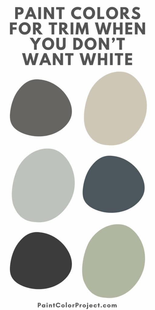
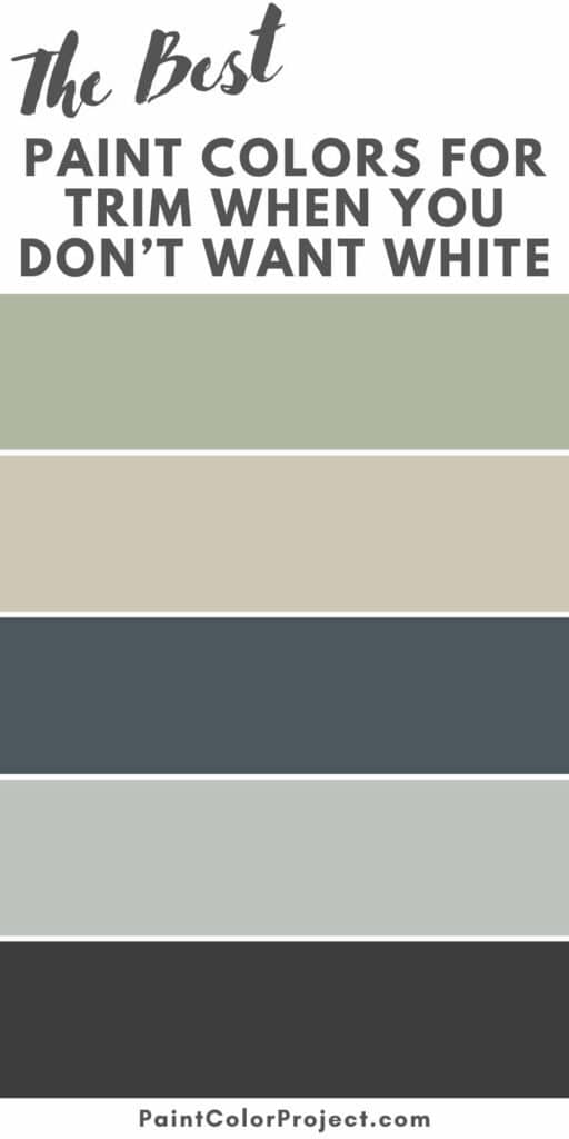
Looking for the best paint colors for trim when you don’t want white? These designer-approved shades feel warmer, richer, and more personal than just bright white.
White trim has been the standard for years. It’s clean, classic, and safe. I’ve used it plenty of times myself.
But sometimes, it can look a little too crisp or predictable, especially if your home already has a lot of white or light tones.
Painting your trim a color instead can completely change the mood of a room. The right shade can highlight beautiful woodwork, frame your walls, or help everything flow together.
Whether you go for something soft and subtle or deep and dramatic, colored trim is such a simple way to give your home that custom, designer touch.

Best Paint Colors for Trim (When You Don’t Want White)
If you’re ready to go beyond standard white, here are some of the best paint colors for trim to inspire your next project.
Soft Neutrals
Choosing a soft neutral for trim gives you a subtle, timeless look without the harshness of bright white.
Beige, greige, or taupe tones help warm up walls and create a softer, more inviting feel.
I especially love this look in older homes where you want that classic, grounded style but still want the space to feel fresh and updated.
Designers recommend:
- Accessible Beige – Sherwin-Williams
A warm, balanced beige that works beautifully with both cool and warm wall colors. - Revere Pewter – Benjamin Moore
A soft greige that adds quiet elegance and looks great with natural wood tones. - Wheat Bread – Behr
A versatile taupe that feels warm and sophisticated without being too dark.


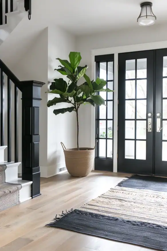
Bold Black
Black trim makes a strong statement and instantly gives a room a polished, designer look. It works beautifully in modern, farmhouse, and industrial-style homes.
I love how it frames windows and doors like artwork, adding structure and contrast to lighter walls. It’s clean, striking, and surprisingly versatile.
Designers recommend:
- Tricorn Black – Sherwin-Williams
A true, deep black that delivers crisp contrast without looking harsh. - Black Satin – Benjamin Moore
A slightly softer black with a subtle sheen that adds richness and depth. - Limousine Leather – Behr
A smooth, dark black that feels bold and dramatic, perfect for trim or interior doors.


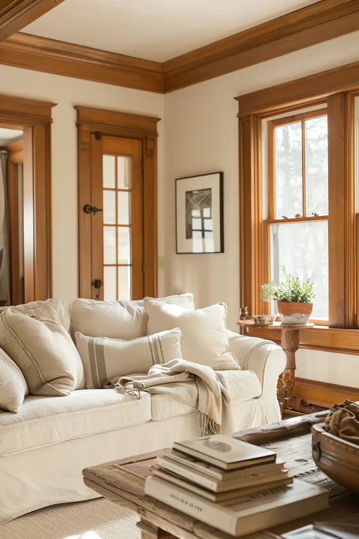
Warm Wood Tones
If you love a natural look, warm wood-stained trim is always a timeless choice. It adds richness, depth, and a cozy character that paint just can’t match.
Oak, walnut, and chestnut stains pair beautifully with earthy wall colors and add warmth and texture to any space.
I love this look in homes with historic character since it keeps that original charm while feeling warm and grounded.
Designer favorites:
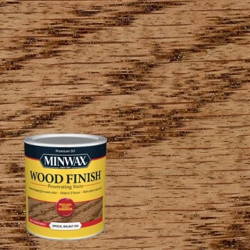
- Chestnut Stain – Sherwin-Williams
A deep, warm brown that adds instant elegance and depth. - Special Walnut – Minwax
A balanced medium stain that brings out the natural beauty of the wood grain. - Golden Oak Stain – Behr
A deep, refined brown that feels rich and timeless, bringing to mind quiet libraries and classic leather accents.
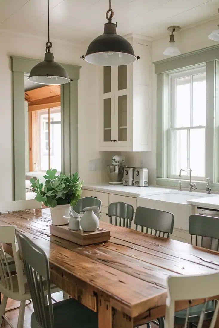
Muted Colors
Painted trim doesn’t always have to stay neutral. Soft greens, blues, or grays can bring personality to a room while still feeling timeless and classic.
Muted colors look especially lovely in cottages, craftsman homes, or spaces where you want just a touch of color without going overboard.
I’ve used pale green trim in a guest room before, and it instantly made the space feel calm and welcoming.
Designers recommend:
- Comfort Gray – Sherwin-Williams
A soft gray-green that feels soothing and balanced in any light. - Saybrook Sage – Benjamin Moore
A gentle, muted sage that adds warmth and character without stealing the spotlight. - Silver Drop – Behr
A pale gray with subtle warmth that works beautifully with both cool and warm palettes.


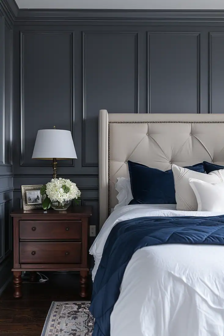
Deep & Moody Shades
For a bold, sophisticated look, try deep trim colors like navy, charcoal, or forest green. These shades add weight and richness, turning your trim into a true design feature.
Dark trim looks beautiful in dining rooms, libraries, or entryways where you want to create a moody, refined atmosphere.
I’ve used navy trim in a small hallway before, and it made the space feel polished and intentional.
Designers recommend:
- Hale Navy – Sherwin-Williams
A classic navy that feels elegant and timeless. - Kendall Charcoal – Benjamin Moore
A deep, neutral charcoal that adds instant sophistication. - Midnight Blue – Behr
A rich, inky blue that brings drama without feeling heavy.


Choosing trim colors that aren’t white is one of my favorite ways to give a room more personality.
It’s such a small change, but it can make your home feel custom and pulled together in the best way.
Whether you go soft and neutral, try bold black, or lean into those rich moody tones, trim color can completely shift the mood of a space.
Need more help?
✨ If you’re not sure how to match your wall and trim colors, my No-Fail Paint Color Jumpstart Guide walks you through the process step by step so you can choose with confidence.
Still unsure which paint color is right for your space?
Choosing paint doesn’t have to be stressful! My free Paint Color Planning Quick Start Guide walks you through the exact steps to confidently choose the perfect color — without the overwhelm, second-guessing, or endless swatch testing.
👉 Click here to download the free guide!
DIYing Your Paint Job? Start Here.
Choosing a paint color is only half the equation — the tools you use matter just as much. I’ve rounded up the painting supplies we rely on for clean lines, smooth finishes, and less frustration overall.

My Paint Color Formula course walks you through the painless process of expertly testing paint swatches to ensure you have the perfect color for your home.
The best way to sample paint? Samplize!
Get peel-and-stick removable and reusable paint samples here!
Thanks for reading!

Morgan is passionate about home decor and paint colors. She has been sharing DIY home decor tips since 2012 at CharlestonCrafted.com. From there, she learned to love paint colors, and the Paint Color Project was born in 2022!