Looking for the perfect neutral paint color for your home? Let’s talk about Benjamin Moore Wind's Breath and if it might be right for your home!
If you’re stuck choosing between whites, creams, grays, and beiges, I’ve got a color you’ll want to know about: Wind’s Breath.
This soft, neutral paint color strikes a perfect balance.
It’s not too warm, not too cool—just an easy, welcoming shade that leans slightly warm. In certain lighting, it really shines.
Wind’s Breath gives you that neutral look you’re after without feeling too stark or cold.
It also pairs nicely with a variety of colors and works with nearly any decor style, making it a versatile choice for any room.
Let’s take a closer look.
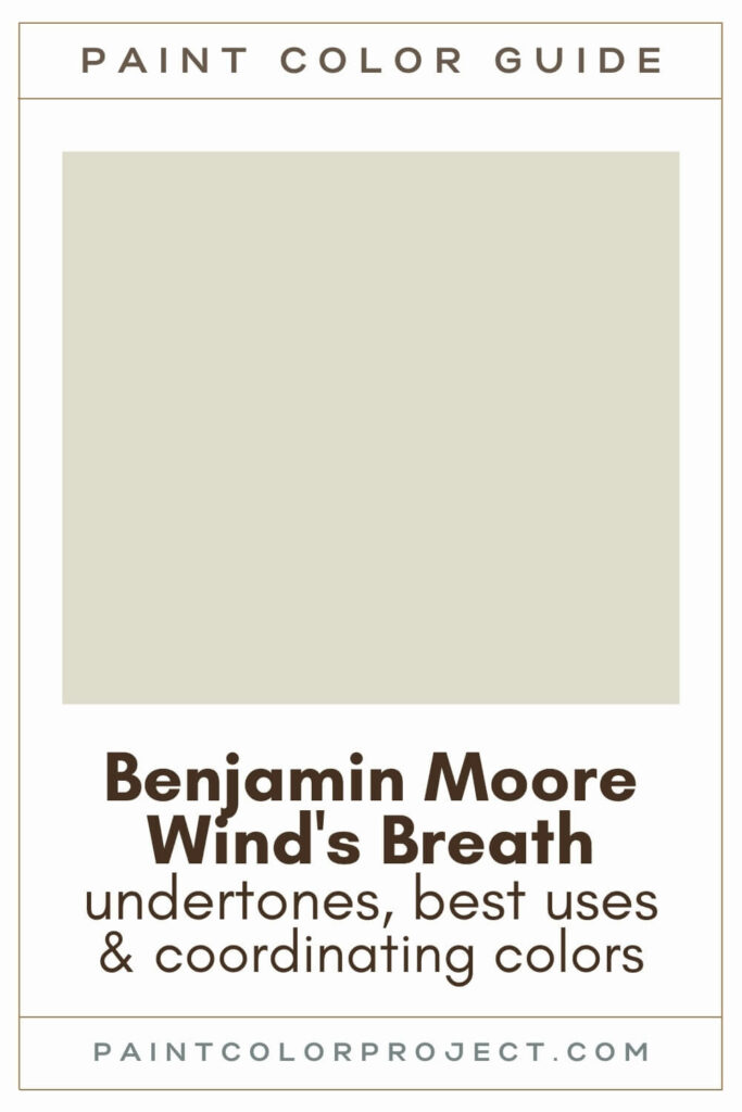
Benjamin Moore, Wind's Breath, OC-24
Wind's Breath is a chameleon neutral color that balances taupe, gray and cream. It feels both relaxed and timeless.
Click here to get a peel and stick sample of Wind's Breath
Color Family
Wind's Breath is in the white family.
Light Reflectance Value
70
Light Reflective Value is the measurement of how much light a color bounces around.
This is on a scale of 0 to 100, with 0 being pure black and 100 being pure white.
With an LRV of 70, Wind's Breath is a light and bright paint color.
However, due to its mix of taupe / gray / cream, it can look a bit dingy in darker spaces, despite its higher LRV number.
RGB Colors
R: 223 G: 219 B: 205
RGB describes the amount of each color - red, green, and blue - present in a color.
This is on a scale of 0 to 255 for each color. This is basically the color mix to make the color!
Hex Code
#dfdbcd

Undertones
Wind's Breath is an almost perfect balance of taupe / beige / gray / cream.
In certain lighting situations, it can take on a slight taupe, pinkish-purple undertone.
In bright, south-facing rooms, you’ll see it lean toward a soft off-white or creamy taupe. If the room gets a lot of light, it might even look a little washed out.
In darker spaces—like north-facing rooms or interior spaces—it can take on more gray tones. Sometimes, it might even look a little dull or dingy.
The sweet spot for Wind’s Breath is a well-lit room that’s not too bright. That’s where this color really shines.
It's very important to swatch colors on your wall to make sure they look good – day and night – in your actual space before committing.
Click here to get removable peel & stick paint samples to easily swatch with!
Best uses
Wind's Breath is neutral enough to work as a whole house paint color. However, keep in mind that Wind's Breath often looks dingy in darker spaces.
Wind's Breath may be a good pick for any of the following spaces:
- Living rooms
- Bedrooms
- Kitchens
- Bathrooms
- Home exterior
- Interior doors
- Cabinets
- Furniture
Similar Colors
- Benjamin Moore Edgecomb Gray
- Behr Light Granite
- Sherwin Williams Oat Milk
- Benjamin Moore Hushed Hue
- Benjamin Moore Olympic Mountains
- Behr Ginger Sugar
- Sherwin Williams Natural Choice
Click here to get a peel and stick sample of Wind's Breath
Coordinating Colors
Wind’s Breath is pretty versatile and works well with:
- Crisp, bright whites
- Warm neutrals like mid to dark browns, blacks, and grays
- Cool grays, blues, and greens
One tip: Avoid pairing it with soft whites. When you do, one of the colors (or both) can end up looking a bit dingy.
Bright, crisp whites:
- Chantilly Lace
- Ice Mist
- Snow White
- Distant Gray
- Wedding Veil
Deep neutrals that cross charcoal / brown / black:
- Silhouette
- Midsummer Night
- Stone Brown
- Iron Mountain
- Topeka Taupe
Warm gray / greiges:
- Rockport Gray
- Herbal Escape
- Jockey Hollow Gray
- Indian River
- River Reflections
Trim Colors
Wind's Breath pairs best with bright, crisp whites for trim.
- Benjamin Moore Simply White
- Sherwin Williams Extra White
- Behr Ultra Pure White
Note: When Wind's Breath is paired with soft whites, your walls or trim (or both), may look dingy.
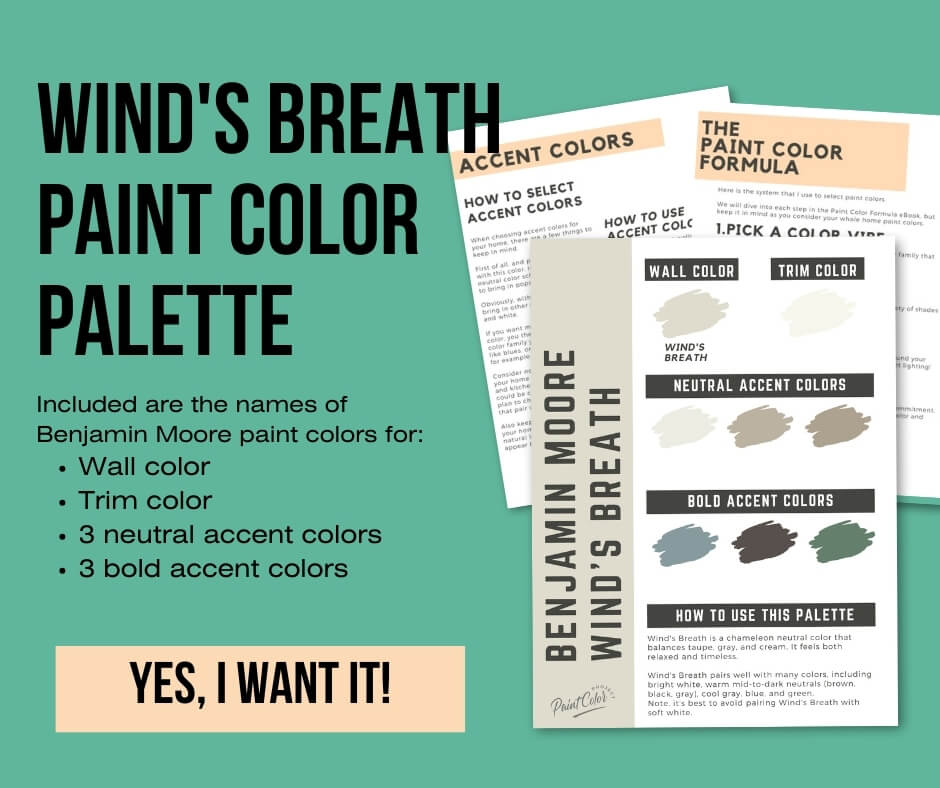
Wind's Breath Color Palette
Want to use this paint color in your home? Instantly upgrade your home's aesthetic with our exclusive paint color palette. Unlock the perfect trim color and six stunning accent colors, a combination of neutrals and bold hues for an instantly harmonious space!
Get your perfect paint color palette by clicking here!
Click here to get a peel and stick sample of Wind's Breath
FAQS
Here are some common frequently asked questions about Wind's Breath.
Is Wind's Breath warm or cool?
Wind's Breath is a warm, neutral paint color.
Is Wind's Breath a good exterior paint color?
Honestly, I wouldn’t recommend it for exteriors.
Outside, Wind’s Breath can look washed out or a little lifeless.
If you like its gray tones, go with a true gray. If it’s the creamy side you love, try swatching creamier options for your exterior instead.
Is Wind's Breath taupe or gray?
It’s a mix of taupe, gray, and cream.
The tricky part is that its appearance changes with the light. In warm lighting, it looks more creamy. In cooler light, it leans grayer.
Always test it in your space before committing.
Does Wind's Breath look pink?
Not usually, but it can happen.
Wind’s Breath has subtle taupe undertones, which sometimes pull a pinkish-purple hue, depending on the lighting.
The best way to know for sure? Swatch it in your space and check it at different times of the day.
Does Wind's Breath look gray?
It can lean gray, especially in darker spaces like north-facing rooms.
This color changes a lot depending on the light, so I always suggest swatching it first.
What's the difference: BM Wind's Breath vs Swiss Coffee?
Swiss Coffee is lighter, with an LRV of 82, compared to Wind’s Breath at 70.
Swiss Coffee is more of a creamy off-white / white, and Wind's Breath is more of a taupe / gray / cream.
If you’re unsure, swatch them side by side.

What's the difference: BM Wind's Breath vs SW Accessible Beige?
Wind’s Breath (LRV 70) is lighter than Accessible Beige (LRV 58).
Accessible Beige is more beige, while Wind’s Breath feels creamier and softer.

What's the difference: BM Wind's Breath vs Edgecomb Gray?
Edgecomb Gray and Wind’s Breath are similar warm neutrals.
The difference? Edgecomb Gray (LRV 63) is darker.
If you’re deciding between the two, swatch them both and see which works best in your lighting.

What is the SW equivalent of BM Wind's Breath?
There’s no exact match, but Sherwin Williams colors like Oat Milk, Natural Choice, Oyster White, or White Duck are close.
Always test these shades on your walls to see how they compare.


Before you go...
So, you've found the perfect paint color, but here's the thing - there's another big decision you have to make: picking the right paint sheen. Seriously, the level of glossiness can totally change how your color looks on the walls and how long the paint lasts!
Check out our complete guide to understanding paint sheens.
Still unsure which paint color is right for your space?
Choosing paint doesn’t have to be stressful! My free Paint Color Planning Quick Start Guide walks you through the exact steps to confidently choose the perfect color — without the overwhelm, second-guessing, or endless swatch testing.
👉 Click here to download the free guide!
DIYing Your Paint Job? Start Here.
Choosing a paint color is only half the equation — the tools you use matter just as much. I’ve rounded up the painting supplies we rely on for clean lines, smooth finishes, and less frustration overall.

My Paint Color Formula course walks you through the painless process of expertly testing paint swatches to ensure you have the perfect color for your home.
The best way to sample paint? Samplize!
Get peel-and-stick removable and reusable paint samples here!
Thanks for reading!

Meg Hemmelgarn is a freelance writer and home decor + DIY blogger who loves to talk about paint colors. She and her husband are currently renovating their third fixer upper. You can see their projects on her blog, Green With Decor.