Awkward layouts can be tricky. These paint colors and decor ideas help balance odd angles and create a more cohesive space.
Odd wall angles or room layouts can feel difficult to decorate around, but there is always a solution!
Intentional furniture placement should be top priority in awkward spaces. Soft neutral paint colors can also help simplify visual lines and keep the eye flowing.
In these situations, balance is more important than symmetry. Work with the weird wall angles instead of against them.
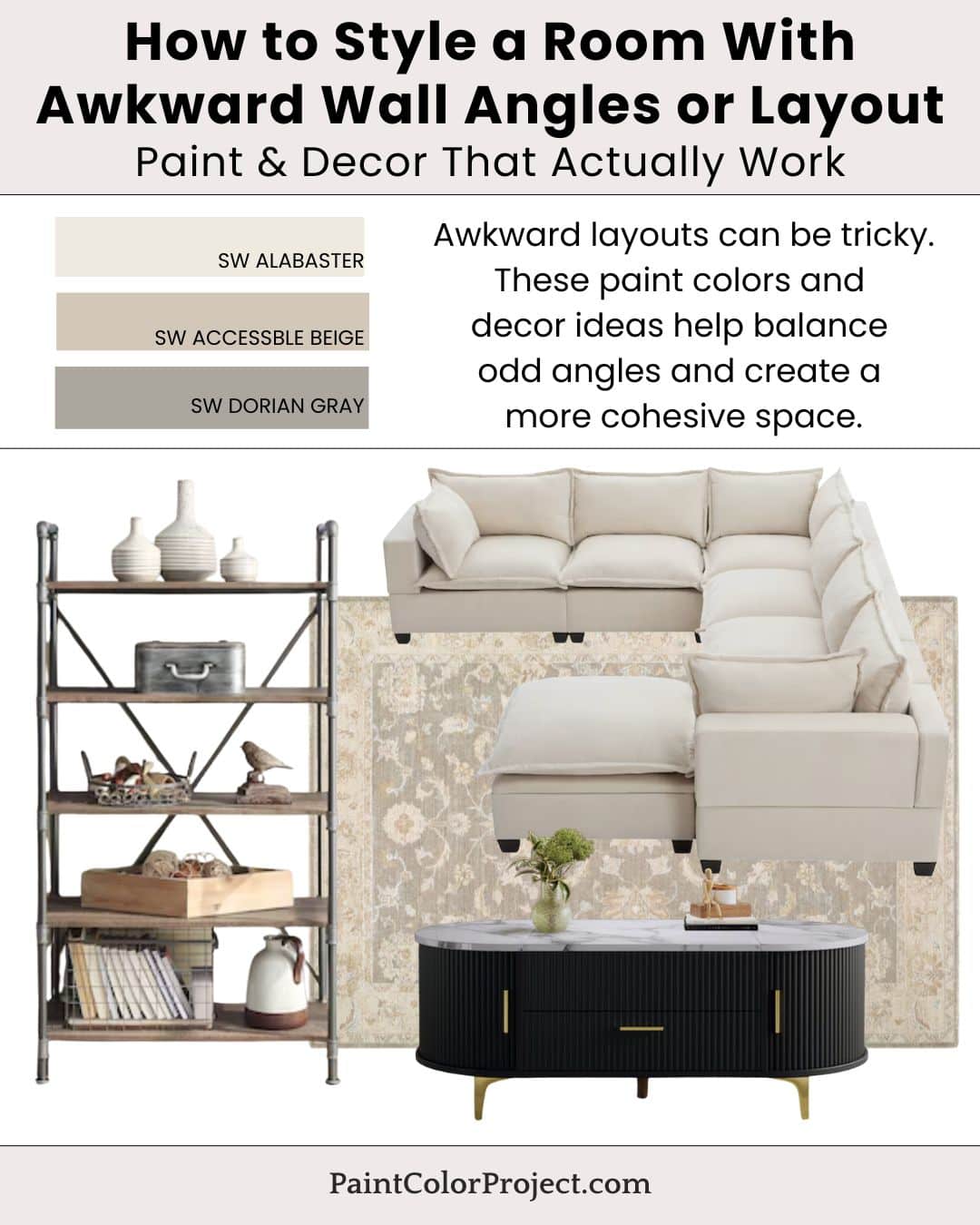
Paint Colors for a Room With Awkward Wall Angles or Layout
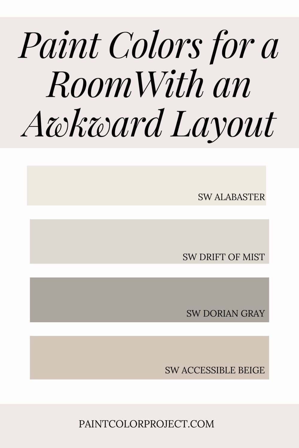
- Alabaster – simplifies space
- Drift of Mist – softens transitions
- Accessible Beige – warmth
- Dorian Gray – adds structure
💡 Tip: These tones transition beautifully between rooms, making them perfect for an open layout or whole-home palette.
If you want to test before committing, order peel-and-stick samples so you can see each color in your real lighting. Read my Samplize review for a quick overview of how to sample the easy way.
How to Bring the Look Together
The key to decorating a room with an awkward layout is to work with the space you have. Start with warm neutral walls, then add some decor pieces that add flexibility.
By utilizing pieces that fit into the nooks and crannies of an odd space, your home will feel cozy and tastfully decorated instead of cluttered.
For even more color ideas, check out my full guide to The Best Whole House Paint Colors.
Decor Inspiration
Paint alone can’t do all the work—decor is where the magic happens. Choose textures and tones that feel comfortable and echo your paint palette.
- Flexible furniture layouts, such as a modular sectional that can be broken into various configurations or a coffee table with storage and a simple work-from-option
- Area rugs to anchor zones
- Vertical decor elements, such as a bookshelf
- Simple window treatments
Stick with flexible, multi-use pieces and muted wall colors for a calm, cohesive look that still feels sophisticated.
Why This Palette Works
Soft, consistent colors minimize visual distractions, making a room feel cohesive and intentional no matter how odd a room's layout. Thoughtful furniture placement goes a long way in making a space feel intentional.
Modular sofa pieces can be arranged to fit into odd corners or under low dormers. A coffee table can provide a place to put drinks but can also offer storage or a lift-top for working from home. A tall bookshelf offers a lot of surface space (for decor or functional items!) without taking up a lot of floor space.
A cohesive color palette paired with furniture pieces that fit into any space creates a home that feels elegantly simple and comfortable.
Still unsure which paint color is right for your space?
Choosing paint doesn’t have to be stressful! My free Paint Color Planning Quick Start Guide walks you through the exact steps to confidently choose the perfect color — without the overwhelm, second-guessing, or endless swatch testing.
👉 Click here to download the free guide!
DIYing Your Paint Job? Start Here.
Choosing a paint color is only half the equation — the tools you use matter just as much. I’ve rounded up the painting supplies we rely on for clean lines, smooth finishes, and less frustration overall.

My Paint Color Formula course walks you through the painless process of expertly testing paint swatches to ensure you have the perfect color for your home.
The best way to sample paint? Samplize!
Get peel-and-stick removable and reusable paint samples here!
Thanks for reading!

Meg Hemmelgarn is a freelance writer and home decor + DIY blogger who loves to talk about paint colors. She and her husband are currently renovating their third fixer upper. You can see their projects on her blog, Green With Decor.