If you're searching for a soft, warm neutral paint color for your home, Sherwin Williams Warm Winter might be just what you’re looking for.
Warm Winter is one of those cozy greige shades that gives you a gentle, welcoming backdrop without the harshness of a bright, crisp white. I love colors like this because they make a room feel calm and pulled together, but still fresh and modern.
Warm neutrals are incredibly versatile. They work with so many styles and mix easily with different woods, metals, and fabrics. Whether your home leans traditional or modern, a warm neutral like this is bound to fit right in.
Of course, warm shades can vary a lot. Some lean brighter and lighter, while others feel deeper and creamier. Undertones matter too, so it’s always worth taking a closer look.
Let’s go through the details of Warm Winter so you can see whether it’s the right match for your space.
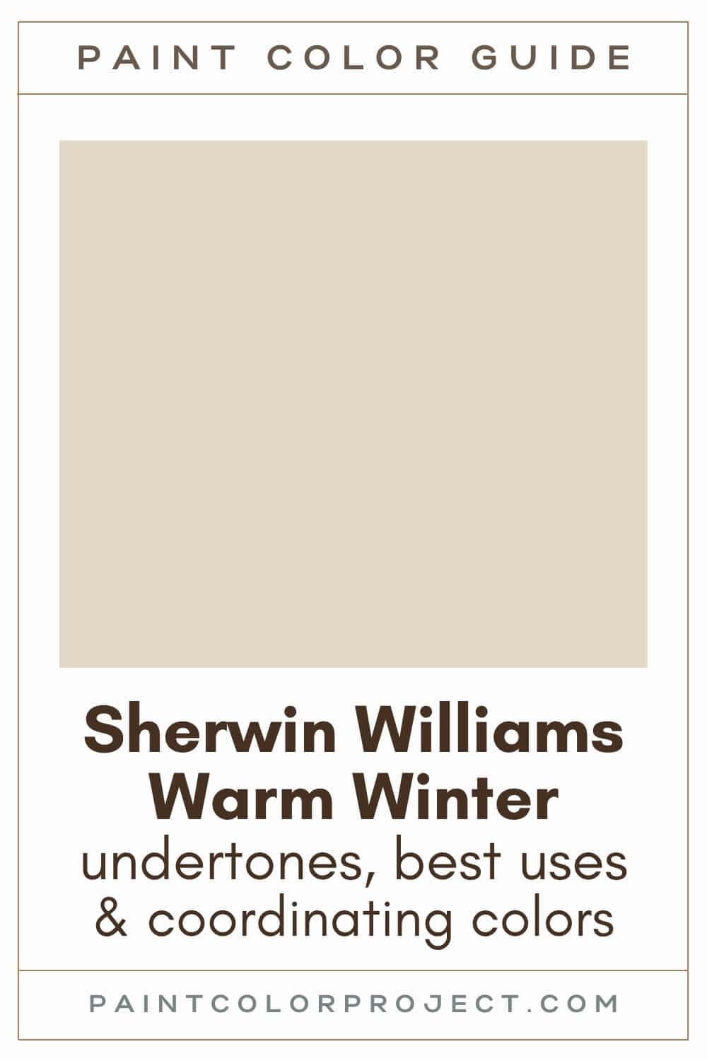
Warm Winter, Sherwin Williams, SW 9506
Warm Winter is a light, warm greige. It perfectly balances beige and gray to create a calming, neutral vibe.
Click here to get a peel and stick sample of Warm Winter
Color Family
Warm Winter is in the neutral family.
Light Reflectance Value
70
Light Reflective Value measures how much light a color reflects on a scale of 0 to 100. 0 is pure black, while 100 is pure white.
With an LRV of 70, Warm Winter is a light to mid-toned paint color.
It's dark enough to avoid being washed out in bright (south-facing) spaces, yet it's light enough to be used in darker (north-facing) rooms without appearing too dark.
RGB Colors
R: 225 G: 217 B: 198
These numbers show how much red, green, and blue make up the color. It’s basically the recipe behind Warm Winter and helps explain why it feels creamy and gentle on the walls.
Hex Code
#E1D9C6

Undertones
Warm Winter has neutral undertones, which makes it feel nice and balanced. You may catch a glimpse of warm gray and subtle red undertones.
In south-facing rooms with lots of natural light, Warm Winter will appear warmer, lighter, and more beige.
In north-facing rooms that lack sunlight, Warm Winter will appear a little more neutral and slightly darker. However, it's not too dark to be used in these spaces.
I always recommend swatching colors on your wall to make sure they look good – day and night – in your actual space before committing.
Click here to get removable peel & stick paint samples to easily swatch with!
Best Uses
Warm Winter is neutral enough to work as a whole house paint color. Use it for:
- Living rooms
- Bedrooms
- Kitchens
- Bathrooms
- Home exterior
- Interior doors
- Cabinets
- Furniture
Similar Colors
- Sherwin Williams Neutral Ground
- Benjamin Moore White Sand
- Behr Alpaca Blanket
- Sherwin Williams Aged White
- Benjamin Moore Creamy White
- Behr Vintage Linen
- Sherwin Williams Antique White
Click here to get a peel and stick sample of Warm Winter
🤯 Too many color choices?
Download my free Paint Color Planning Quick Start Guide — it’s the exact method I use to help readers choose a color that works the first time.
📥 Grab it here!
Coordinating Colors
Because it's so light and warm, Warm Winter is very easy to pair with other colors. It looks great with classic neutrals like soft whites, warm grays, tans, browns, and blacks.
Warm Winter also looks good with muted greens, rust oranges, blues, pinks, reds, yellows, and violets.
Mid-toned warm neutrals (with a hint of green):
- Canal Street
- Featherstone
- Bunglehouse Gray
- Studio Clay
- Felted Wool
Mid-toned blues:
- Lakeside
- Krypton
- Dockside Blue
- Languid Blue
- Niebla Azul
Warm whites:
- Cold Foam
- Alabaster
- Cotton
- Greek Villa
- Shell White
Trim Colors
Due to its very subtle hint of warmth, Warm Winter looks best with soft white colors for trim.
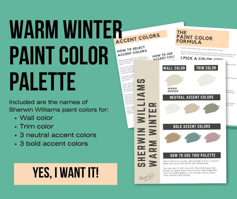
Warm Winter Paint Color Palette
Want to use this paint color in your home? Instantly upgrade your home's aesthetic with our exclusive paint color palette. Unlock the perfect trim color and six stunning accent colors, a combination of neutrals and bold hues for an instantly harmonious space!
Get your perfect paint color palette by clicking here!
Click here to get a peel and stick sample of Warm Winter
FAQs
Here are some frequently asked questions about Warm Winter.
What is the undertone of Sherwin Williams Warm Winter?
Warm Winter has a very balanced undertone, which is why it feels so easy to use. You might notice a soft warm gray with a tiny touch of red in certain lighting.
In bright rooms it leans a little warmer and more beige, while in darker rooms it settles into a more neutral feel. I always like to check colors in different lighting because these small shifts can change the whole mood of your room.
Is Warm Winter warm or cool?
Sherwin Williams Warm Winter is a warm color, but the warmth is gentle. It gives your walls a soft, cozy glow without feeling too yellow.
Because the warmth is subtle, you can pair it with both warm and cool color schemes. This makes it a really easy color to work with if you like mixing different tones in your home.
What is the difference between Sherwin Williams Warm Winter and Neutral Ground?
Warm Winter and Neutral Ground are both warm neutrals with an LRV of 70. So they fall into the same light to mid-tone range and neither one looks noticeably lighter or darker on the wall.
Warm Winter leans slightly more yellow, and Neutral Ground leans a bit more orange. Warm Winter also feels a touch more saturated, although the difference is small enough that you might only notice it when they are side by side.
If you are choosing between the two, I would test both in your home so you can see how the undertones behave in your lighting.

What whites look good with Sherwin Williams Warm Winter?
Because Warm Winter has a soft, gentle warmth, it pairs beautifully with warm whites. My favorites are Sherwin Williams Cold Foam, Sherwin Williams Alabaster, Benjamin Moore White Dove, and Behr Cameo White.
These whites keep everything looking fresh without fighting the warmth in Warm Winter.


Does Sherwin Williams Warm Winter look yellow?
Warm Winter does not read yellow on the wall, even though it has some warmth to it. It sits in that greige category where beige and gray are nicely balanced.
In bright south-facing rooms it may feel a little warmer, but not enough to turn yellow. If you are sensitive to yellow tones, I would still swatch it first so you can see it in your own light.
What is the difference between Sherwin Williams Warm Winter and Behr Antique White?
Behr Antique White has an LRV of 72, which makes it slightly lighter than Warm Winter at 70. Antique White is also considered a dark off-white, while Warm Winter falls into the light greige family.
Both are warm colors, but Antique White is noticeably warmer and a bit more saturated. Warm Winter looks more muted and a little more neutral.
If you want to see the real difference, I recommend swatching both. It is the easiest way to know which one feels right in your home.

Before you go...
So, you've found the perfect paint color, but here's the thing - there's another big decision you have to make: picking the right paint sheen. Seriously, the level of glossiness can totally change how your color looks on the walls and how long the paint lasts!
Check out our complete guide to understanding paint sheens.
Still unsure which paint color is right for your space?
Choosing paint doesn’t have to be stressful! My free Paint Color Planning Quick Start Guide walks you through the exact steps to confidently choose the perfect color — without the overwhelm, second-guessing, or endless swatch testing.
👉 Click here to download the free guide!
DIYing Your Paint Job? Start Here.
Choosing a paint color is only half the equation — the tools you use matter just as much. I’ve rounded up the painting supplies we rely on for clean lines, smooth finishes, and less frustration overall.

My Paint Color Formula course walks you through the painless process of expertly testing paint swatches to ensure you have the perfect color for your home.
The best way to sample paint? Samplize!
Get peel-and-stick removable and reusable paint samples here!
Thanks for reading!

Meg Hemmelgarn is a freelance writer and home decor + DIY blogger who loves to talk about paint colors. She and her husband are currently renovating their third fixer upper. You can see their projects on her blog, Green With Decor.