Thinking about a rich blue-gray paint color for your home? Sherwin Williams Slate Tile might be just the shade you’ve been searching for.
Deep blue-grays can be amazing paint choices because they manage to be bold and timeless at the same time. They work almost like a neutral, but with so much more personality.
Colors like Slate Tile can completely change the feel of a room. They can be dramatic and moody, or warm and cozy, depending on how you style them.
Just keep in mind, blue-grays can shift. Some lean more blue, others more gray, and sometimes you’ll even catch a purple cast in certain lighting.
So if you’re curious whether Slate Tile is the right fit, let’s go through the details.
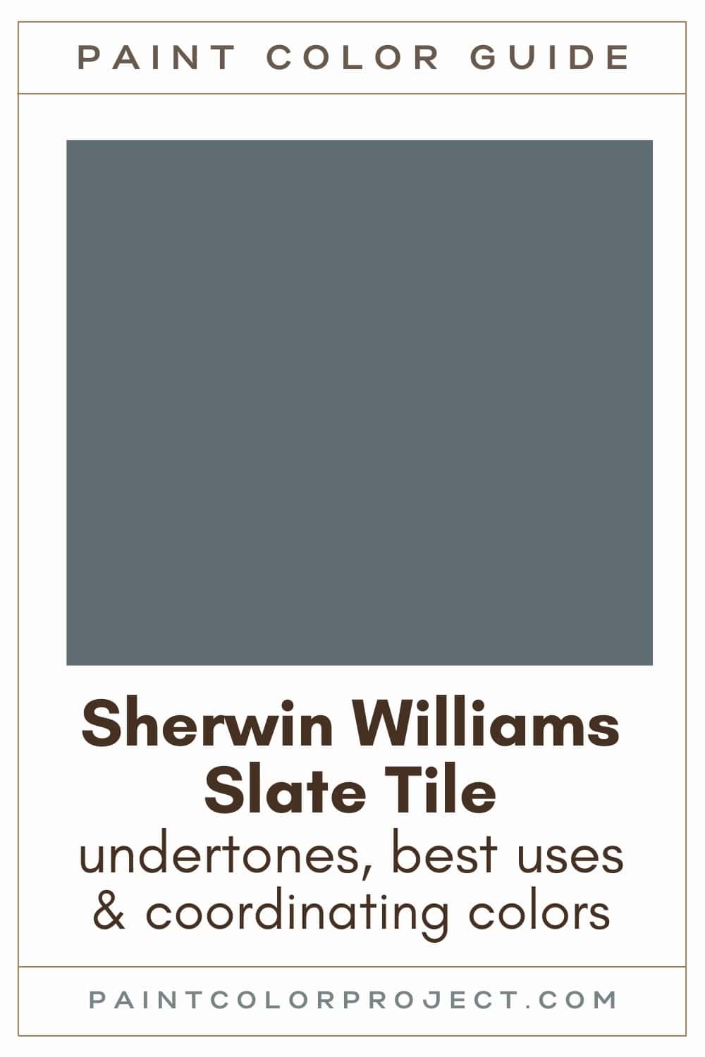
Slate Tile, Sherwin Williams, SW 7624
Slate Tile is a cool blue-gray that instantly makes a room feel classic and sophisticated. It’s also dark and muted enough that it almost behaves like a neutral.
Click here to get a peel and stick sample of Slate Tile
Color Family
Slate Tile is in the neutral family.
Light Reflectance Value
15
LRV measures how much light a paint color bounces around, on a scale of 0 to 100 with 0 being pure black and 100 being pure white.
The LRV of Slate Tile is 15, which makes it a very dark paint color. In rooms with lots of natural light, it softens a little and looks lighter. In darker rooms, it can read much deeper and moodier.
RGB Colors
R: 96 G: 110 B: 116
These values show the mix of red, green, and blue that create the Slate Tile shade. It’s balanced enough to feel versatile, but the green and blue keep it firmly on the cool side.
Hex Code
#606E74

Undertones
Slate Tile is a true blue-gray, but it’s the gray that keeps it from feeling too bold or too saturated. That balance is what makes it so livable.
In north-facing rooms or under cool artificial light, the gray side comes forward and makes the color feel cooler and moodier.
In brighter spaces with south-facing windows, you’ll notice more of the blue coming through, giving it a softer blue-gray feel.
I always suggest testing this shade on your own walls. Colors like this can shift a lot between morning and evening light, and it’s best to see it in your exact space before deciding.
Click here to get removable peel & stick paint samples to easily swatch with!
Best Uses
I love to use a dark color like Slate Tile for:
- Walls of a room you want to make cozier such as a bedroom or home office
- Creating a focal point such as a fireplace
- Kitchen or bathroom cabinets
- Interior or exterior doors
- Home exterior
- Accent wall
- Furniture
Similar Colors
- Sherwin Williams Granite Peak
- Benjamin Moore Blue Spruce
- Behr Desert Night
- Sherwin Williams Smoky Blue
- Benjamin Moore Powell Gray
- Behr NYPD
- Sherwin Williams Gibraltar
Click here to get a peel and stick sample of Slate Tile
🤯 Too many color choices?
Download my free Paint Color Planning Quick Start Guide — it’s the exact method I use to help readers choose a color that works the first time.
📥 Grab it here!
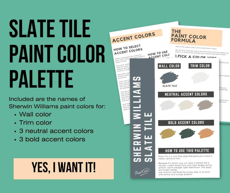
Coordinating Colors
Slate Tile is dark and muted enough that it almost works like a neutral. That’s why it pairs so easily with so many other shades.
For a soft and calming look, try it with light beiges, other blues, or gentle grays. If you want something more playful and bold, mix it with sunny yellows or warm oranges.
Bright whites:
- Ice Cube
- Extra White
- Gypsum
- Ceiling Bright White
- High Reflective White
Soft grays:
- Intellectual Gray
- Western Reserve
- Fawn Brindle
- Morris Room Grey
- Rushing River
Light slate blues:
- Stardew
- Niebla Azul
- Lullaby
- North Star
- Krypton
Trim Colors
Since Slate Tile leans cool, it really shines when paired with crisp, clean whites on the trim. This keeps the edges sharp and fresh.
Bright white trim options include:
- Benjamin Moore Simply White
- Sherwin Williams Extra White
- Behr Ultra Pure White
Slate Tile Paint Color Palette
Want to use this paint color in your home? Instantly upgrade your home's aesthetic with our exclusive paint color palette. Unlock the perfect trim color and six stunning accent colors, a combination of neutrals and bold hues for an instantly harmonious space!
Get your perfect paint color palette by clicking here!
Click here to get a peel and stick sample of Slate Tile
FAQs
Here are some common frequently asked questions about Slate Tile.
What color is Sherwin Williams Slate Tile?
Slate Tile is a deep blue-gray with a cool, muted feel. Because it is so toned down, it almost acts like a neutral, which makes it easy to mix with lots of different colors and styles.
I like how versatile it is. You can use it in a modern room or something more traditional, and it still feels right at home.
Is Sherwin Williams Slate Tile warm or cool?
Sherwin Williams Slate Tile is a cool blue-gray paint color. The blue and gray undertones give it a crisp, calming feel instead of warmth.
What’s the difference: Sherwin Williams Slate Tile vs Granite Peak?
Both Slate Tile and Granite Peak are dark, dramatic shades, but they are not identical. Slate Tile has an LRV of 15, which makes it just a touch lighter than Granite Peak with its LRV of 14.
Granite Peak leans a little more blue and feels more saturated, while Slate Tile stays slightly grayer and more muted.
If you are deciding between them, it really depends on whether you want that stronger blue presence or a softer gray balance. Swatching them side by side will make the difference clear.

What’s the difference: Sherwin Williams Slate Tile vs Smoky Blue?
Even though Slate Tile and Smoky Blue share the same LRV of 15, they show up differently once on the wall.
Smoky Blue reads more saturated and a little more vibrant, while Slate Tile looks grayer and more subdued.
If you like a moodier, almost neutral look, you might prefer Slate Tile. But if you want more color presence, Smoky Blue will give you that.

Where should I use Sherwin Williams Slate Tile?
Slate Tile is flexible because it can play as a neutral or as an accent color. I think it works beautifully in bedrooms, especially if you want a cozier, moody feel.
It is also striking on a fireplace, built-ins, or cabinets in a kitchen or bathroom. I’ve even seen it used on interior doors and accent walls, and it gives the space so much depth.
What color trim goes with Sherwin Williams Slate Tile?
Since Slate Tile leans cool, I think it looks best with a bright white trim. That crisp contrast makes the blue-gray really stand out.
Some great options include Sherwin Williams Extra White, Benjamin Moore Simply White, or Behr Ultra Pure White.


Still unsure which paint color is right for your space?
Choosing paint doesn’t have to be stressful! My free Paint Color Planning Quick Start Guide walks you through the exact steps to confidently choose the perfect color — without the overwhelm, second-guessing, or endless swatch testing.
👉 Click here to download the free guide!
DIYing Your Paint Job? Start Here.
Choosing a paint color is only half the equation — the tools you use matter just as much. I’ve rounded up the painting supplies we rely on for clean lines, smooth finishes, and less frustration overall.

My Paint Color Formula course walks you through the painless process of expertly testing paint swatches to ensure you have the perfect color for your home.
The best way to sample paint? Samplize!
Get peel-and-stick removable and reusable paint samples here!
Thanks for reading!

Meg Hemmelgarn is a freelance writer and home decor + DIY blogger who loves to talk about paint colors. She and her husband are currently renovating their third fixer upper. You can see their projects on her blog, Green With Decor.