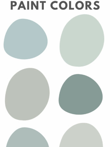
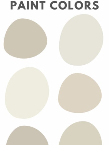
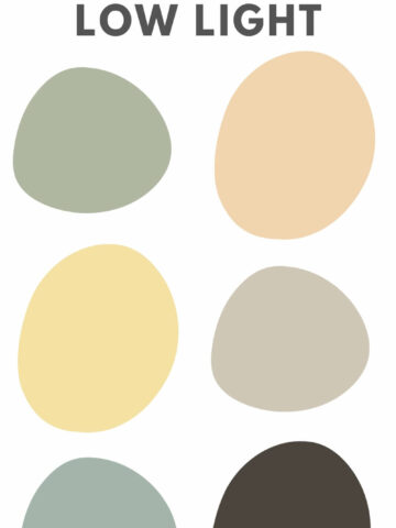
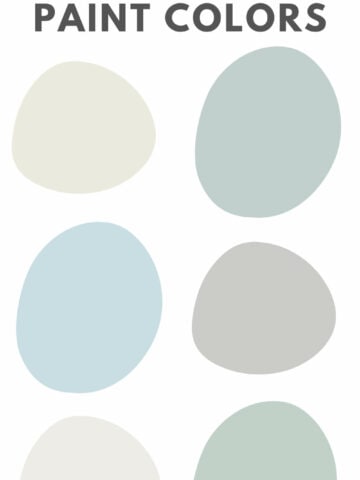
Painting the majority of your home one color is a great way to help the space feel cohesive. Here are the best whole house paint colors!
If you love color, it's easy to get excited about bringing colors into your home. An easy way to do that is with wall paint!
However, having vastly different colored rooms can be jarring and make a home feel very choppy and disjointed.
It is a very popular choice to paint the entire interior of a home - or at least the open, common living spaces, one color.
Should my entire house be painted same color?
I say no, you should not paint your whole home one color. I personally like for bedrooms to each have their own personalities and paint colors that make sense for their vibes.
I also love accent walls, molding, and wallpaper in certain spaces.
However, I feel strongly that open common spaces - especially if you have an open concept "gathering" type living space, should all be painted one cohesive color.
How to pick a paint color for your whole house
Here are a few questions to keep in mind when selecting a main paint color for your entire home.
Cool tone or warm tone?
Look at the aspects of your home that won't be changing. This could be flooring, cabinets, or major furniture pieces. Are they cool toned or warm toned?
You personally are probably already drawn to either a cool or warm color palette, but this is the time to commit if you haven't already. Pick a paint color that flows with your existing tone.
What mood do you want your home to have?
Do you want a light, bright, and airy space? Something more cozy and moody? Something bright and colorful?
Hop onto Pinterest and start a board of rooms that inspire you. Then, take a look at the paint colors. Do they have a similar mood or vibe? This is a great way to get started in the right direction!
How much natural light does your home get?
In general, darker spaces do better with lighter, brighter colors. If you have a super well-lit home, you might want to pick a color with a bit more pigment to it as the bright light can wash colors out.
Be sure that any color that you choose works in all types of light!
One of the most important thing to remember about all paint colors is that they appear differently in different lighting situations. So, you want to be sure to paint large samples and check them at different times of day to be sure that you like the way the color looks.
For example, in our condo, I painted our bedroom what I thought was a warm gray color. I got 3 samples, painted small spots on the wall, looked at them, and drove straight to Lowe's and bought a gallon of the one I liked best.
Well, at night - or any time it was dark and I had the lamps on - it looked purple. Like VERY purple. I hated it, but also didn't want to re-paint, which was a lot of work.
Lesson learned! Always paint BIG samples and look at them multiple times a day for 2-3 days before committing to a color!

What is the best paint color for the whole house?
Any color can work for your home, and in the end it comes down to what you prefer. But, here are some popular, tried and true options.
- Sherwin Williams Online
- Sherwin Williams Repose Gray
- Sherwin Williams Agreeable Gray
- Benjamin Moore Simply White
- Benjamin Moore Edgecomb Gray
- Sherwin Williams Accessible Beige
- Sherwin Williams Mushroom Cream
- Sherwin Williams Dover White
- Sherwin Williams Eider White
Now, let's break each of those colors down and see examples of them in real homes!
Sherwin Williams Online (SW-7072)
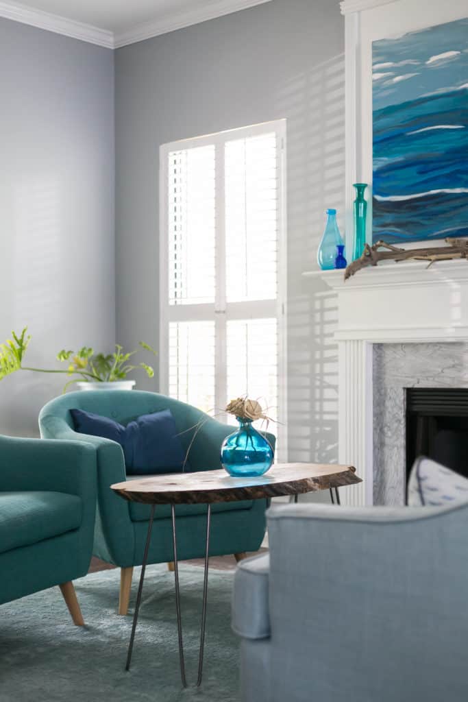
Sherwin Williams Online is actually the paint color that we chose to paint our entire downstairs, stairway, and hallway upstairs! It has been one of my favorite colors lately.
It is a cool gray color with very slight blue undertones. It's not a super light color - it is pigmented enough that it definitely reads as gray. I'd classify it as closer to a medium than light gray.
It's an awesome option for spaces where you want a coastal or beachy feel or a nice blue gray wall color.
Click here to get a 12" x 12" peel and stick sample of Sherwin Williams Online!
Sherwin Williams Repose Gray (SW-7015)
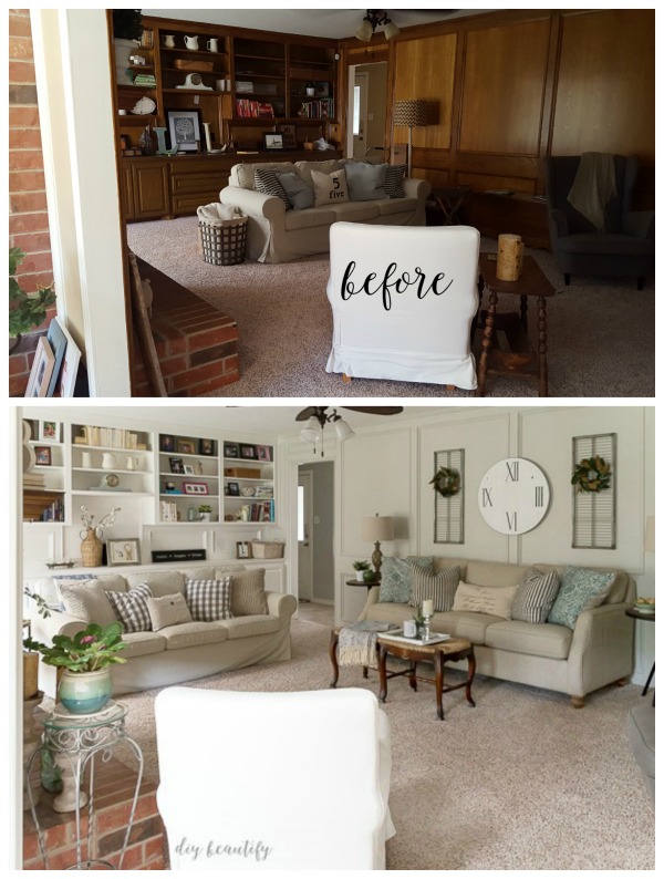
Repose Gray family room by DIY Beautify
Repose Gray is a very light, slightly warm toned gray paint color. You can see how truly light and bright it is in the image above.
Some people say that it can read ever so slightly purple, especially in morning light. While it does have those slight lavender undertones, it is very very close to a true gray.
This is a great option if you are looking for a light, creamy greige. It works really well for rustic or farmhouse style homes especially.
Click here to get a 12" x 12" peel and stick sample of Sherwin Williams Repose Gray.
Sherwin Williams Agreeable Gray (SW-7029)
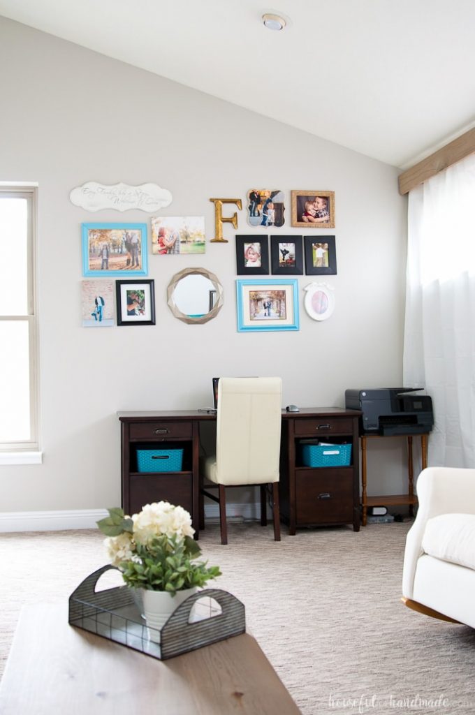
Agreeable Gray by Houseful of Handmade
Agreeable Gray is a super popular warm toned gray paint color. It is frequently used by builders or real estate stagers to paint the entire interior of a home.
Read my mega review of Agreeable Gray here!
Agreeable Gray has yellow undertones, so it pairs best with other warm earth tones. Keep that in mind when selecting accent colors!
As you can see in the real life living room above, Agreeable Gray reads as really light in a bright, well lit room, especially when paired with a lot of white.
Click here to get a 12" x 12" peel and stick sample of Sherwin Williams Agreeable Gray.
Benjamin Moore Simply White (OC-117)
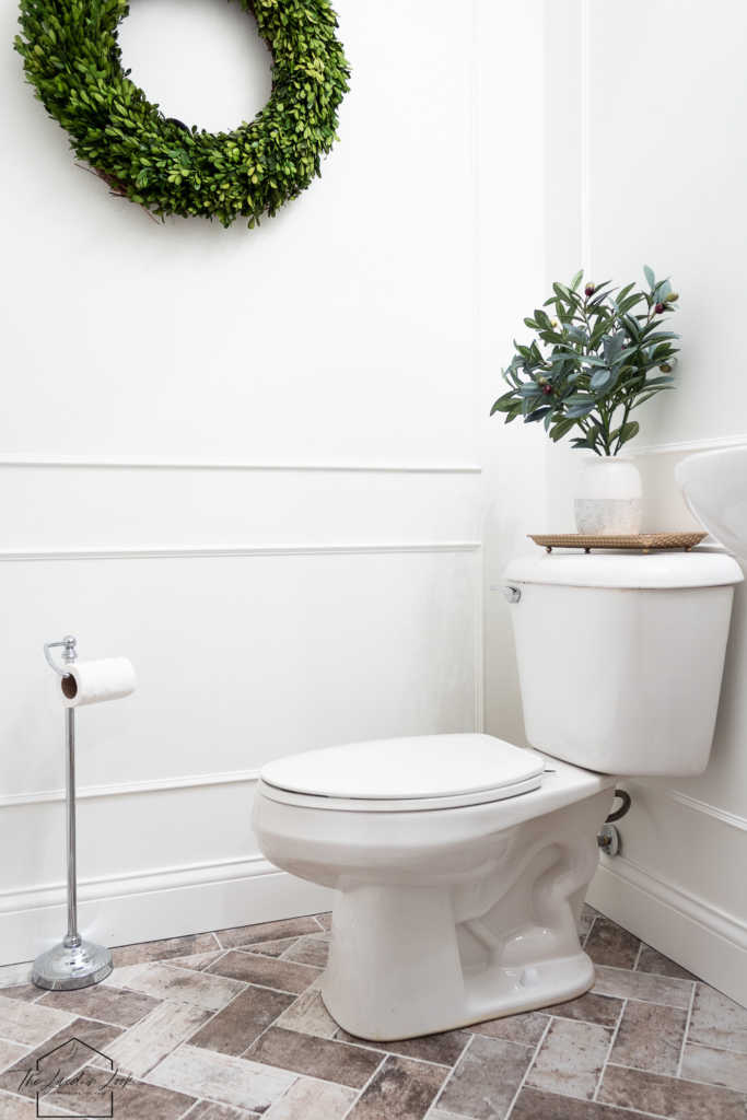
Simply White in a bathroom by The Lived In Look
If you want a white home, Simply White is an excellent choice. It is a warm toned white, which means it has ever so slightly yellow undertones to it. It does not have any blue undertones to it.
All white walls can be very powerful. This look works really well in homes where you want high-contrast - dark metal accents, dark woods, or vibrant colored textiles.
This is a great choice for almost any style of home, but especially modern, mid-century modern, eclectic, or farmhouse styles.
Click here to get a 12" x 12" peel and stick sample of Benjamin Moore Simply White.
Benjamin Moore Edgecomb Gray (HC-173)
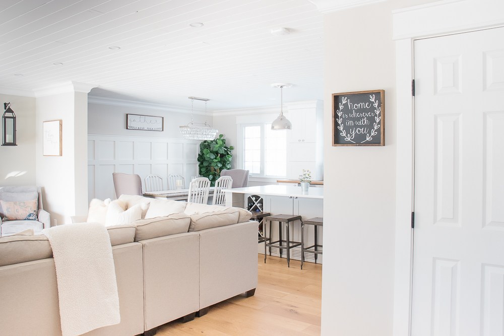
Edgecomb Gray by Making it in the Mountains
Edgecomb Gray is a light and bright greige paint color - a mixture between gray and beige. It is a great option for a fresh but slightly warm look.
This is a great option if you want a greige paint color without green or purple undertones - which can be pretty hard to find in a gray, since most have one or the other!
Beware that Edgecomb Gray can look a bit dingy in artificial light and is best for homes with lots of bright light.
Click here to get a 12" x 12" peel and stick sample of Sherwin Williams Edgecomb Gray.
Sherwin Williams Accessible Beige (SW-7036)
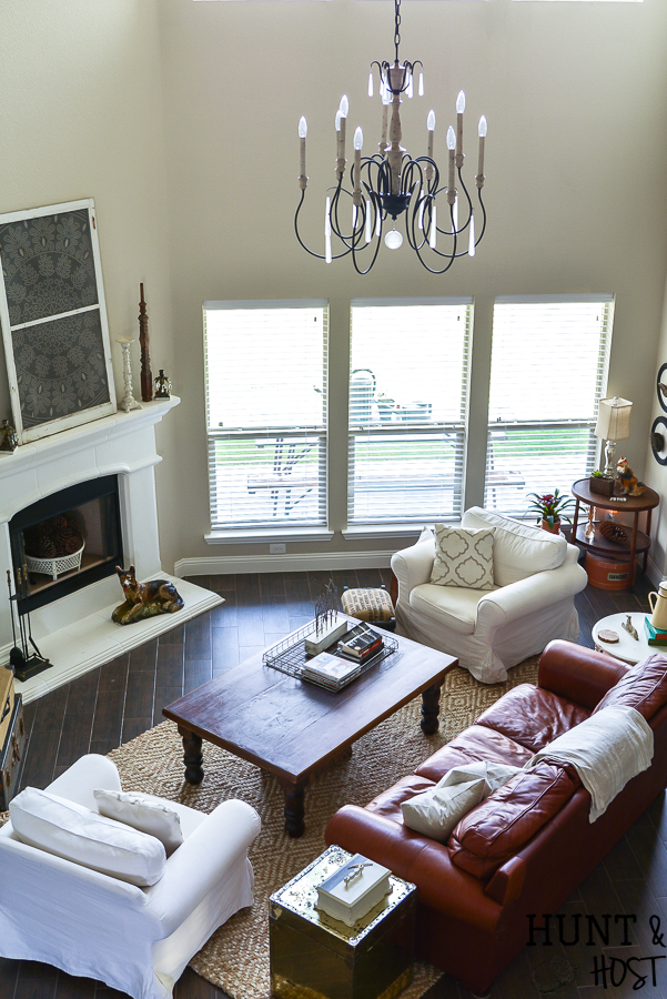
Accessible Beige living room by Salvaged Living
Accessible Beige is another super popular whole house paint color option. It is another light greige but this one has very warm undertones. It is definitely more heavy on the beige than the gray!
The less natural light your space gets, the more gray (as opposed to beige) this color tends to look. That's why it's so important to keep your home's lighting in mind when choosing interior paint colors!
Just keep in mind that if different rooms in your home get different amounts of natural light, this (and many other!) paint color might look totally different in different rooms!
Click here to get a 12" x 12" peel and stick sample of Sherwin Williams Accessible Beige.
Sherwin Williams Mushroom Cream (MAB 5047)
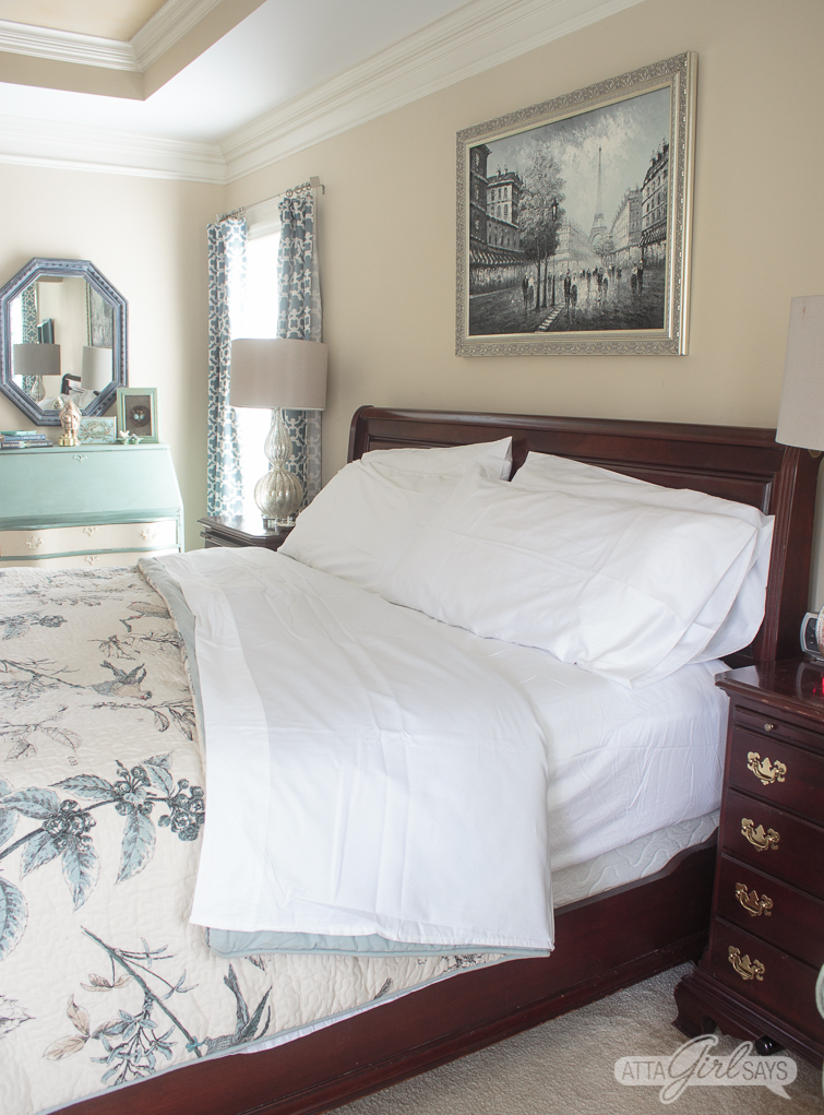
Mushroom Cream master bedroom by Atta Girl Says
Want more of a true beige? Check out Mushroom Cream! It has brown and taupe undertones without any purple to it.
Mushroom Cream works really well in traditional style homes and contrasts well with dark wood tones. It looks best paired with crisp pure white paint for trim work.
Sherwin Williams Dover White (SW-6385)
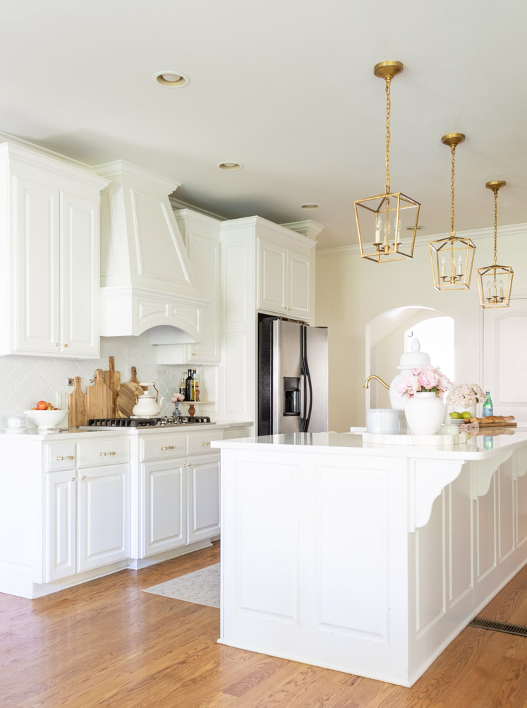
Dover White Kitchen by Jennifer Maune
Dover White is a warm white paint color with very creamy, yellow undertones. It is an excellent option if you want a very light and bright home, but with a slight bit of color and warmth to your walls.
You can see how the color is not quite white when paired with these crisp white kitchen cabinets. It is a great option if you want almost-white walls, but don't want a space to feel too cold or sterile.
Click here to get a 12" x 12" peel and stick sample of Sherwin Williams Dover White.
Sherwin Williams Eider White (SW-7014)
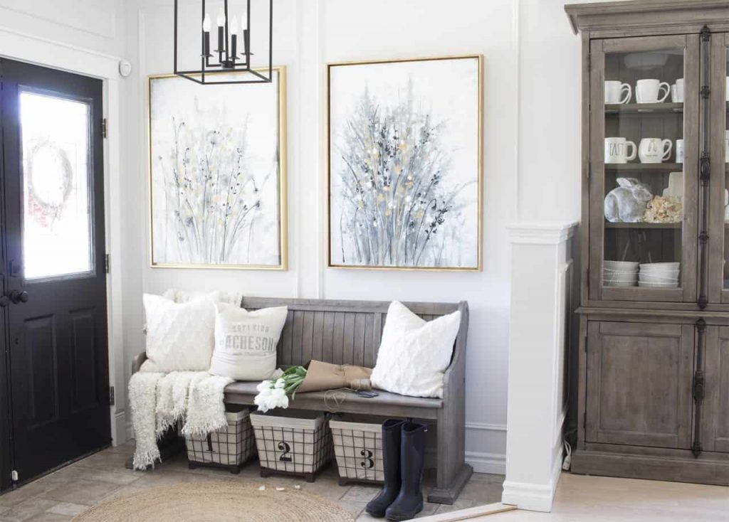
Eider White by Home Made Lovely
Eider White is a very very light gray color. It looks to be white until you put it next to a crisp white such as trim. It's a great "barely there" gray color for those wanting an almost-white look.
This shade has some purple or pink undertones in it, so be sure to test a large swatch to be sure that you like the look.
Click here to get a 12" x 12" peel and stick sample of Sherwin Williams Eider White.
Is your home painted one cohesive color? I'd love to her what your favorite paint colors are!
Still unsure which paint color is right for your space?
Choosing paint doesn’t have to be stressful! My free Paint Color Planning Quick Start Guide walks you through the exact steps to confidently choose the perfect color — without the overwhelm, second-guessing, or endless swatch testing.
👉 Click here to download the free guide!

My Paint Color Formula course walks you through the painless process of expertly testing paint swatches to ensure you have the perfect color for your home.
The best way to sample paint? Samplize!
Get peel-and-stick removable and reusable paint samples here!
Thanks for reading!
Morgan is passionate about home decor and paint colors. She has been sharing DIY home decor tips since 2012 at CharlestonCrafted.com. From there, she learned to love paint colors, and the Paint Color Project was born in 2022!

