Looking for the best warm neutral living room paint colors? I’ve rounded up some of my favorites that always look good and never go out of style.
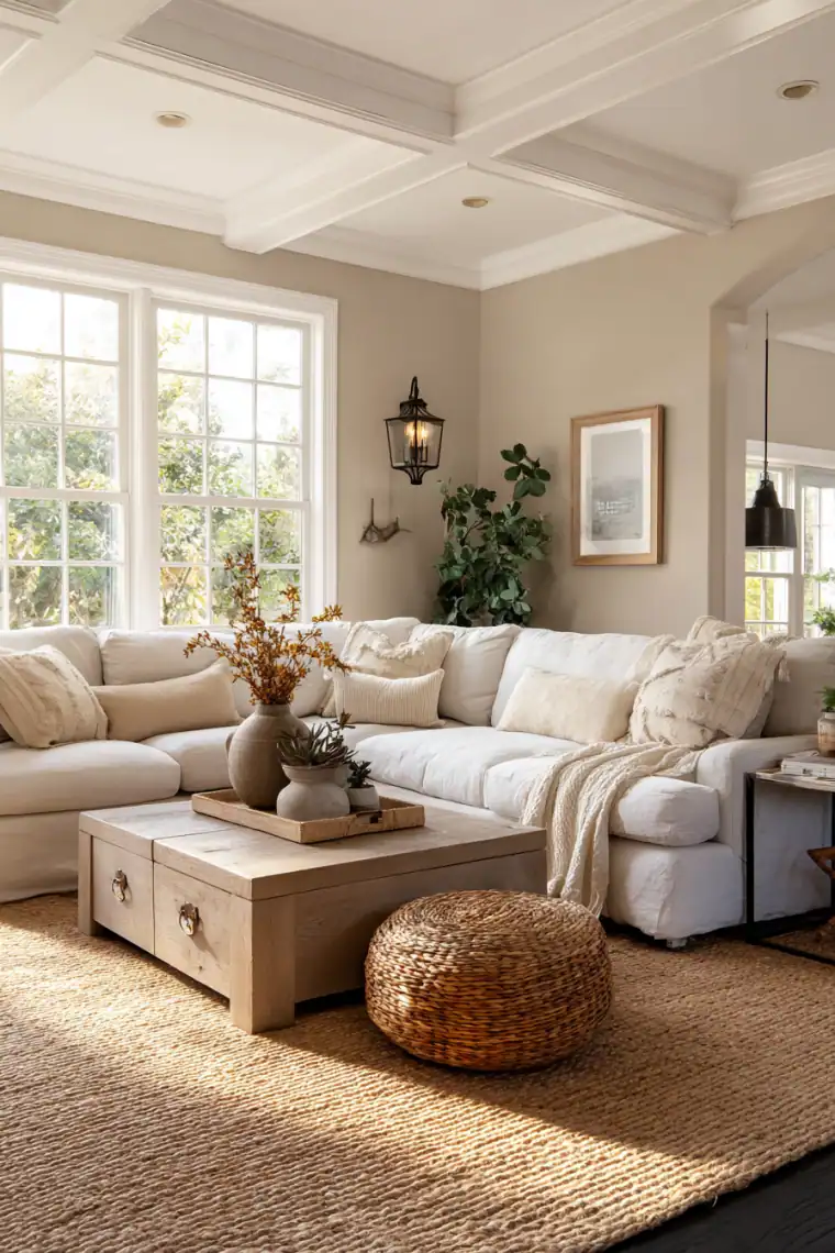
I’ve always been drawn to warm neutrals in a living room. They calm the space without taking over. The walls soften, the furniture has room to shine, and the whole place feels instantly more inviting.
What I like most is how easy these shades are to live with. Soft off-whites, cozy beiges, richer taupes, they all work. You can mix them with bold colors or keep things simple, and they’ll still feel timeless.
If you want a living room that’s comfortable, stylish, and easy to decorate around, these warm neutral paint colors are a great place to start.
Keep reading and I’ll share some of my favorites.
Why Choose a Warm Neutral Paint Color?
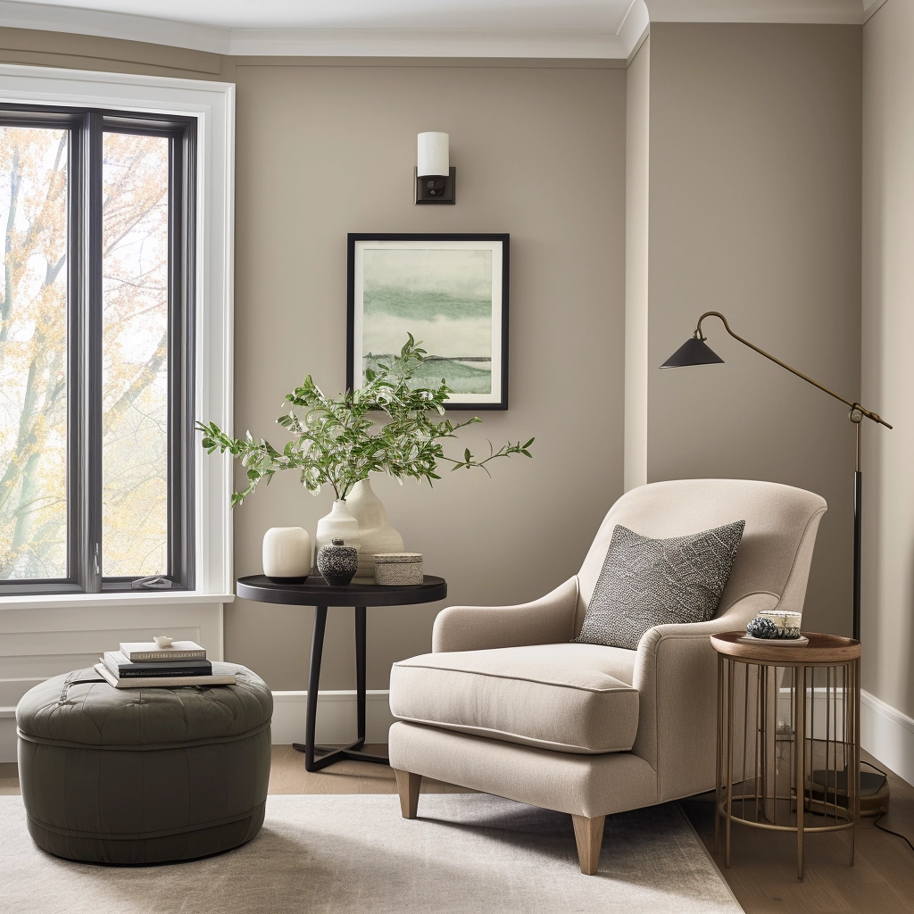
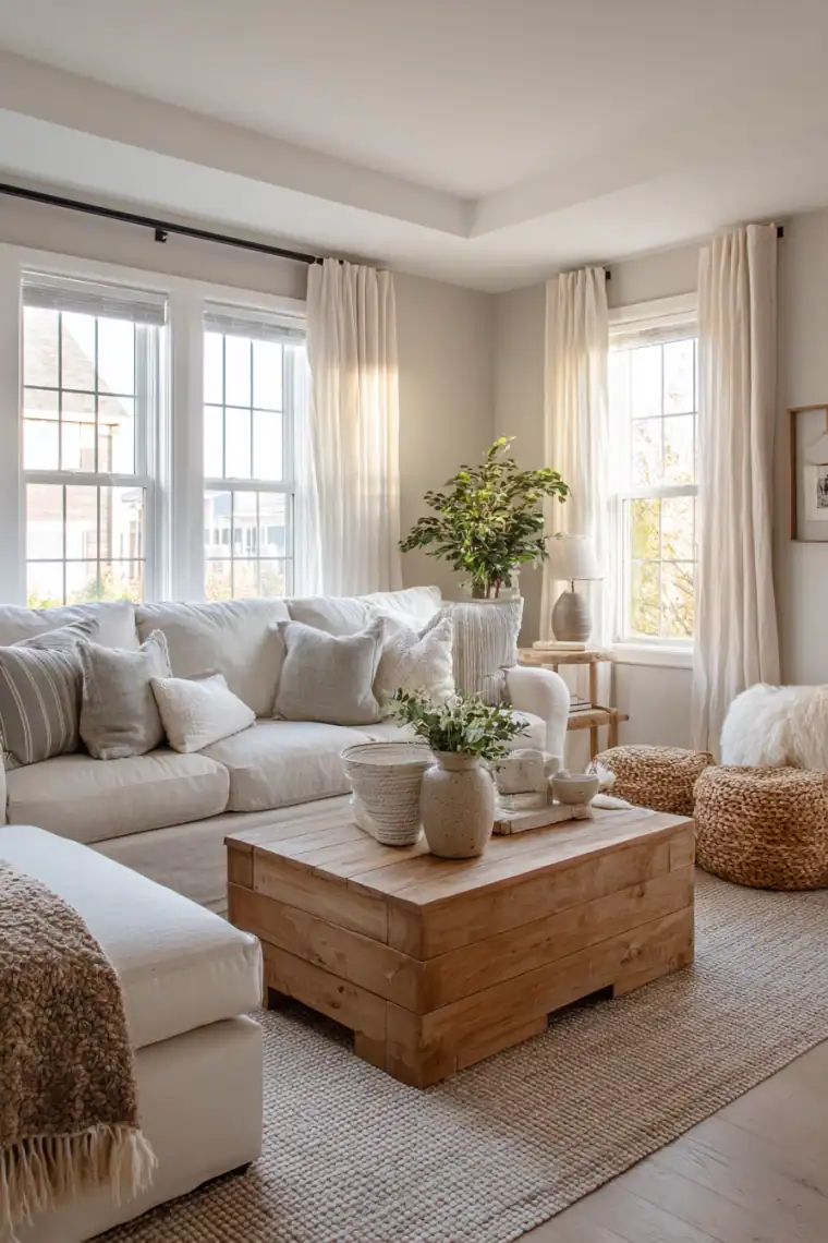
Warm neutrals are some of the easiest colors to live with. Unlike cool grays that can feel a little stark, warm tones add softness and make a space feel more welcoming.
They also play nicely with so many decorating styles. Modern farmhouse, traditional, boho, or even transitional all look great with a warm neutral backdrop. No matter if your furniture is white, wood, or a mix of both, these colors just work.
If you want to learn more about what counts as a warm neutral, check out this Sherwin-Williams warm neutral paint color breakdown.
How to Use Warm Neutrals in Your Living Room
Here are a few easy ways to make warm neutral walls feel their best:
- Layer in texture: Warm neutrals work well with natural touches like rattan, wood, linen, or cozy throws.
- Add contrast: Black or deep bronze accents in hardware, lighting, or furniture legs keep the room from looking flat.
- Play with undertones: Match the warmth of your paint with flooring or trim, especially if they lean pink, yellow, or orange.
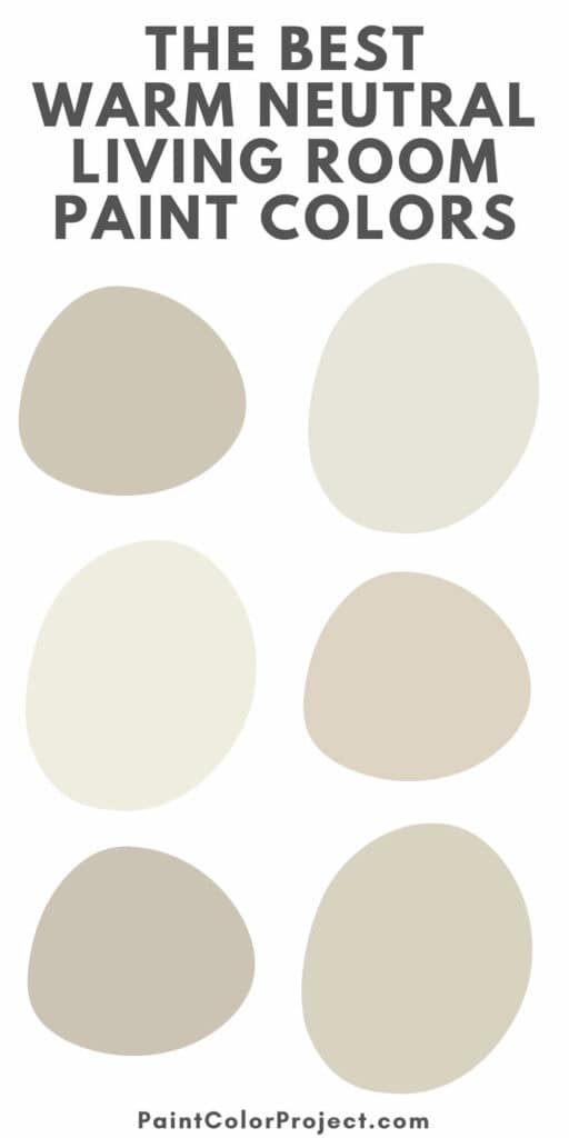
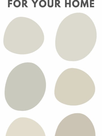
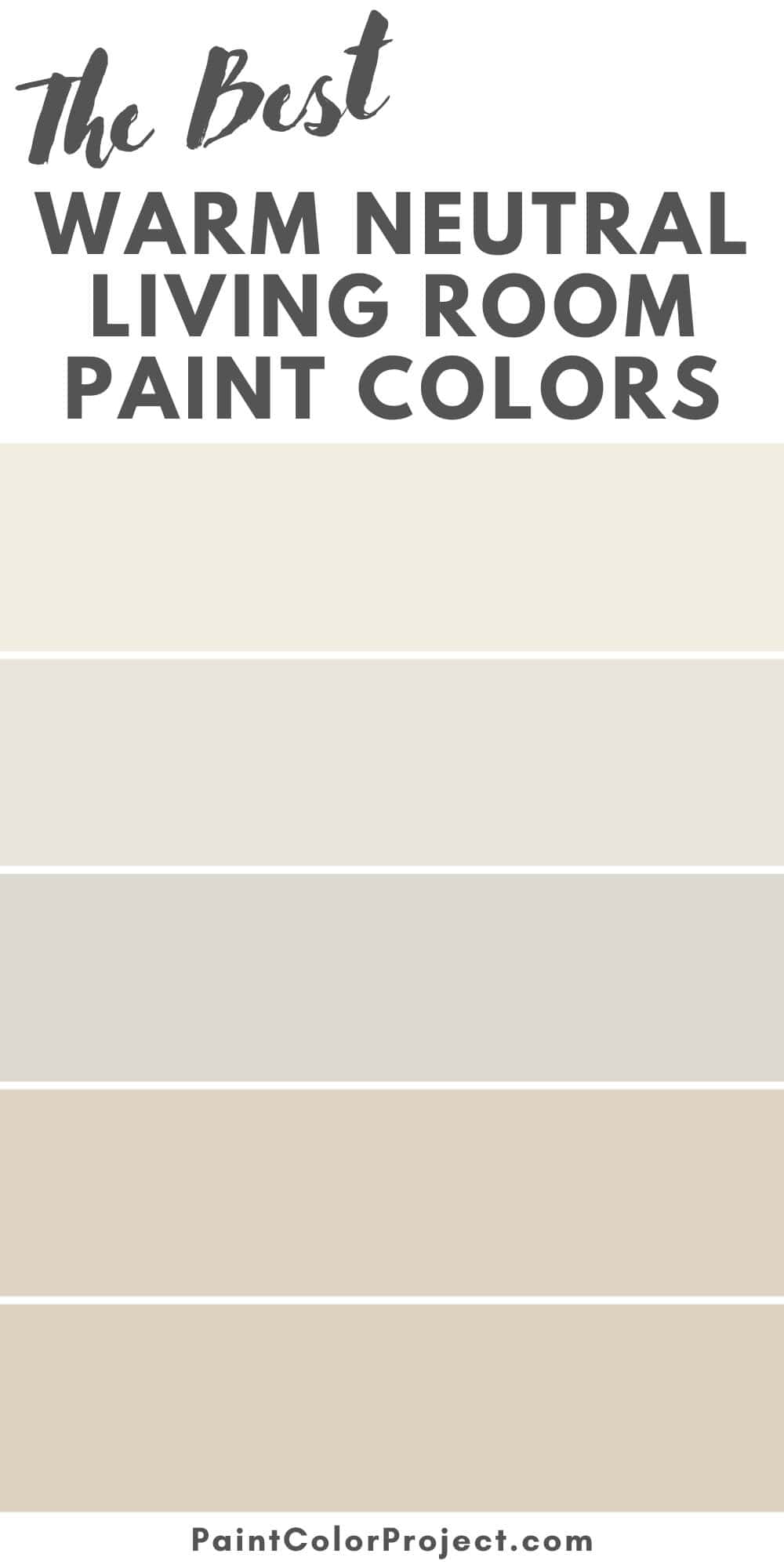
Best Warm Neutral Living Room Paint Colors
These are some of my favorite shades for adding warmth without taking over the room.
A lot of them also show up in my list of the coziest paint colors, so you know they’ll make your living room feel comfortable and inviting.
1. Accessible Beige – Sherwin Williams
A modern classic greige with a warm undertone. Accessible Beige is soft and flexible without going too yellow.

Perfect for: Open-concept living rooms and spaces with mixed wood tones.
2. Pale Oak – Benjamin Moore
Airy and warm, Pale Oak has just enough pigment to read as color while still feeling bright and soothing on the walls.

Perfect for: Small living rooms or spaces with less natural light.
3. Swiss Coffee – Behr
With subtle beige undertones, Behr’s Swiss Coffee is a creamy off-white that feels warmer and softer than a stark white.

Perfect for: Modern farmhouse or traditional living rooms with white trim and texture.
4. Natural Linen – Sherwin Williams
Natural Linen is a warm beige with a subtle pink undertone that adds a welcoming softness without looking peachy.

Perfect for: Classic living rooms with warm wood floors or antiques.
5. Edgecomb Gray – Benjamin Moore
Edgecomb Gray shifts beautifully depending on the light — reading more beige in bright rooms and more gray in cooler spaces.

Perfect for: Transitional living rooms where you want year-round flexibility.
6. Wheat Bread – Behr
Grounded and cozy, Behr Wheat Bread is a medium beige that feels stylish without being too dark.

Perfect for: Family rooms with lots of activity and mixed furnishings.
7. Canvas Tan – Sherwin Williams
Soft and timeless, Canvas Tan avoids strong yellow or pink undertones, giving you a clean backdrop to build on.

Perfect for: Living rooms with layered neutrals, wood, and natural fiber rugs.
8. Grant Beige – Benjamin Moore
Grant Beige is a slightly deeper beige with earthy undertones that add coziness without feeling muddy.

Perfect for: Larger living rooms or vaulted spaces that need depth.
9. Smoky White – Behr
If you want an ultra-light look, Behr Smoky White is a soft beige-white that provides just enough contrast from trim while staying warm.

Perfect for: Light-filled or coastal-inspired living rooms.
Tips for Using Warm Neutrals Successfully
- Check the lighting: Warm neutrals can look more yellow in south-facing rooms and more muted in north-facing ones.
- Don’t skip sampling: Even the “perfect” beige can shift once it’s on your wall, so always test first.
- Layer tones: Mix light and dark neutrals with furniture, textiles, and decor for a more finished look.
- Avoid stark whites: Pair warm neutrals with creamy whites or off-whites on trim and ceilings to keep the space soft.

Need more help?
If choosing a paint color still feels overwhelming, I’ve got you covered.
✨ Grab The No-Fail Paint Color Jumpstart Guide — it’s a fast, easy way to confidently choose the right paint color (and feel great about it).
Still unsure which paint color is right for your space?
Choosing paint doesn’t have to be stressful! My free Paint Color Planning Quick Start Guide walks you through the exact steps to confidently choose the perfect color — without the overwhelm, second-guessing, or endless swatch testing.
👉 Click here to download the free guide!

My Paint Color Formula course walks you through the painless process of expertly testing paint swatches to ensure you have the perfect color for your home.
The best way to sample paint? Samplize!
Get peel-and-stick removable and reusable paint samples here!
Thanks for reading!

Morgan is passionate about home decor and paint colors. She has been sharing DIY home decor tips since 2012 at CharlestonCrafted.com. From there, she learned to love paint colors, and the Paint Color Project was born in 2022!