Looking for the right muted gray paint color for your home? Let’s talk about Sherwin Williams Roycroft Mist Gray and see whether it might be a good fit for your space.
Picking a neutral paint color can feel a bit tricky, especially once you start comparing gray, greige, taupe, and beige samples side by side. Mid-toned grays are a great place to start since they give you depth without feeling too dark or heavy.
I like grays in this range since they can make a room feel calm and finished, yet still flexible. They work with many decor styles, wood tones, metal finishes, and accent colors, which makes the rest of your design choices feel a little simpler.
Still, no two gray paint colors are exactly the same. Each one has its own depth, warmth, coolness, and undertones, so the same color can look very different from room to room.
Let’s look closely at Sherwin Williams Roycroft Mist Gray so you can decide if it belongs in your home.
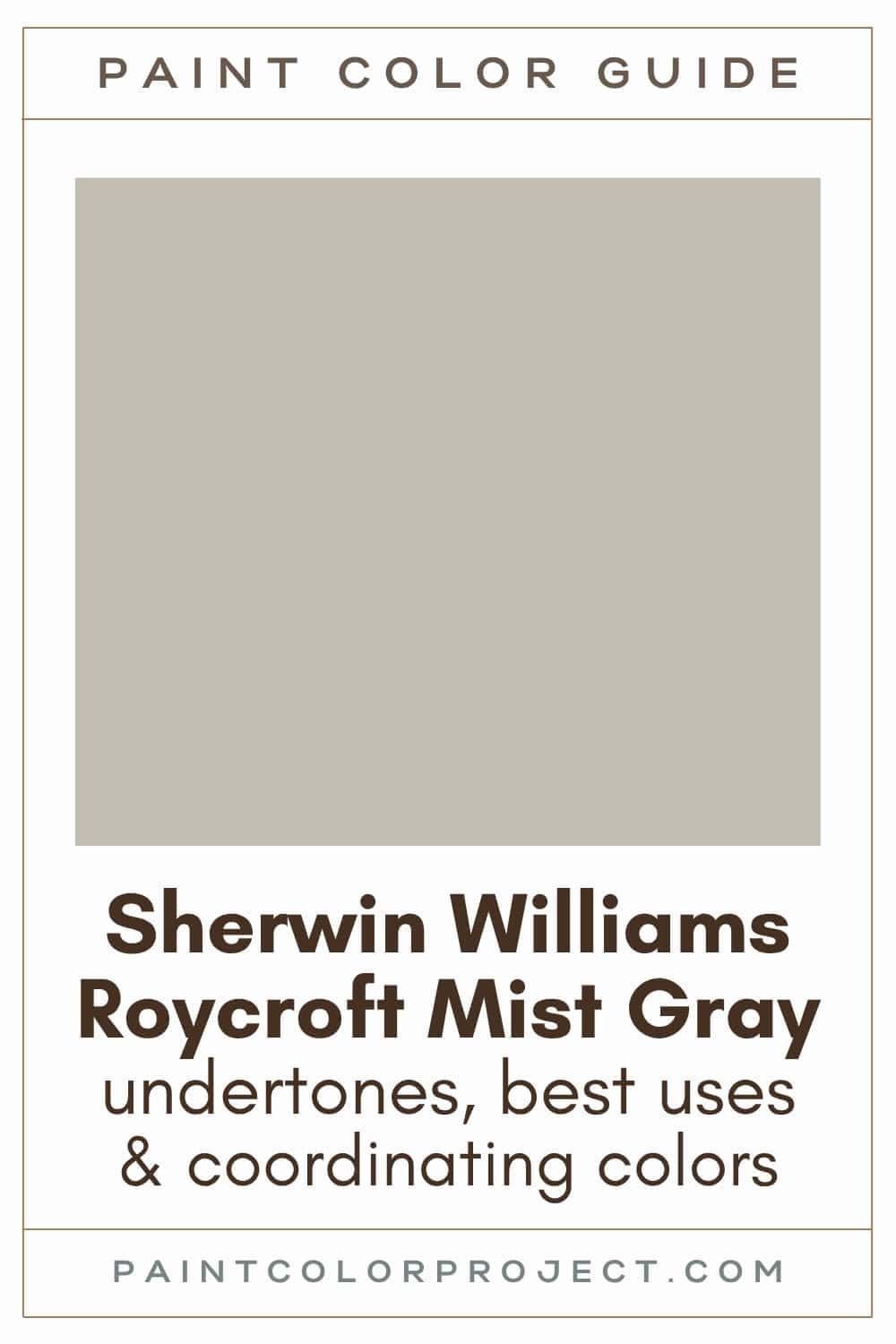
Roycroft Mist Gray, Sherwin Williams, SW 2844
Sherwin Williams Roycroft Mist Gray is a smoky, muted neutral with a soft gray base and a slightly earthy feel.
Click here to get a peel and stick sample of Roycroft Mist Gray
Color Family
Roycroft Mist Gray is in the neutral family.
Light Reflectance Value
51
LRV tells you how much light a paint color reflects back into a room. The scale runs from 0 to 100, with lower numbers looking darker and higher numbers looking lighter.
With an LRV of 51, Roycroft Mist Gray sits right in the mid-toned range. In a bright room, it can read softer and lighter. In a darker room, it will look deeper, moodier, and more gray.
RGB Colors
R: 194 G: 189 B: 177
RGB values show the red, green, and blue levels used to create a color on a digital screen. Each number can range from 0 to 255, and the balance between those three numbers gives you a helpful clue about the color’s overall look.
For Roycroft Mist Gray, the red value is slightly higher than the green and blue values. That small difference helps explain why this gray can feel muted and earthy instead of cold or icy.
Hex Code
#C2BDB1

Undertones
Roycroft Mist Gray has subtle cool undertones, but it is not a sharp or steely gray. I see it as a smoky gray with a soft, muted quality that can shift based on the lighting around it.
In south-facing rooms, Roycroft Mist Gray can look warmer and a bit more greige. The stronger natural light helps pull out some of its softer, earthier side.
In north-facing rooms, it can look cooler and more like a true gray. If your room has limited natural light, the color may feel a bit heavier on the walls.
This is the type of paint color I would always sample before painting the whole room. Test it on more than one wall, then check it in the morning, afternoon, and evening so you can see how it changes in your own lighting.
Click here to get removable peel & stick paint samples to easily swatch with!
Best Uses
Roycroft Mist Gray is a great neutral, but it may be too dark to work as a whole house paint color.
I like to use Roycroft Mist Gray for the following spaces, as long as there is ample natural light. It looks especially great in historic homes.
- Living rooms
- Bedrooms
- Kitchens
- Bathrooms
- Hallways
- Mudrooms
- Home exterior
- Interior doors
Similar Colors
- Sherwin Williams Viaduct
- Benjamin Moore Thunder
- Behr Pumice
- Sherwin Williams Techno Gray
- Benjamin Moore Shale
- Behr Tanglewood
- Sherwin Williams Mindful Gray
Click here to get a peel and stick sample of Roycroft Mist Gray
🤯 Too many color choices?
Download my free Paint Color Planning Quick Start Guide — it’s the exact method I use to help readers choose a color that works the first time.
📥 Grab it here!
Coordinating Colors
Roycroft Mist Gray is a neutral gray paint color, so it pairs well with many different color families. I would use it with deeper grays, muted purples, soft blues, greens, crisp whites, and warmer accents like gold, blush, taupe, or brown.
The trick is to keep the surrounding colors slightly muted as well. Roycroft Mist Gray has a softened look, so super bright, high-saturation colors may feel a little too harsh beside it.
Mid to dark grays:
- Westchester Gray
- Before the Storm
- Gauntlet Gray
- Going Grey
- Attitude Gray
Muted purples:
- Renwick Heather
- Enigma
- Soulmate
- Coquina
- Chinchilla
Mid-toned blues:
- Rain
- Tradewind
- Interesting Aqua
- Sleepy Blue
- Sleepy Hollow
Trim Colors
Roycroft Mist Gray pairs well with many white paint colors for trim. Since it can lean slightly cool in some lighting, I prefer a clean, bright white that keeps the trim looking crisp.
A warmer creamy white could work in the right room, but it might make Roycroft Mist Gray look cooler by comparison. For that reason, I would start with brighter whites first.
- Benjamin Moore Simply White
- Sherwin Williams Extra White
- Behr Ultra Pure White
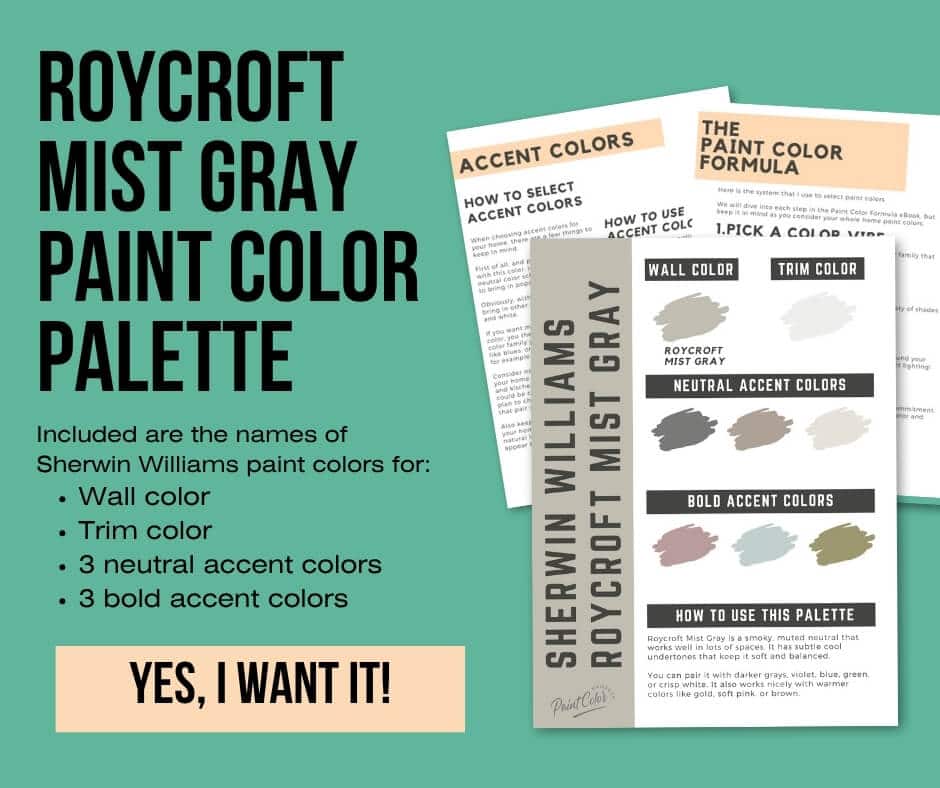
Roycroft Mist Gray Paint Color Palette
Want to use this paint color in your home? Instantly upgrade your home's aesthetic with our exclusive paint color palette. Unlock the perfect trim color and six stunning accent colors, a combination of neutrals and bold hues for an instantly harmonious space!
Get your perfect paint color palette by clicking here!
Click here to get a peel and stick sample of Roycroft Mist Gray
FAQs
Here are some frequently asked questions about Roycroft Mist Gray.
What color trim with SW Roycroft Mist Gray?
With its subtle cool undertones, Sherwin Williams Roycroft Mist Gray looks best with crisp white trim. I would reach for a clean white rather than a creamy one, since creamier trim can make this gray look cooler by comparison.
My favorite trim colors with Roycroft Mist Gray are Benjamin Moore Simply White, Sherwin Williams Extra White, and Behr Ultra Pure White.



What's the difference: SW Roycroft Mist Gray vs BM Thunder?
Roycroft Mist Gray and Benjamin Moore Thunder are similar gray paint colors. They both have a soft, muted look that works well if you want a gray that feels calm rather than stark.
Roycroft Mist Gray is slightly lighter and more saturated. Thunder is a bit darker and more muted, so it can feel softer and moodier on the wall.
These two are close enough that I would sample them side by side before choosing. Seeing them in your own light will make the better fit much easier to spot.

What's the difference: SW Roycroft Mist Gray vs Mindful Gray?
Roycroft Mist Gray and Mindful Gray are both great mid-toned gray paint colors. They can each bring a grounded neutral look to a room without feeling too dark.
Roycroft Mist Gray is slightly lighter, and Mindful Gray is a bit darker. I find that Mindful Gray can feel a touch heavier in rooms without much natural light.

Is Roycroft Mist Gray a good choice for exteriors?
Yes, Roycroft Mist Gray looks great as an exterior paint color.
As a mid-toned paint color, Roycroft Mist Gray appears as a light gray outside, since colors often look lighter in all of that natural light. This makes it an ideal choice for exteriors.
What colors go with Roycroft Mist Gray?
Roycroft Mist Gray is a neutral gray paint color, so it pairs well with many color families. I like it with deeper grays, muted violets, soft blues, greens, crisp whites, and warmer accents like gold, blush, and brown.
For a classic palette, I would pair Roycroft Mist Gray with Westchester Gray, Renwick Heather, Rain, or Sherwin Williams Extra White. Those colors give you a nice mix of depth, softness, and contrast.



Where to use Roycroft Mist Gray?
Roycroft Mist Gray is a great neutral for spaces with a good amount of natural light. I especially like it in south-facing rooms, where the light can soften the color and bring out its warmer greige side.
In north-facing rooms, Roycroft Mist Gray can look cooler and a bit deeper. For those spaces, I would compare it with a lighter gray before choosing.
This color looks especially good in historic homes. I love Roycroft Mist Gray for a living room, bedroom, kitchen, bathroom, hallway, mudroom, home exterior, or doors.
Before you go...
So, you've found the perfect paint color, but here's the thing — there's another big decision you have to make: picking the right paint sheen.
Seriously, the level of glossiness can totally change how your color looks on the walls and how long the paint lasts!
Check out our complete guide to understanding paint sheens.
Still unsure which paint color is right for your space?
Choosing paint doesn’t have to be stressful! My free Paint Color Planning Quick Start Guide walks you through the exact steps to confidently choose the perfect color — without the overwhelm, second-guessing, or endless swatch testing.
👉 Click here to download the free guide!
DIYing Your Paint Job? Start Here.
Choosing a paint color is only half the equation — the tools you use matter just as much. I’ve rounded up the painting supplies we rely on for clean lines, smooth finishes, and less frustration overall.

My Paint Color Formula course walks you through the painless process of expertly testing paint swatches to ensure you have the perfect color for your home.
The best way to sample paint? Samplize!
Get peel-and-stick removable and reusable paint samples here!
Thanks for reading!

Meg Hemmelgarn is a freelance writer and home decor + DIY blogger who loves to talk about paint colors. She and her husband are currently renovating their third fixer upper. You can see their projects on her blog, Green With Decor.