Looking for the perfect cool white paint color? Let's talk about Sherwin Williams Big Chill and see if it's the one for your home!
Cool neutral paint colors like whites and grays have been popular for years. They create a fresh canvas for any decor style — traditional, modern, farmhouse, or coastal.
Cool neutrals bring a sophisticated, calming vibe. They mix perfectly with other neutrals or bolder colors, depending on your vision.
Big Chill by Sherwin Williams is one such cool neutral. I personally love how this color balances white and gray. It's subtle but not stark, giving your space a sleek, modern feel.
So, if you're after a fresh, clean look that’s not too cold, Big Chill might be your perfect match!
Keep reading my review to see how it could work in your home.
Big Chill, Sherwin Williams, SW 7648
Big Chill is a cool white with a hint of gray. It's often called "stormy" because it looks like a neutral gray, making it a super versatile paint choice.
Click here to get a peel and stick sample of Big Chill
Color Family
Big Chill is in the white family.
Light Reflectance Value
62
The Light Reflective Value (LRV) measures how much light a color reflects. The scale goes from 0 (pure black) to 100 (pure white).
With an LRV of 62, Big Chill isn’t too light or too dark.
Its mid-level LRV means it performs well in different lighting conditions, unlike some lighter neutrals that can look washed out.
RGB Colors
R: 208 G: 206 B: 201
RGB tells you how much red, green, and blue are in the color, each on a scale from 0 to 255. This mix creates the exact shade you see.
Hex Code
#D0CEC9

Undertones
Big Chill is a white paint color with gray undertones, which often makes it appear gray. It also has a hint of blue.
In south-facing rooms with lots of natural light, Big Chill usually keeps its neutral gray look because of its mid-level LRV. But in extremely bright rooms, it might look a bit washed out.
In north-facing rooms with less natural light, Big Chill will look grayer, darker, and cooler. Here, you might notice its subtle blue undertones, giving it a slightly stormy appearance.
As Big Chill changes slightly depending on the light, it's a good idea to swatch it on your wall before going all in.
Click here to get removable peel & stick paint samples for easy swatching!
Best uses
Big Chill is great for:
- Living rooms
- Bedrooms
- Kitchens
- Bathrooms
- Home exterior
- Interior doors
- Cabinets
- Furniture
It's also neutral enough to work as a whole house paint color.
Similar Colors
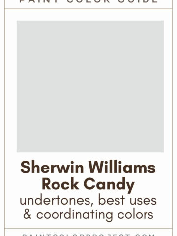
- Benjamin Moore Stonington Gray
- Benjamin Moore Moonshine
- Behr Gazebo Gray
- Sherwin Williams Touch of Grey
- Sherwin Williams On the Rocks
- Sherwin Williams Guild Grey
- Benjamin Moore Barren Plain
Click here to get a peel and stick sample of Big Chill
Coordinating Colors
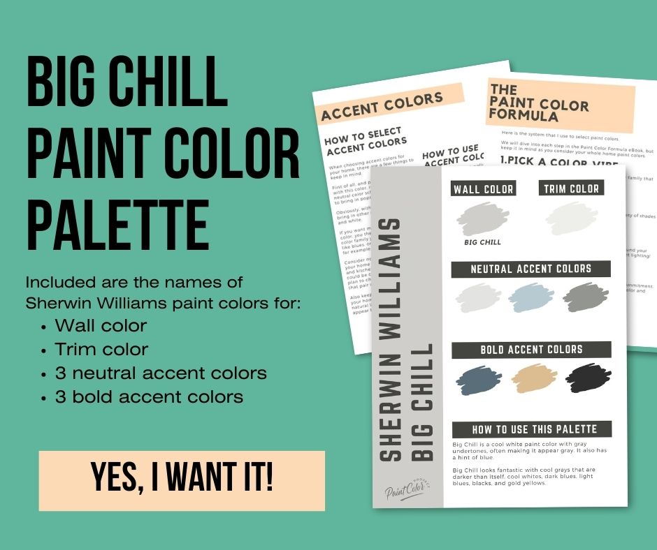
Big Chill looks fantastic with cool grays that are darker than itself, cool whites, dark blues, light blues, blacks, and gold yellows.
I’ve found that Big Chill doesn't pair well with warm neutrals like beiges, tans, or creams. The contrast just isn’t right.
From my experience, pairing Big Chill with cool tones really makes it pop and keeps the space feeling fresh and modern.
So, if you're looking to create a sleek and cohesive look, stick with those cooler shades.
Cool whites:
- Extra White
- Ceiling Bright White
- Ice Cube
- Rhinestone
- Nebulous White
Dark blues:
- Slate Tile
- Smoky Blue
- Granite Peak
- Gibraltar
- Distance
Gold yellows:
- Blonde
- Restrained Gold
- White Raisin
- Birdseye Maple
- Sequin
Trim Colors
Because of its cool nature, Big Chill looks best with bright white trim colors.
A crisp, white trim creates a clean, sharp contrast that makes the wall color stand out beautifully.
- Benjamin Moore Simply White
- Sherwin Williams Extra White
- Behr Ultra Pure White
Big Chill Paint Color Palette
Want to use this paint color in your home? Instantly upgrade your home's aesthetic with our exclusive paint color palette. Unlock the perfect trim color and six stunning accent colors, a combination of neutrals and bold hues for an instantly harmonious space!
Get your perfect paint color palette by clicking here!
Click here to get a peel and stick sample of Big Chill
FAQs
Here are some common questions about Big Chill:
What's the difference between SW Big Chill and On the Rocks?
Big Chill and On the Rocks are both cool white-gray paint colors with an LRV of 62, meaning they have the same color depth.
The main difference is that On the Rocks is slightly warmer, with a violet/green undertone, while Big Chill has a blue undertone, making it appear cooler.
I always find it helpful to swatch these colors in your space to see how the undertones play with your lighting.

Is SW Big Chill white or gray?
Sherwin Williams defines Big Chill as a cool white with gray undertones. On the wall, it often looks like a neutral gray.
In my experience, it’s a perfect balance if you want a color that’s not too white or too gray.
Swatching it in your room can help you see this balance better.
Does SW Big Chill look blue?
Big Chill doesn’t usually look blue. It’s a white paint color with strong gray undertones, so it mostly appears gray.
In north-facing rooms or spaces with less light, you might notice the subtle blue undertones more.
To really understand how it will look, try swatching it in different areas of your home.
What's the difference between SW Big Chill and BM Moonshine?
Big Chill and Moonshine are both white paint colors with strong gray undertones. They often look gray on the wall.
Moonshine is lighter, with an LRV of 67, compared to Big Chill’s LRV of 62. Moonshine is slightly warmer, while Big Chill is cooler.
Swatching them both can help you decide which suits your space better.

What's the difference between SW Big Chill and Agreeable Gray?
Big Chill and Agreeable Gray are both grayish, but they have some differences.
Big Chill is a white paint color with strong gray undertones, making it look neutral gray.
Agreeable Gray is a warm gray. Big Chill is cooler and slightly lighter with an LRV of 62, compared to Agreeable Gray’s LRV of 60.

What BM colors are similar to SW Big Chill?
While there are no exact matches between brands, Big Chill closely resembles BM Stonington Gray and BM Moonshine.
I’ve found that swatching these colors in your space ensures you pick the perfect shade for your home.
Before you go...
So, you've found the perfect paint color, but here's the thing - there's another big decision you have to make: picking the right paint sheen. Seriously, the level of glossiness can totally change how your color looks on the walls and how long the paint lasts!
Check out our complete guide to understanding paint sheens.
Still unsure which paint color is right for your space?
Choosing paint doesn’t have to be stressful! My free Paint Color Planning Quick Start Guide walks you through the exact steps to confidently choose the perfect color — without the overwhelm, second-guessing, or endless swatch testing.
👉 Click here to download the free guide!

My Paint Color Formula course walks you through the painless process of expertly testing paint swatches to ensure you have the perfect color for your home.
The best way to sample paint? Samplize!
Get peel-and-stick removable and reusable paint samples here!
Thanks for reading!

Meg Hemmelgarn is a freelance writer and home decor + DIY blogger who loves to talk about paint colors. She and her husband are currently renovating their third fixer upper. You can see their projects on her blog, Green With Decor.