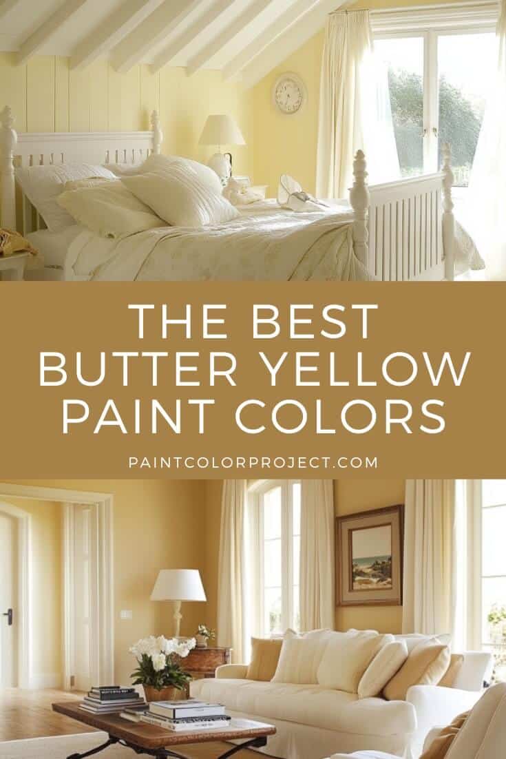
Butter yellow paint colors are back! These soft, creamy shades feel warm, cheerful, and are perfect for kitchens, bathrooms, and cozy accent pieces.
You might get flashbacks to a Martha Stewart kitchen from the 1990s, but butter yellow is showing up in modern spaces too, and it works. It’s soft, warm, and a little nostalgic in the best way.
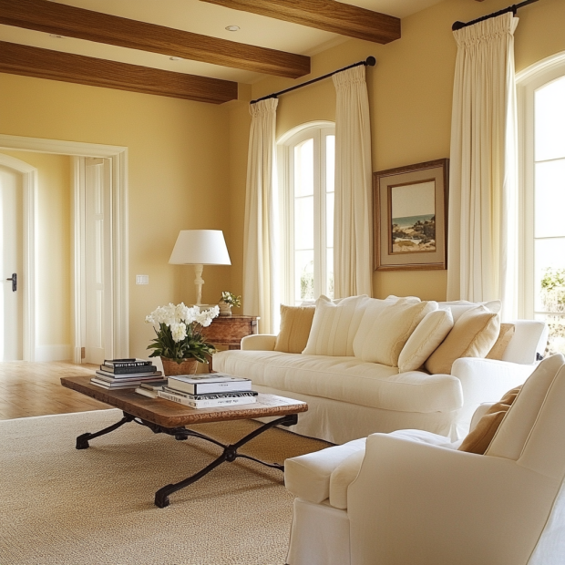
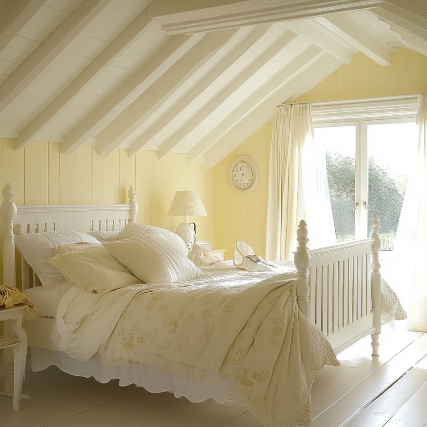
This warm, soft yellow adds color without feeling loud or overwhelming. It’s happy and cozy, not highlighter bright.
It works beautifully in kitchens, bathrooms, mudrooms, or even as a fun front door or accent wall.
Why Choose Butter Yellow Paint Colors?
- It feels warm and welcoming without being too bold
- It goes with so much: whites, creams, wood tones, and even soft blues or greens.
- It brings vintage charm that somehow feels fresh again in 2025.
What to Know Before You Pick a Butter Yellow
- Light makes a big difference. In bright rooms, it’ll look sunnier. In darker corners, it softens into more of a creamy yellow
- Use the right finish. I like eggshell or satin. They add a soft glow without looking too shiny
- Always sample first. Yellow can be tricky. I’ve had shades look totally different on the wall than they did on the swatch. Peel-and-stick samples save a lot of regret
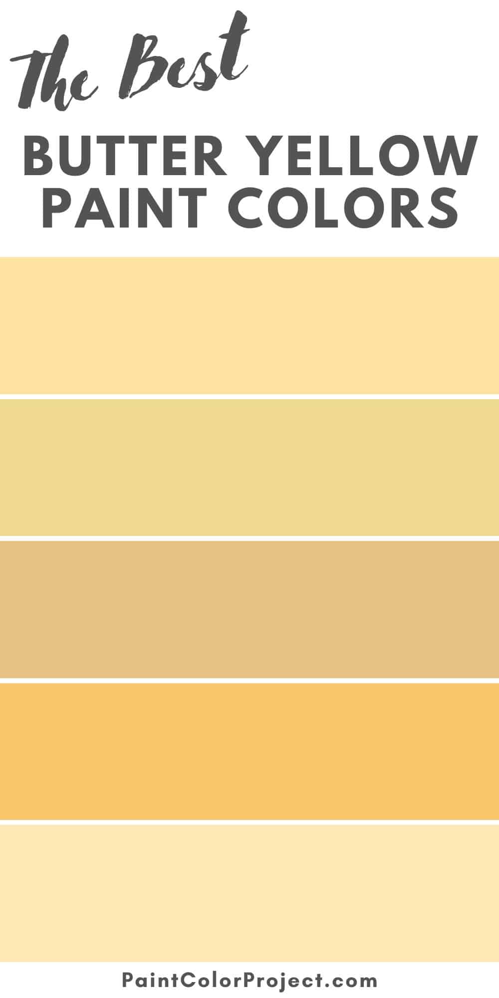
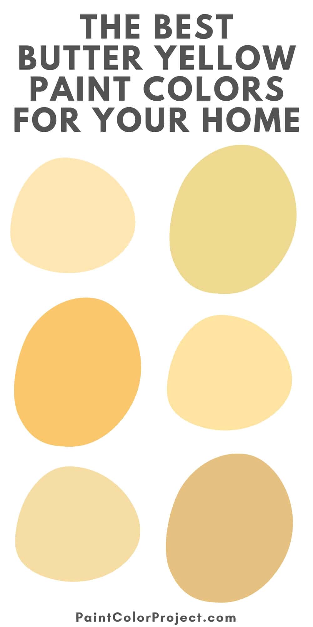
My Favorite Butter Yellow Paint Colors
Here are a few of my go-to butter yellows. These shades are soft, warm, and so easy to live with.
1. Hawthorne Yellow – Benjamin Moore
Hawthorne Yellow is soft and sunny without being too bold. It has just enough warmth to feel cozy, especially in the morning light. I love it in traditional spaces or anywhere you want that gentle, golden glow.
It leans buttery, not lemony, and looks amazing with crisp white trim.

2. Pineapple Cream – Behr
Pineapple Cream has a cozy, vintage feel to it. It’s creamy and warm, which makes it great for kitchens, bathrooms, or even a laundry room. In dim lighting, it shifts a little golden but still feels soft.

3. Dayroom Yellow – Farrow & Ball
A pale, elegant yellow with a warm, buttery undertone. Dayroom Yellow feels refined and calming, perfect for older homes or spaces with lots of trim details.
What I really like is how it shifts throughout the day. Bright and airy when the sun’s out, then warm and calm when it’s cloudy or evening.

4. Sundance – Sherwin-Williams
Sundance is bright, happy, and has a soft golden glow that makes any space feel more alive.
It’s a bit stronger than the others on this list, so I like it as an accent rather than a whole-room color. Think playroom walls, breakfast nooks, or even a back door that catches the sun.

5. Morning Sunshine – Benjamin Moore
Morning Sunshine is soft and buttery, leaning into a warm pastel tone. It’s perfect for spaces like a nursery, a cozy bathroom, or a bright mudroom.
It has a clean, smooth look that doesn’t feel too creamy or faded.

6. Vanilla Ice Cream – Behr
If you just want a hint of yellow, this one’s a winner. Vanilla Ice Cream is a super soft mix of yellow and cream. It almost fades into the background, but still gives the room a warm glow.
In bright light, it feels sunny. In darker spaces, it leans more like a cozy off-white.

7. Friendly Yellow – Sherwin-Williams
A true buttery yellow with classic cottagecore energy, Friendly Yellow is warm, cheerful, and full of charm. I love it in kitchens or on a front door that needs a little personality. If you want something nostalgic that still feels fresh, this is it.

8. Lemon Soufflé – Benjamin Moore
Lemon Soufflé is soft and creamy with just the right amount of yellow.
It leans a little pastel, but still reads as yellow — especially when you pair it with white trim or tile. I love this one for bathrooms or cozy breakfast areas.

9. Charismatic – Behr
Charismatic is the boldest yellow on this list. It’s richer and deeper than the others, with strong golden undertones that make a statement.
I like it best on accent walls or cabinetry when you really want to embrace the yellow. Pair it with warm woods or matte black for a more modern look.


Final Thoughts on Butter Yellow
Butter yellow might give you flashbacks to your grandma’s kitchen, but in the best way possible.
It’s warm, happy, and instantly makes a room feel more inviting. If you want to add some color without going bold, butter yellow is a great middle ground. It’s soft, subtle, and still full of personality.
Need More Help?
Take a look at The No-Fail Paint Color Jumpstart. It’s a simple way to feel more confident choosing paint without all the second-guessing.
Still unsure which paint color is right for your space?
Choosing paint doesn’t have to be stressful! My free Paint Color Planning Quick Start Guide walks you through the exact steps to confidently choose the perfect color — without the overwhelm, second-guessing, or endless swatch testing.
👉 Click here to download the free guide!

My Paint Color Formula course walks you through the painless process of expertly testing paint swatches to ensure you have the perfect color for your home.
The best way to sample paint? Samplize!
Get peel-and-stick removable and reusable paint samples here!
Thanks for reading!

Morgan is passionate about home decor and paint colors. She has been sharing DIY home decor tips since 2012 at CharlestonCrafted.com. From there, she learned to love paint colors, and the Paint Color Project was born in 2022!