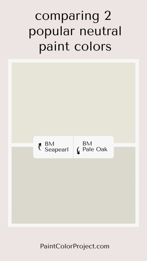
Trying to find the perfect warm neutral paint color for your home? I’ve got you covered. Today, we’re comparing two favorites: Seapearl vs Pale Oak.
Both of these shades are known for their warm, inviting vibes. If you want a space that feels cozy without being too stark or cold, you’re in the right place.
Warm-toned neutrals are popular for a reason. They work in almost any room and pair easily with different decor styles. Plus, they give your space that versatile, timeless look.
So today I'm comparing two super popular shades of warm neutral paint – Seapearl and Pale Oak by Benjamin Moore.
Let's see which one wins for your space.
Read my full review of Seapearl
Read my full review of Pale Oak
Seapearl vs Pale Oak
Seapearl and Pale Oak are both warm neutral paint colors that can work in almost any room.
eapearl leans more toward an off-white, giving your space a fresh, clean look.
Pale Oak, on the other hand, is a warm greige, perfect if you want a little more depth while still keeping things neutral.
What’s Similar Between Seapearl and Pale Oak?
Seapearl and Pale Oak are both warm-leaning neutrals.
They both have warm yellow undertones, which gives them that inviting warmth. But as you’ll see, they also have some unique undertones that set them apart!
Both shades are neutral enough that you could easily use them as a whole-house color.
Just keep in mind that lighting can really change how these colors look on your walls. Always swatch them in each room before making a final decision!
What’s Different Between Seapearl and Pale Oak?
The biggest difference? Seapearl is much lighter and brighter than Pale Oak.
Seapearl falls in the off-white category, while Pale Oak is more of a warm gray or greige.
While both have those warm yellow undertones, Seapearl also brings in some cool gray undertones that balance it out.
Pale Oak stays on the warmer side, thanks to its purely warm yellow base.
| Seapearl | Pale Oak | |
| LRV | 76 | 69 |
| RGB | R: 231 G: 228 B: 217 | R: 222 G: 216 B: 205 |
| Undertones | cool gray and warm yellow undertones, subtle green | warm yellow undertones, subtle pink / purple |
Light Reflectance Value (LRV)
Light Reflectance Value (LRV) measures how much light a color reflects, on a scale from 0 to 100. A score of 0 means pure black, and 100 means pure white.
Seapearl has an LRV of 76, making it lighter and brighter than Pale Oak, which has an LRV of 69.
Because of these numbers, Seapearl is classified as an off-white, while Pale Oak falls into the greige category.


Undertones
Even though both Pale Oak and Seapearl have warm yellow undertones, they show up differently depending on the light.
Pale Oak is interesting because it mixes cool gray and warm yellow undertones. In a bright, south-facing room with plenty of natural light, it tends to look like a creamy off-white.
But put Pale Oak in a north-facing room with less light, and things change. It can look a bit darker and lean more toward gray. Sometimes, you might even catch a hint of pink or purple undertones in those spaces.
Seapearl works in a similar way but with its own twist. In a south-facing room, it leans warm and feels more creamy, almost beige. That natural light really brings out its cozy side.
In a north-facing room, Seapearl shifts cooler, picking up some gray. And if you look closely, you might notice a very subtle green undertone sneaking in.
I’ve seen these changes firsthand in different spaces, so trust me when I say lighting can totally change how these colors look. That’s why it’s super important to swatch paint on your walls before committing.
Click here to get peel-and-stick samples that you can try out without the mess!
How Do You Choose Between Seapearl vs Pale Oak?
Deciding between Seapearl and Pale Oak comes down to the vibe you want for your space.
Seapearl is perfect if you’re looking for something light and bright. It’s warm but not overly so, making it a great option for a soft, welcoming feel without things getting too yellow.
Pale Oak is your pick if you want a warm greige with more depth. It’s a cozy, sophisticated mix of gray and beige, perfect for neutrals with a bit of richness.
One thing to consider—Seapearl can have a subtle green undertone, especially in certain lighting. So if that’s not your style, Pale Oak is a safer bet.
On the flip side, Pale Oak can show hints of pink or purple in darker rooms. If you want to avoid those, Seapearl may be the better choice.
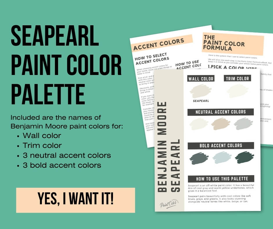
Seapearl Paint Paint Color Palette
Want to use this paint color in your home? Instantly upgrade your home's aesthetic with our exclusive paint color palette. Unlock the perfect trim color and six stunning accent colors, a combination of neutrals and bold hues for an instantly harmonious space!
Get your perfect paint color palette by clicking here!
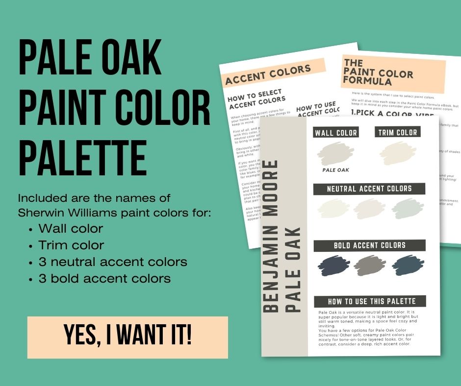
Benjamin Moore Pale Oak Paint Color Palette
Want to use this paint color in your home? Instantly upgrade your home's aesthetic with our exclusive paint color palette. Unlock the perfect trim color and six stunning accent colors, a combination of neutrals and bold hues for an instantly harmonious space!
Get your perfect paint color palette by clicking here!
Still unsure which paint color is right for your space?
Choosing paint doesn’t have to be stressful! My free Paint Color Planning Quick Start Guide walks you through the exact steps to confidently choose the perfect color — without the overwhelm, second-guessing, or endless swatch testing.
👉 Click here to download the free guide!

My Paint Color Formula course walks you through the painless process of expertly testing paint swatches to ensure you have the perfect color for your home.
The best way to sample paint? Samplize!
Get peel-and-stick removable and reusable paint samples here!
Thanks for reading!

Meg Hemmelgarn is a freelance writer and home decor + DIY blogger who loves to talk about paint colors. She and her husband are currently renovating their third fixer upper. You can see their projects on her blog, Green With Decor.