Thinking about using alpine oat paint colors in your home? This post shares my favorite shades and tips for choosing the right one.
Alpine oat might sound like a breakfast bar, but it’s actually one of the coziest paint color trends out there.
I’ve been seeing it everywhere lately, from design magazines to Pinterest boards, and it’s easy to see why.
This soft neutral falls somewhere between cream, oatmeal, and light beige.
It doesn’t have the yellow tint of old-school tan, and it feels warmer than your typical gray.
It’s the kind of color that makes a room feel calm and inviting without trying too hard.
If you’re into natural textures, soft lighting, and earthy tones, alpine oat might be just what your walls need.
Why I Love Alpine Oat Paint Colors
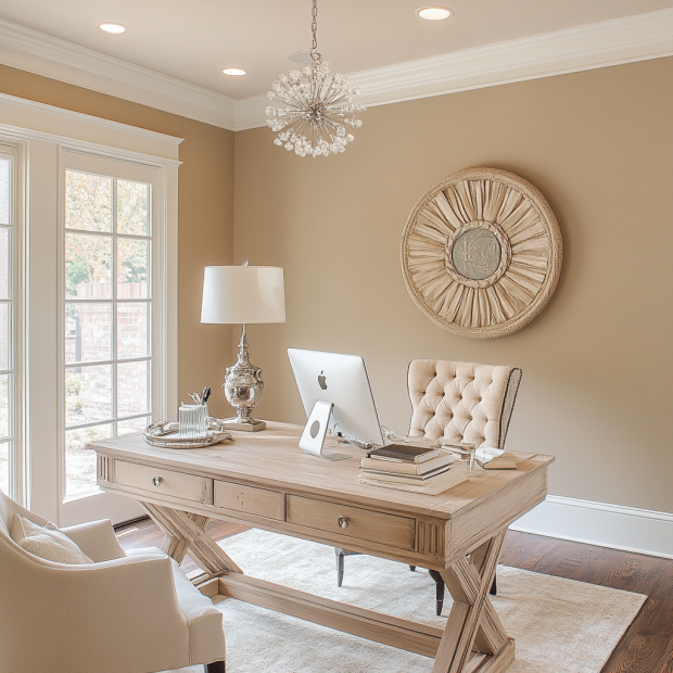
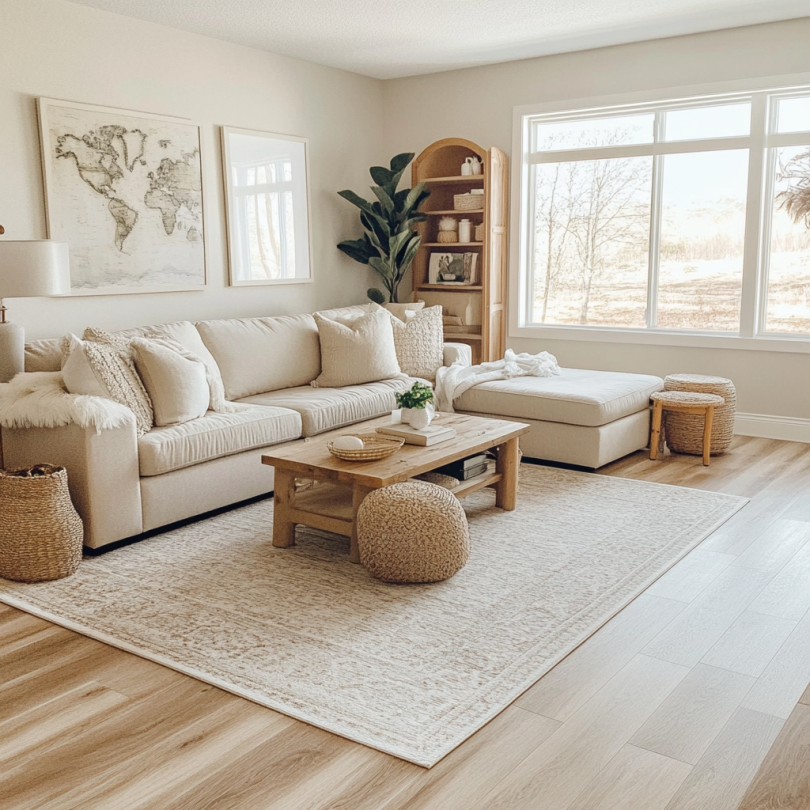
Alpine oat colors are easy to love. They’re warm, soft, and light. They make a room feel calm without being boring. That’s why I keep going back to them.
Also, they work in every room. I’ve used them in bedrooms, hallways, even kitchens. They always look good, no matter the space or style.
And these colors also pair well with almost everything: wood furniture, black hardware, brass lights, or soft, cozy fabrics. They’re simple but never plain.
What to Know Before You Pick an Alpine Oat Paint Color
Not every alpine oat color looks the same. Some lean a little pink or peach. Others are more beige or even a bit gray. It depends on the brand and the light in your home.
Sunlight brings out the warmth. In a darker room, the color might look more muted. I always test a few samples first and check them throughout the day.
Also, the paint finish can change how the color feels. I usually go with matte or eggshell. Those finishes keep it soft and natural. Glossy finishes can look too shiny or cold.
Take your time picking the right shade. When it’s a good fit, you’ll know.

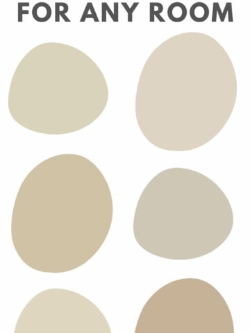
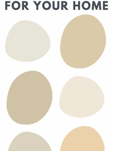
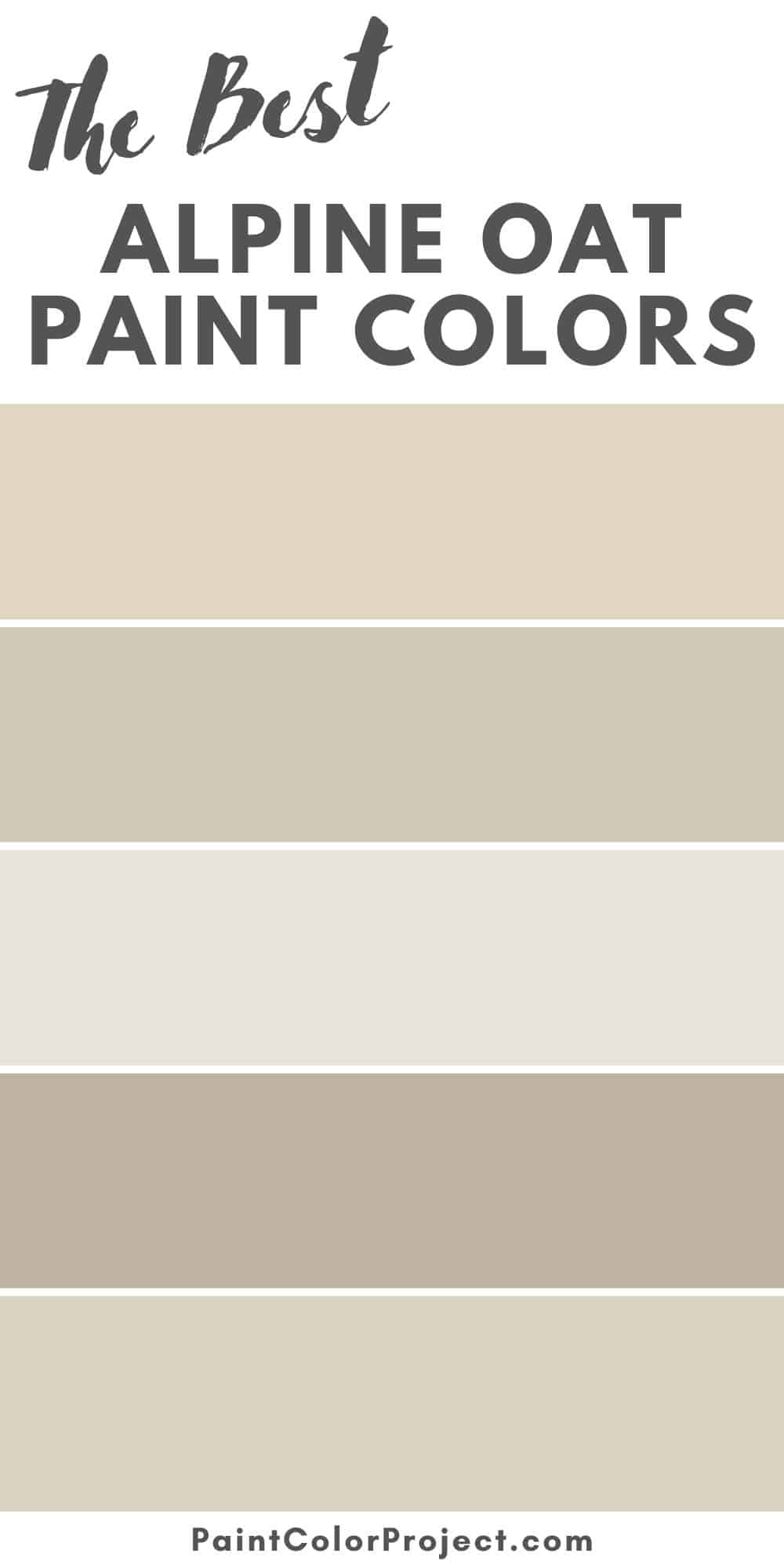
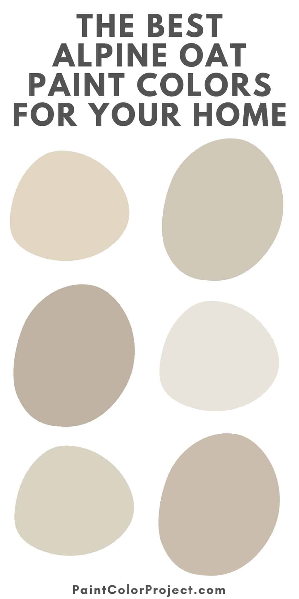
My Favorite Alpine Oat Paint Colors
Here are my top picks for alpine oat paint colors for your home!
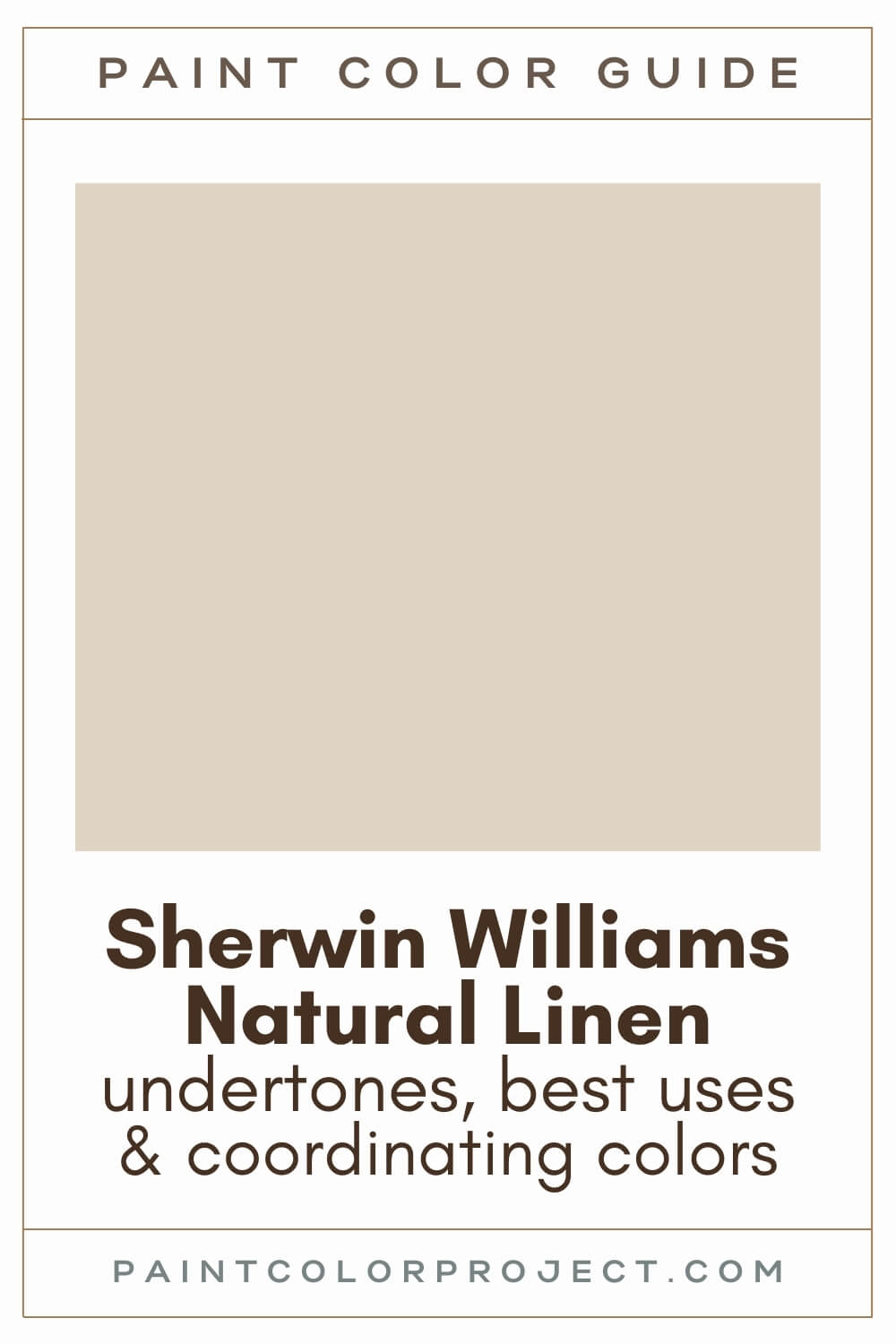
Natural Linen – Sherwin-Williams
Creamy, light, and soft. It doesn’t lean too yellow or pink, which makes it great for whole-house use. I like it in hallways and cozy bedrooms.

Muslin – Benjamin Moore
A timeless beige with a creamy undertone. It feels warm but never too peachy. Try it in living rooms or guest rooms for a neutral base that still has personality.

Creamy Mushroom – Behr
Earthy and soft with just the right mix of gray and beige. This one works really well if you want your space to feel grounded but still bright.

Edgecomb Gray – Benjamin Moore
Not too cool, not too warm. Edgecomb Gray is the perfect middle ground between greige and oat. It’s a solid choice for open floor plans.

Accessible Beige – Sherwin-Williams
Accessible Beige reads as oat in good lighting. It has just enough gray to balance the warmth, and it looks amazing with wood tones and black metal accents.

Smoky White – Behr
A very pale oat color. Smoky White is almost white in some lights but still brings warmth to a space. I’ve used it on trim and even ceilings when I wanted something softer than stark white.

Canvas Tan – Sherwin-Williams
More grounded and slightly deeper than the others. Canvas Tan has a classic, clean look that works beautifully in traditional homes or farmhouse-style spaces.

Feather Down – Benjamin Moore
A dreamy oat-gray that fades into the background in the best way. Feather Down works especially well in rooms with lots of natural light.

Oat Milk – Sherwin-Williams
Oat Milk is warm, creamy, and soft. It’s perfect for cabinets, bedrooms, or kitchens where you want a welcoming, sunlit vibe.

Balanced Beige – Sherwin-Williams
A richer, slightly deeper neutral with plenty of warmth. I like using Balanced Beige in cozy rooms where you want more contrast but still want that alpine oat feel.

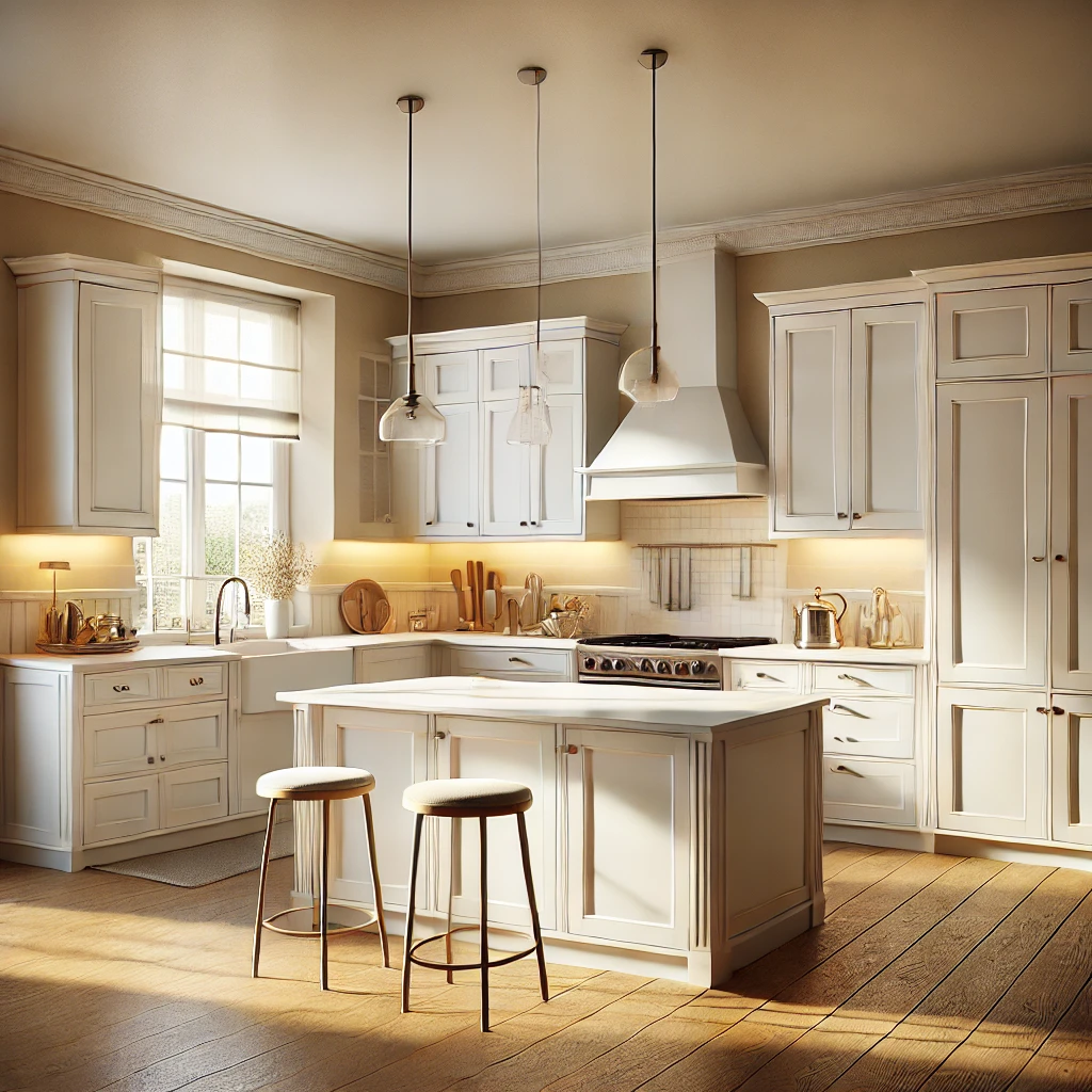
Trim and Ceiling Color Pairings
If you’re using an alpine oat paint on your walls, picking the right trim and ceiling color will really pull the room together.
I usually stick with warm whites for trim. Something like Benjamin Moore White Dove or Sherwin-Williams Alabaster works beautifully.
They’re soft, creamy whites that don’t feel too sharp next to the warmth of alpine oat. If you go too cool or bright, the contrast can feel a bit harsh.
For ceilings, you can use the same warm white to keep things seamless. Or, if you want a softer look, try going just a shade lighter than your wall color. It gives the room a quiet, cozy feel without looking too uniform.
And yes, you can use alpine oat on trim or cabinets too, especially if you’re going for a tone-on-tone look. Just be sure to choose a satin or semi-gloss finish to help it stand out from matte walls.
Final Thoughts on Alpine Oat
If you want a color that’s soft, natural, and easy to live with, alpine oat paint is a great choice.
It adds warmth without overpowering your space. It feels fresh but timeless.
You can use it all over or just in one special room. Either way, it brings that quiet, cozy elegance that makes a house feel like home.
Need More Help?
Check out The No-Fail Paint Color Jumpstart—it’s the shortcut to confidently choosing the right paint color for your home, with way less second-guessing.
Still unsure which paint color is right for your space?
Choosing paint doesn’t have to be stressful! My free Paint Color Planning Quick Start Guide walks you through the exact steps to confidently choose the perfect color — without the overwhelm, second-guessing, or endless swatch testing.
👉 Click here to download the free guide!

My Paint Color Formula course walks you through the painless process of expertly testing paint swatches to ensure you have the perfect color for your home.
The best way to sample paint? Samplize!
Get peel-and-stick removable and reusable paint samples here!
Thanks for reading!

Morgan is passionate about home decor and paint colors. She has been sharing DIY home decor tips since 2012 at CharlestonCrafted.com. From there, she learned to love paint colors, and the Paint Color Project was born in 2022!