Searching for a moody gray paint color that still feels soft enough for everyday life? Let’s talk through Benjamin Moore Stormy Monday and whether it could be a good fit for your home.
Picking a neutral paint color can feel harder than it should. You want a color that feels classic, easy to decorate with, and calm, but you probably still want a little depth and interest on the walls.
That is where a medium moody gray can be such a smart choice. It can ground a room, add a cozy feeling, and still work with a lot of different furniture, finishes, and accent colors.
If you are drawn to a gray that feels modern without looking cold or flat, Stormy Monday is one I would definitely sample. It has enough body to feel intentional, but it is still neutral enough to use in many spaces.
There is a lot to like here, from the way it shifts in natural light to how easily it pairs with whites, blues, greens, and deeper accent colors.
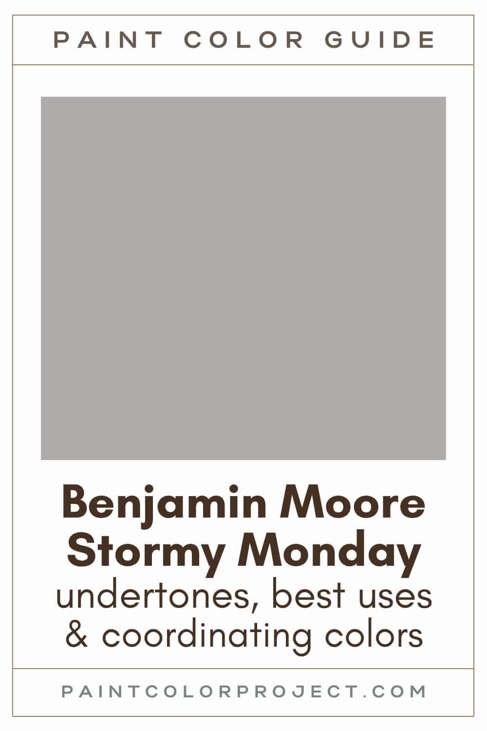
Stormy Monday, Benjamin Moore, 2112-50
Stormy Monday is a moody medium gray with a stormy, softened look. I like it for rooms where you want depth on the walls, but you still want the space to feel calm and livable.
Click here to get a peel and stick sample of Stormy Monday
Color Family
Stormy Monday is in the neutral family.
Light Reflectance Value
41
LRV tells you how light or dark a paint color will feel once it is on the wall. The scale runs from 0 to 100. A color at 0 would read as pure black, and a color at 100 would read as pure white.
With an LRV of 41, Stormy Monday is right in the middle. It’s not too light, but it won’t turn your room into a cave either, especially if you’ve got decent natural light.
RGB Colors
R: 174 G: 171 B: 170
RGB values show the mix of red, green, and blue used to create a color. Each number sits on a 0 to 255 scale.
Stormy Monday’s RGB mix is very close across all three channels, which is why it reads as a true gray at first glance. The slightly higher red value gives it a touch of warmth, but not enough to make it feel beige.
Hex Code
#AEABAA

Undertones
Stormy Monday is a moody gray with violet undertones.
In bright south-facing rooms, Stormy Monday can look warmer, softer, and a bit more greige. The natural light pulls out its warmer side and keeps it from feeling too cool.
In darker north-facing rooms, Stormy Monday usually looks cooler and a little more serious. This is where you are more likely to see its violet undertone come through, especially next to creamy whites, warm woods, or beige finishes.
This I why I always say you should swatch colors on your wall to make sure they look good before committing.
Click here to get removable peel & stick paint samples to easily swatch with!
Best Uses
Personally, I wouldn’t use Stormy Monday as a whole house paint color unless your home gets tons of sunlight. But in the right room, it’s stunning.
Stormy Monday is a great choice for:
- Living rooms with big windows
- Bedrooms where you want a cozy but not dark vibe
- Kitchens, especially with white or wood cabinets
- Exteriors—it’s gorgeous on siding with white trim
- Furniture for a soft, modern look without going too bold
Similar Colors
- Benjamin Moore Silver Dollar
- Behr Soft Pebble
- Sherwin Williams Ellie Gray
- Benjamin Moore Baltic Gray
- Behr Sparrow
- Sherwin Williams Proper Gray
- Benjamin Moore Nightingale
Click here to get a peel and stick sample of Stormy Monday
🤯 Too many color choices?
Download my free Paint Color Planning Quick Start Guide — it’s the exact method I use to help readers choose a color that works the first time.
📥 Grab it here!
Coordinating Colors
This moody gray plays nicely with others. I like to pair Stormy Monday with deep neutrals (blacks / grays), cool whites, soft blues, sage greens, or even dusty pinks.
Deep colors that balance black / gray / blue:
- Deep Space
- Temptation
- Westcott Navy
- French Beret
- Gray
Cool whites:
- Super White
- White Christmas
- Frostine
- Oxford White
- White Ice
Refreshing blues:
- Buxton Blue
- Colorado Gray
- Ocean City Blue
- Cape Blue
- Exhale
Trim Colors
Stormy Monday pairs best with bright white trim. A cleaner white helps the gray look fresh and keeps the violet undertone from feeling muddy.
- Benjamin Moore Simply White
- Sherwin Williams Extra White
- Behr Ultra Pure White
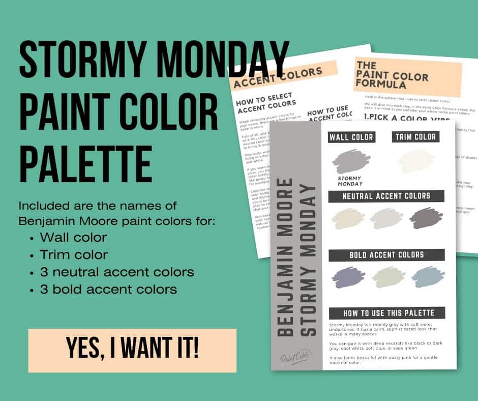
Stormy Monday Paint Color Palette
Want to use this paint color in your home? Instantly upgrade your home's aesthetic with our exclusive paint color palette. Unlock the perfect trim color and six stunning accent colors, a combination of neutrals and bold hues for an instantly harmonious space!
Get your perfect paint color palette by clicking here!
Click here to get a peel and stick sample of Stormy Monday
FAQs
Here are some common frequently asked questions about Stormy Monday.
What are the undertones for BM Stormy Monday?
The undertones for BM Stormy Monday are violet. This moody gray will lean more greige in brighter spaces and more gray (with glimpses of violet) in darker spaces.
Does Stormy Monday look violet?
Stormy Monday is a moody gray. It will not look violet
However, you may catch glimpses of its violet undertones in certain lighting, especially in darker, cooler spaces, such as north-facing rooms or interior rooms.
What color trim with BM Stormy Monday?
Stormy Monday looks best with bright white trim. My favorite trim colors with it are Benjamin Moore Simply White, Sherwin Williams Extra White, and Behr Ultra Pure White.
A cleaner white trim helps Stormy Monday feel fresh and crisp. If your trim is more creamy or yellow, test the pairing in your room first so you can see how the undertones work together.



What's the difference: BM Silver Dollar vs Stormy Monday?
Silver Dollar and Stormy Monday are similar mid-toned, moody grays.
Silver Dollar is slightly lighter and more silvery. Stormy Monday is a bit darker and more violet.
If you’re torn between the two, try swatching them side by side to see which one feels right in your space.

What is the hex color code for BM Stormy Monday?
The hex color code for Benjamin Moore Stormy Monday is #AEABAA.
This is helpful if you are working on a digital design project, mood board, or room plan and want a close visual match to the paint color.
What's the difference: BM Stormy Monday vs Agreeable Gray?
While these two are both grays, they're different colors.
Stormy Monday (LRV 41) is darker and more violet. It's more of a true gray. Agreeable Gray (LRV 60) is lighter and more yellow / orange. It's more of a greige.
Agreeable Gray is a very popular paint color, but that does not automatically make it the better choice. If you want a deeper, cooler gray, Stormy Monday may be the better fit, but I would swatch both colors in your home before deciding.

Before you go...
So, you've found the perfect paint color, but here's the thing — there's another big decision you have to make: picking the right paint sheen.
Seriously, the level of glossiness can totally change how your color looks on the walls and how long the paint lasts!
Check out our complete guide to understanding paint sheens.
Still unsure which paint color is right for your space?
Choosing paint doesn’t have to be stressful! My free Paint Color Planning Quick Start Guide walks you through the exact steps to confidently choose the perfect color — without the overwhelm, second-guessing, or endless swatch testing.
👉 Click here to download the free guide!
DIYing Your Paint Job? Start Here.
Choosing a paint color is only half the equation — the tools you use matter just as much. I’ve rounded up the painting supplies we rely on for clean lines, smooth finishes, and less frustration overall.

My Paint Color Formula course walks you through the painless process of expertly testing paint swatches to ensure you have the perfect color for your home.
The best way to sample paint? Samplize!
Get peel-and-stick removable and reusable paint samples here!
Thanks for reading!

Meg Hemmelgarn is a freelance writer and home decor + DIY blogger who loves to talk about paint colors. She and her husband are currently renovating their third fixer upper. You can see their projects on her blog, Green With Decor.