Looking for the perfect deep olive green paint color for your home? Let’s talk about Sherwin Williams Roycroft Bronze Green and see if it might be a good fit for your space.
A deep olive green can feel classic, grounded, and fresh at the same time. I love colors like this since they bring in color without feeling loud or trendy.
Dark greens have a neutral quality, yet they still make a room feel intentional. They can bring warmth, depth, and character to a space in a way that plain gray or beige often cannot.
Roycroft Bronze Green is one of these such hues. You can lean into the drama and pair it with other rich shades, or you can soften it with neutrals and warm woods. There's a lot you can do with a green like this.
So let’s take a closer look at Sherwin Williams Roycroft Bronze Green and see if it might be the perfect olive green for your space.
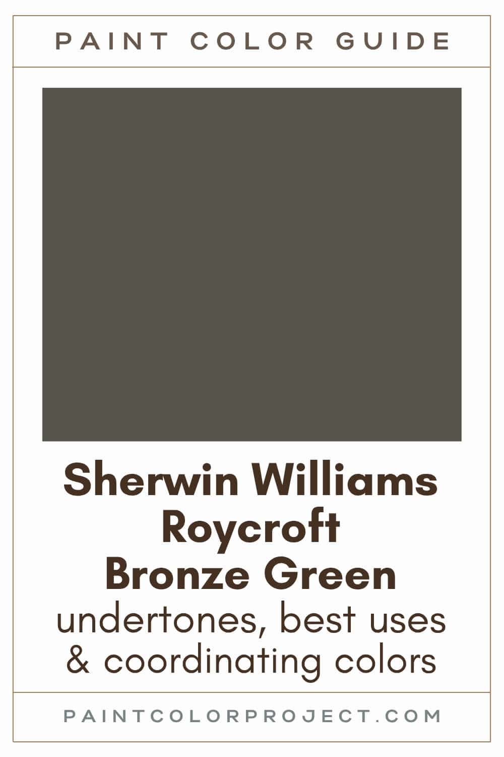
Roycroft Bronze Green, Sherwin Williams, SW 2846
Roycroft Bronze Green is a deep olive green with bronze undertones. This dark hue looks stunning with warm wood and brass finishes.
Click here to get a peel and stick sample of Roycroft Bronze Green
Color Family
Roycroft Bronze Green is in the green family.
Light Reflectance Value
9
Light Reflectance Value measures how much light a paint color reflects. The scale runs from 0 to 100, with 0 being pure black and 100 being pure white.
With an LRV of 9, Roycroft Bronze Green is a very dark paint color. It is not going to bounce much light around a room.
Instead, it creates a cozy, intimate, moody feel. I would use it in a room where you want depth and atmosphere rather than brightness.
RGB Colors
R: 87 G: 84 B: 73
RGB tells you how much red, green, and blue are present in a paint color. Each value is measured on a scale from 0 to 255.
This mix shows why Roycroft Bronze Green feels so muted. The red, green, and blue values are close together, which gives the color its softened, grayed-down look.
Hex Code
#575449

Undertones
Roycroft Bronze Green has bronze and gray undertones.
The bronze undertone gives it warmth and keeps it from feeling like a flat, cold green. The gray undertone softens it and makes it feel more refined.
In south-facing rooms with strong natural light, Roycroft Bronze Green can look warmer, browner, and more bronze. I think this is where you may notice its olive character most.
In north-facing rooms or darker spaces, it can read cooler, deeper, and more gray. It may look closer to a deep green-gray in lower light.
This is why I would not choose this color from a small paper chip alone. Dark colors can shift a lot once they cover a full wall.
Paint a large sample or use a peel and stick sample, then check it in the morning, afternoon, and evening. Roycroft Bronze Green is beautiful, but you really want to see how that bronze undertone behaves in your own light.
Click here to get removable peel & stick paint samples to easily swatch with!
Best Uses
I love Roycroft Bronze Green for spaces where you want a cozy, collected, slightly historic feel. It has that old-home richness, but it can still work beautifully in a newer home with the right styling.
Here are some of my favorite ways to use Roycroft Bronze Green:
- Exterior accents: Perfect for siding, shutters, doors, or even a fence. It gives such a timeless, nature-inspired look.
- Bedrooms, living rooms, or dens: Use it on an accent wall or go all in for a warm and sophisticated space.
- Fireplace surrounds: A gorgeous, dramatic statement.
- Built-in shelving: Instantly makes any built-in feel custom and high-end.
- Interior or exterior doors: A great way to add character without overwhelming a space
Similar Colors
- Sherwin Williams Thunder Gray
- Benjamin Moore Dakota Woods Green
- Behr Black Bean
- Sherwin Williams Nocturne
- Benjamin Moore Aegean Olive
- Behr Gladiator Gray
- Sherwin Williams Garden Gate
Click here to get a peel and stick sample of Roycroft Bronze Green
🤯 Too many color choices?
Download my free Paint Color Planning Quick Start Guide — it’s the exact method I use to help readers choose a color that works the first time.
📥 Grab it here!
Coordinating Colors
Roycroft Bronze Green is very easy to work with.
It pairs nicely with deep reds, muddy oranges, grays (cool or neutral), browns, tans, beiges, sunny yellows, blues (light or dark), and crisp whites.
Deep, rich reds:
- Roycroft Copper Red
- Fireweed
- Crabby Apple
- Rustic Red
- Fired Brick
Mid to dark grays (cool or neutral):
- Summit Gray
- Gray Shingle
- Pewter Cast
- Bedrock
- Tin Lizzle
Sunny yellows:
- Lemon Chiffon
- Full Moon
- Friendly Yellow
- Lily
- They call it Mellow
Trim Colors
For trim, I prefer bright whites against rich, dark shades like Roycroft Bronze Green. The contrast really makes both colors look their best.
- Benjamin Moore Simply White
- Sherwin Williams Extra White
- Behr Ultra Pure White
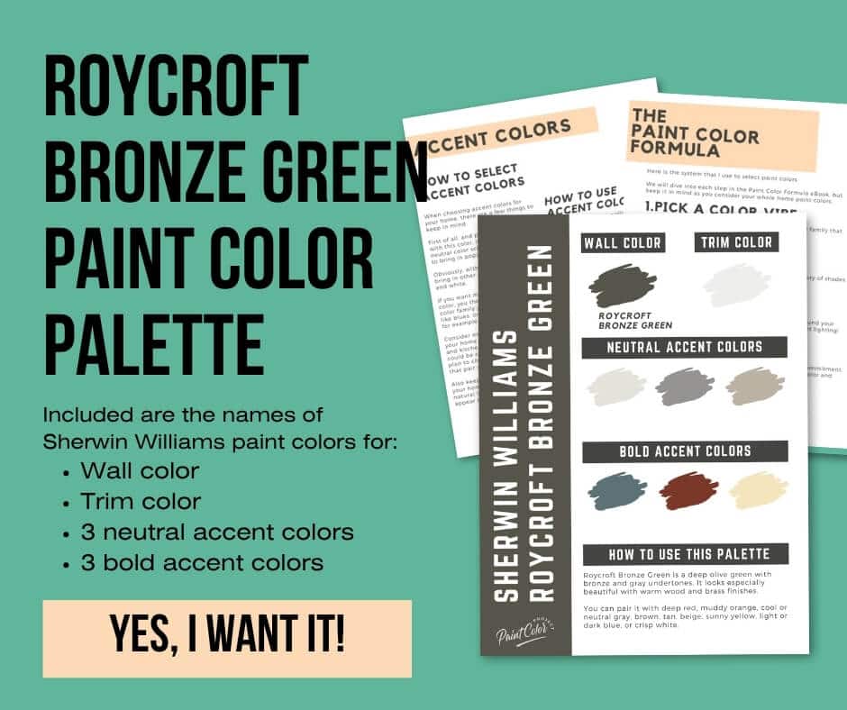
Roycroft Bronze Green Paint Color Palette
Want to use this paint color in your home? Instantly upgrade your home's aesthetic with our exclusive paint color palette. Unlock the perfect trim color and six stunning accent colors, a combination of neutrals and bold hues for an instantly harmonious space!
Get your perfect paint color palette by clicking here!
Click here to get a peel and stick sample of Roycroft Bronze Green
FAQs
Here are some common frequently asked questions about Roycroft Bronze Green.
Is Roycroft Bronze Green warm or cool?
Roycroft Bronze Green is a warm paint color. It's a deep olive green with bronze and gray undertones.
What colors go well with Roycroft Bronze Green?
As a deep green, Roycroft Bronze Green pairs beautifully with many other colors.
I love it with Roycroft Copper Red (a deep red), Summit Gray (a cool gray), and Lemon Chiffon (a sunny yellow).
If you're looking for more options, it pairs nicely with deep reds, muddy oranges, grays (cool or neutral), browns, tans, beiges, sunny yellows, blues (light or dark), and crisp whites.



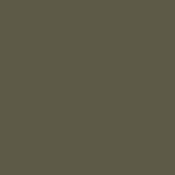
What's the difference: SW Roycroft Bronze Green vs Garden Gate?
These two deep greens are very similar at first glance. If you hold the swatches up quickly, you might not even see a difference.
Roycroft Bronze Green has an LRV of 9, so it is slightly darker. Sherwin Williams Garden Gate has an LRV of 10, which means both colors are still very dark.
Roycroft Bronze Green reads softer and a little more muted, whereas Garden Gate feels a bit more saturated and bold.
What is Sherwin Williams March 2024 Color of the Month?
Sherwin Williams March 2024 Color of the Month is Roycroft Bronze Green, a deep olive green with bronze undertones.
What's the difference: SW Roycroft Bronze Green vs Dried Thyme?
Roycroft Bronze Green and Sherwin Williams Dried Thyme are great options if you're looking for a dark green, but the two bring different vibes to a space.
Roycroft Bronze Green is deeper, darker, more saturated, and more bronze / brown / gray. Dried Thyme is lighter, more green, and more muted.
These are both worth swatching if you like earthy greens. Seeing them side by side will make the difference much clearer.
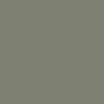
What's the difference: SW Roycroft Bronze Green vs BM Aegean Olive?
Roycroft Bronze Green and Benjamin Moore Aegean Olive are similar dark olive hues.
Roycroft Bronze Green is a bit darker with an LRV of 10 compared to Aegean Olive's LRV of 12.
Roycroft Bronze Green leans a bit more green and more muted, whereas Aegean Olive leans slightly more yellow and more saturated.
If you're debating between these two colors, my advice is simple: swatch them both. Paint samples on your walls, check them in different lighting, and go with the one that feels right.

Before you go...
So, you've found the perfect paint color, but here's the thing — there's another big decision you have to make: picking the right paint sheen.
Seriously, the level of glossiness can totally change how your color looks on the walls and how long the paint lasts!
Check out our complete guide to understanding paint sheens.
Still unsure which paint color is right for your space?
Choosing paint doesn’t have to be stressful! My free Paint Color Planning Quick Start Guide walks you through the exact steps to confidently choose the perfect color — without the overwhelm, second-guessing, or endless swatch testing.
👉 Click here to download the free guide!
DIYing Your Paint Job? Start Here.
Choosing a paint color is only half the equation — the tools you use matter just as much. I’ve rounded up the painting supplies we rely on for clean lines, smooth finishes, and less frustration overall.
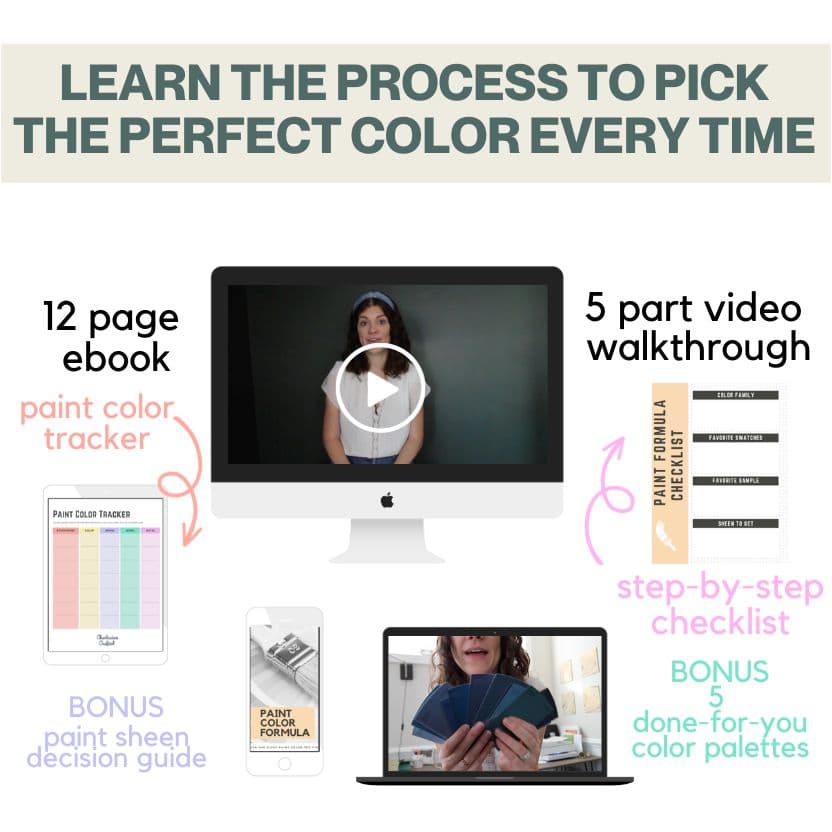
My Paint Color Formula course walks you through the painless process of expertly testing paint swatches to ensure you have the perfect color for your home.
The best way to sample paint? Samplize!
Get peel-and-stick removable and reusable paint samples here!
Thanks for reading!

Meg Hemmelgarn is a freelance writer and home decor + DIY blogger who loves to talk about paint colors. She and her husband are currently renovating their third fixer upper. You can see their projects on her blog, Green With Decor.