Looking for the perfect dark blue paint color for your home? Let’s talk about Sherwin Williams Outerspace and if it might be right for your home!
Dark blues are the perfect balance between bold and timeless.
If you want to add some color without going too bright—or bring in a trendy touch while still keeping things classic—dark blue is the way to go.
I love how versatile they are. Dark blues pair beautifully with so many colors, finishes, and decor styles, making them easy to use in almost any space. They bring depth, sophistication, and a sense of calm all at once.
Today, we’re talking about Outerspace by Sherwin Williams. This deep, moody blue isn’t quite navy, but it’s dark enough to make a statement while still feeling serene and stylish. Let’s take a closer look!
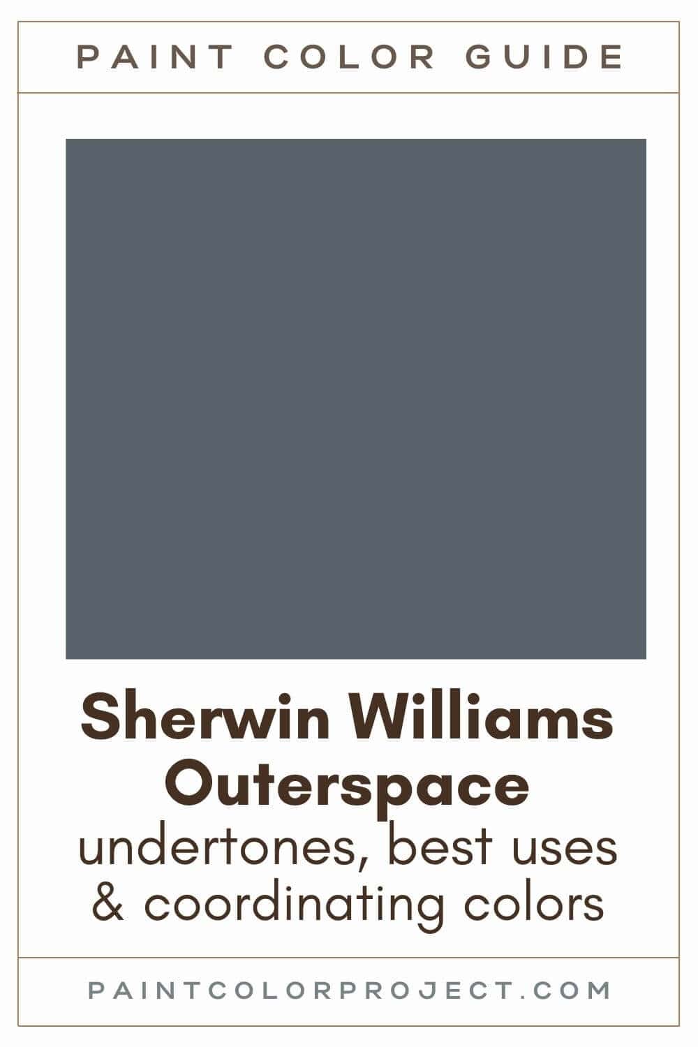
Outerspace, Sherwin Williams, SW 6251
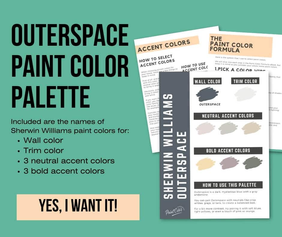
Outerspace is a dark, mysterious blue with a gray undertone.
Click here to get a peel and stick sample of Outerspace
Color Family
Outerspace is in the blue family.
Light Reflectance Value
12
Light Reflective Value is the measurement of how much light a color bounces around. This is on a scale of 0 to 100 with 0 being pure black and 100 being pure white.
With an LRV of 12, Outerspace is a very dark blue. It will look pretty dark in rooms without much lighting and brighter in rooms with brighter lighting.
Note that with an LRV of 12, Outerspace is dark but it's lighter than the navy paint colors, which have lower LRVs.
RGB Colors
R: 88 G: 97 B: 104
RGB describes the amount of each color - red, green, and blue - present in a color. This is on a scale of 0 to 255 for each color. This is basically the color mix to make the color!
Hex Code
#586168

Undertones
Outerspace is a deep blue with gray undertones, giving it a soft, muted look.
In south-facing rooms with lots of natural light, you'll notice Outerspace look a bit warmer and brighter, with more of a blue hue.
On the other hand, in north-facing rooms with cooler light, it leans darker and moodier, sometimes looking like a blue-gray or even near-black in shadowy corners.
It's very important to swatch colors on your wall to make sure they look good – day and night – in your actual space before committing.
Click here to get removable peel & stick paint samples to easily swatch with!
Best uses
I like using deep, moody colors like Outerspace to add depth and coziness to a space. Here are some of my favorite ways to use it:
- Walls of a room you want to feel cozier such as a bedroom, living room, or den (you can even paint the trim and moldings for a more sophisticated feel)
- Creating a focal point, such as a fireplace
- Built-ins
- Kitchen cabinets
- Interior or exterior doors
- Shutters
- Accent wall
- Furniture
You could even use Outerspace as an exterior paint color if you’re going for a bold, modern look!
Similar Colors
If you love Outerspace but want to explore other options, check out these similar shades:
- Sherwin Williams Grays Harbor
- Benjamin Moore Powell Gray
- Behr Calligraphy
- Sherwin Williams Rain Cloud
- Benjamin Moore Ocean Floor
- Behr Thunder Bay
- Sherwin Williams Granite Peak
Click here to get a peel and stick sample of Outerspace
Coordinating Colors
Outerspace is so deep and muted that it almost acts like a neutral, meaning it pairs well with a wide range of colors.
I like to pair Outerspace with neutrals like crisp whites, grays, or tans, to create a balanced look.
For a bit more contrast, try pairing Outerspace with soft blues, light yellows, or even a touch of pink or orange.
Muted mid to dark greens:
- Retreat
- Taiga
- Dried Thyne
- Acacia Haze
- Evergreen Fog
Very light (pale) violets:
- Quicksilver
- Icicle
- Rarified Air
- Spatial White
Warm mid-toned neutrals:
- Sticks & Stones
- Keystone Gray
- Mega Greige
- Truly Taupe
Trim Colors
For trim, I recommend a bright, crisp white to complement the rich tones of Outerspace.
This contrast helps the color stand out while keeping the overall look fresh and clean.
- Benjamin Moore Simply White
- Sherwin Williams Extra White
- Behr Ultra Pure White
Outerspace Color Palette
Want to use this paint color in your home? Instantly upgrade your home's aesthetic with our exclusive paint color palette. Unlock the perfect trim color and six stunning accent colors, a combination of neutrals and bold hues for an instantly harmonious space!
Get your perfect paint color palette by clicking here!
Click here to get a peel and stick sample of Outerspace
FAQS
Here are some common frequently asked questions about Outerspace.
What's the difference: SW Outerspace vs Cyberspace?
Outerspace and Cyberspace sound like they should be similar paint colors, don't they? Both are dark, cool paint colors, but they have some key differences.
Outerspace is a deep blue with gray undertones, and Cyberspace is a charcoal black.
With an LRV of 6, Cyberspace is darker than Outerspace, which has an LRV of 12.
Swatching both colors will help you see the difference and decide which one suits your style best.

Is Outerspace warm or cool?
Sherwin Williams Outerspace is a cool dark blue paint color.
Is Outerspace a navy blue?
Sherwin Williams Outerspace is a dark, mysterious blue; however, it is not a navy. Outerspace has a gray undertone, making it a bit more muted / neutral / less saturated than a typical navy paint color.
Outerspace has an LRV of 12, so it's lighter than navy paint colors. For example, Sherwin Williams In the Navy and Naval both have LRVs of 4, making them much darker than Outerspace.
What's the difference: SW Outerspace vs BM Gentleman's Gray?
While Outerspace and Gentleman's Gray are both dark, not-navy paint colors, they also have some differences beteween them.
When compared side by side, Outerspace will look more gray and Gentleman's Gray will look more blue.
Gentleman's Gray (LRV 7) is darker than Outerspace (LRV 12). Gentelman's Gray is more saturated, and Outerspace is more neutral.
Both are gorgeous colors. It just depends if you're going for a more darker, saturated look or a slightly less dark, more muted look.
Swatching both colors in your space will help you see those differences and decide which fits your preference best.

What's the difference: SW Outerspace vs Grays Harbor?
Outerspace and Grays Harbor are very similar paint colors! Both are dark blues (not navys!) with gray undertones.
Both have an LRV of 12, meaning neither is lighter or darker than the other. Both are extremely dark!
When compared side by side, Outerspace is ever so slightly bluer and Grays Harbor slightly grayer. But the difference is minimal!
Outerspace and Grays Harbor are both cool paint colors. It's best to swatch both colors in your space to decide which one you like best, especially when two colors have so many similarities.

Is Sherwin Williams Outerspace a good choice for an exterior?
Yes, if you're looking to go dark, deep blues like Outerspace work wonderfully for exteriors.
Outerspace holds its color beautifully outside, looking dark enough to make a statement but still rich and vibrant.
Surrounded by natural light, it appears lighter, warmer and more blue, which can give your home a fresh, bold look.
Pair it with white, tan, or gray trim. You can also pair Outerspace with natural wood, stone, or brick for a versatile exterior.
As always, remember it’s always a good idea to swatch it on your exterior to see how it looks in different lighting throughout the day.
Before you go...
So, you've found the perfect paint color, but here's the thing - there's another big decision you have to make: picking the right paint sheen. Seriously, the level of glossiness can totally change how your color looks on the walls and how long the paint lasts!
Check out our complete guide to understanding paint sheens.
Still unsure which paint color is right for your space?
Choosing paint doesn’t have to be stressful! My free Paint Color Planning Quick Start Guide walks you through the exact steps to confidently choose the perfect color — without the overwhelm, second-guessing, or endless swatch testing.
👉 Click here to download the free guide!

My Paint Color Formula course walks you through the painless process of expertly testing paint swatches to ensure you have the perfect color for your home.
The best way to sample paint? Samplize!
Get peel-and-stick removable and reusable paint samples here!
Thanks for reading!

Meg Hemmelgarn is a freelance writer and home decor + DIY blogger who loves to talk about paint colors. She and her husband are currently renovating their third fixer upper. You can see their projects on her blog, Green With Decor.