Looking for the perfect off-white paint color for your home? Let's compare Antique White vs Alabaster to see if one might be perfect for your space!
Off-whites are one of those paint color staples that always work. They’re soft, neutral, and way less harsh than a stark white wall.
But as much as I love them, not all off-whites are the same. Some are nearly white, while others lean cream or even beige.
If you’ve ever picked a color thinking it was perfect, only to see it turn out way too warm or too cold, you know what I mean.
Today, I want to compare two super popular off-whites—Antique White and Alabaster.
They’re both gorgeous, but they have very different personalities.
Let’s talk through the details so you can decide which one feels right for your space.
Read my full review of Antique White
Read my full review of Alabaster
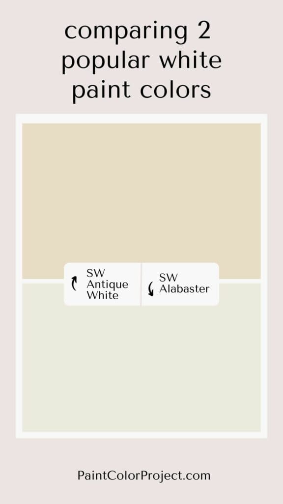
Antique White vs Alabaster
Antique White and Alabaster have many similar characteristics on paper; however, they're very different paint colors!
What is similar about Antique White vs Alabaster?
At first glance, Antique White and Alabaster seem pretty alike. They’re both warm off-whites with beige undertones that make them feel cozy and inviting.
Antique White and Alabaster are both light and bright enough to be used in many rooms of the house.
However, Antique White may read too warm for some south-facing rooms. (More on that below!)
What is different about Antique White vs Alabaster?
Antique White is darker, warmer, and creamier. Alabaster is lighter, more neutral, and more white. (Note that Alabaster is still a warm off-white!)
Alabaster is the more popular of the two, as it's a more versatile neutral. Alabaster makes a great trim color in addition to its popularity for walls.
Antique White pairs very well with other warm neutrals (soft whites, tans, beiges, browns), but it can be a bit trickier to pair with other colors. Alabaster is more adaptable.
| Antique White | Alabaster | |
| LRV | 72 | 82 |
| RBG | R: 232 G: 220 B: 198 | R: 237 G: 234 B: 224 |
| Undertones | creamy off-white with warm beige undertones | off-white with warm beige undertones |
Light Reflectance Value
Light Reflective Value is the measurement of how much light a color bounces around. This is on a scale of 0 to 100 with 0 being pure black and 100 being pure white.
Antique White is noticeably darker than Alabaster.
With an LRV of 72, Antique White is the darkest an off-white paint color can be. It's a dark, very warm off-white.
With an LRV of 82, Alabaster is the lightest an off-white paint color can be. It's a light, warm (not overly warm) off-white. It's just a touch shy of true white.


Undertones
Both Antique White and Alabaster have warm beige undertones.
Antique White often appears as a cream or even sometimes as a slight beige. Meanwhile, Alabaster is more of a warm, soft cream.
In south-facing rooms with lots of natural light, both colors will lean warmer and creamier, especially Antique White.
In north-facing rooms that are a bit darker, both colors will lean more neutral / white, especially Alabaster. Antique White is often a great choice for north-facing rooms because its deep warmth isn't quite so apparent.
It's very important to swatch colors on your wall to make sure they look good – day and night – in your actual space before committing.
Click here to get removable peel & stick paint samples to easily swatch with!
How do I decide between these two colors?
So, which one should you pick? It really comes down to the vibe you’re going for and how much natural light your room gets.
Go with Antique White if: You love a warm, creamy look that feels rich and inviting. It’s especially great for darker, north-facing rooms where you want some extra coziness.
Pick Alabaster if: You want a lighter, more neutral off-white that works with a variety of colors and styles. It’s a safe choice for south-facing rooms or if you’re looking for something fresh and versatile.
Personally, I’d recommend Alabaster if you’re someone who likes to change up your decor often. It’s so adaptable, you won’t feel boxed in.
But if you’re drawn to that timeless, creamy look, Antique White is hard to beat.
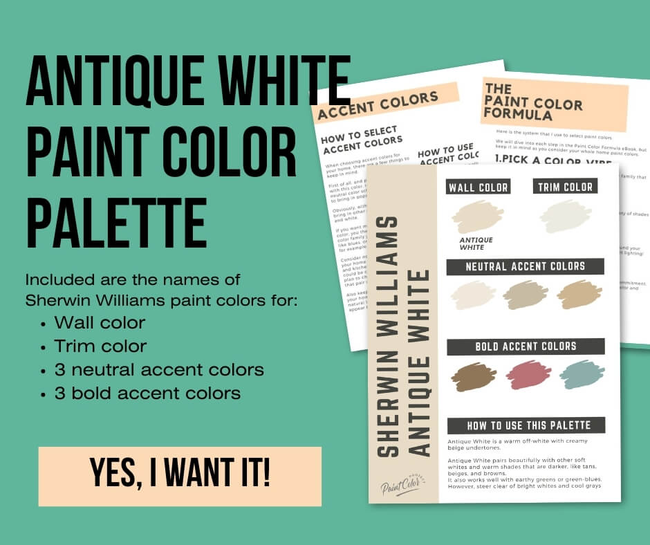
Sherwin Williams Antique White Color Palette
Want to use this paint color in your home? Instantly upgrade your home's aesthetic with our exclusive paint color palette. Unlock the perfect trim color and six stunning accent colors, a combination of neutrals and bold hues for an instantly harmonious space!
Get your perfect paint color palette by clicking here!
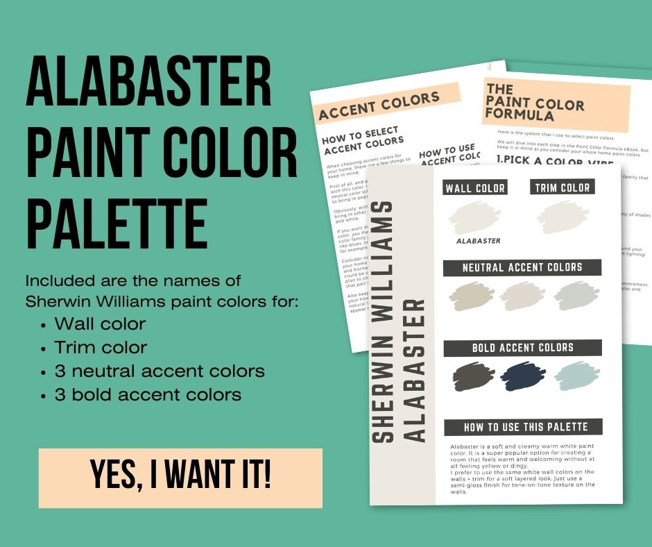
Sherwin Williams Alabaster Paint Color Palette
Want to use this paint color in your home? Instantly upgrade your home's aesthetic with our exclusive paint color palette. Unlock the perfect trim color and six stunning accent colors, a combination of neutrals and bold hues for an instantly harmonious space!
Get your perfect paint color palette by clicking here!
Still unsure which paint color is right for your space?
Choosing paint doesn’t have to be stressful! My free Paint Color Planning Quick Start Guide walks you through the exact steps to confidently choose the perfect color — without the overwhelm, second-guessing, or endless swatch testing.
👉 Click here to download the free guide!

My Paint Color Formula course walks you through the painless process of expertly testing paint swatches to ensure you have the perfect color for your home.
The best way to sample paint? Samplize!
Get peel-and-stick removable and reusable paint samples here!
Thanks for reading!

Meg Hemmelgarn is a freelance writer and home decor + DIY blogger who loves to talk about paint colors. She and her husband are currently renovating their third fixer upper. You can see their projects on her blog, Green With Decor.