Looking for the perfect neutral paint color for your home? Let’s talk about Benjamin Moore Strand of Pearls and if it might be right for your home!
If you’re looking for a warm neutral that feels soft and cozy but not too dark, creamy off-whites might be just what you need.
They’re perfect when you want something that’s more interesting than plain white but still light enough to brighten up a room.
I love how they bring warmth and a relaxed feel to a space, especially if you don’t want anything too bold or cold.
But not all creamy off-whites are the same. Some are barely off-white. Others are deeper, almost greige. One color that really stands out in this group is Strand of Pearls by Benjamin Moore.
Let’s take a closer look.
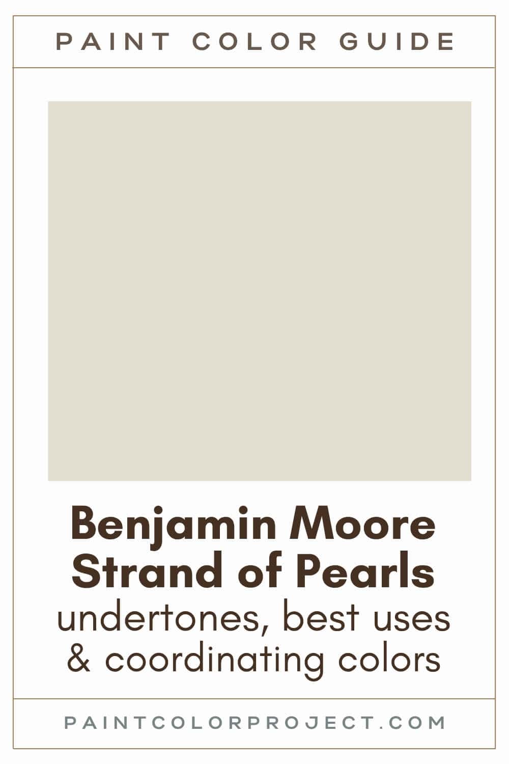
Strand of Pearls, Benjamin Moore, CSP-395
This color really lives up to its name. It reminds me of vintage pearls: warm, elegant, and just a little nostalgic.
Strand of Pearls is a soft, creamy off-white with subtle greige undertones. It has a quiet richness to it.
I’ve seen it used in everything from calm bedrooms to cozy living rooms, and it always adds a warm, inviting feel. It’s one of those shades that works in modern and traditional homes alike.
Click here to get a peel and stick sample of Strand of Pearls
Color Family
Strand of Pearls is in the neutral family.
Light Reflectance Value
72
Light Reflective Value is the measurement of how much light a color bounces around. This is on a scale of 0 to 100 with 0 being pure black and 100 being pure white.
Generally, anything with an LRV from 72-82 is considered off-white.
With an LRV of 72, this is technically an off-white, but it’s on the deeper end. It won’t wash out in sunlight and adds just enough contrast next to white trim or cabinets.
RGB Colors
R: 227 G: 222 B: 208
RGB describes the amount of each color - red, green, and blue - present in a color. This is on a scale of 0 to 255 for each color. This is basically the color mix to make the color!
Strand of Pearls leans warm thanks to a bit more red and yellow in the mix.
Hex Code
#E3DED0

Undertones
Strand of Pearls has warm yellow and orange undertones.
In bright, south-facing rooms, you’ll really notice that golden warmth. It looks soft and creamy without feeling yellow.
In darker, north-facing rooms, it can look darker and a bit cooler / more neutral.
It's very important to swatch colors on your wall to make sure they look good – day and night – in your actual space before committing.
Click here to get removable peel & stick paint samples to easily swatch with!
Best uses
Strand of Pearls works well as a whole house paint color, especially if you want a bit more depth than typical builder-grade whites.
But since it’s slightly darker than your average off-white, it also looks amazing when used in just a few spaces. Try it in:
- Living rooms
- Bedrooms
- Kitchens
- Bathrooms
- Home exterior
- Interior doors
- Cabinets
- Furniture
Similar Colors
Looking for something close? Here are a few similar shades you might want to compare:
- Benjamin Moore Gray Mist
- Behr Sand Drift
- Sherwin Williams Oyster White
- Benjamin Moore Etiquette
- Behr Cotton Knit
- Sherwin Williams White Duck
- Benjamin Moore Olympic Mountains
Click here to get a peel and stick sample of Strand of Pearls
Coordinating Colors
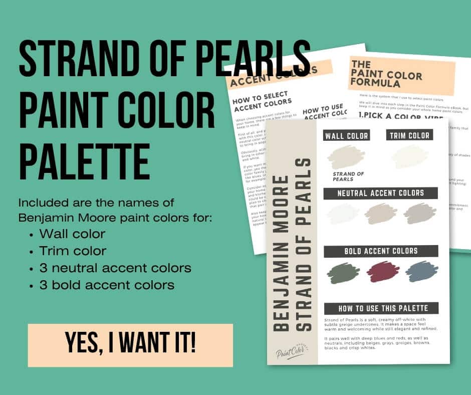
As a neutral, Strand of Pearls pairs well with many other colors, including deep blues and reds, as well as neutrals, including beiges, grays, greiges, browns, blacks and crisp whites.
Dark, warm reds:
- Modern Romance
- Cranberry Cocktail
- Pottery Red
- Maple Leaf Red
- Cherokee Brick
Mid blue-grays:
- Bachelor Blue
- Normandy
- Alfresco
- West Coast
Neutral-grays:
- Cumulus Cloud
- London Fog
- Apparition
- Shale
- Seattle Mist
Trim Colors
Strand of Pearls really pops next to a crisp, bright white trim colors. I recommend:
- Benjamin Moore Simply White
- Sherwin Williams Extra White
- Behr Ultra Pure White
Strand of Pearls color palette
Want to use this paint color in your home? Instantly upgrade your home's aesthetic with our exclusive paint color palette. Unlock the perfect trim color and six stunning accent colors, a combination of neutrals and bold hues for an instantly harmonious space!
Get your perfect paint color palette by clicking here!
Click here to get a peel and stick sample of Strand of Pearls
FAQS
Here are some common questions I get about this soft, cozy neutral.
Is Benjamin Moore Strand of Pearls warm or cool?
Strand of Pearls is definitely a warm color. It’s a creamy off-white with subtle yellow and orange undertones, which gives it a soft, welcoming feel.
What is the undertone of Strand of Pearls?
Strand of Pearls leans warm with yellow and orange undertones.
In rooms with lots of sunlight, like south-facing spaces, those warm tones really shine through and the color feels brighter.
In cooler, north-facing rooms, it tends to look more muted and neutral. It can even read a touch grayer depending on the lighting.
What's the difference: BM Strand of Pearls vs SW White Duck?
These two are really close in depth and tone, but there are some small differences.
Strand of Pearls has an LRV of 72, while White Duck is just a bit lighter at 74. Both are still in the off-white range.
The undertones are where you might notice a shift. Strand of Pearls leans a little more yellow. White Duck has a slightly more orange-beige feel.
Strand of Pearls also feels a touch more muted to me, while White Duck reads a little more crisp and clean.
Try both in your space to see what feels better with your lighting and furniture.
What's the difference: BM Strand of Pearls vs SW Oyster White?
Again, these are pretty similar shades. They even share the same LRV of 72, so neither one is lighter than the other.
The biggest difference comes down to undertones. Strand of Pearls leans yellow and a bit creamy, while Oyster White has subtle green and beige undertones.
If your space has cooler light, Oyster White might feel a bit fresher. Strand of Pearls brings more warmth and softness.
Both are great choices, but definitely swatch them side by side if you’re stuck between the two.
What is the difference: BM Pale Oak vs Strand of Pearls?
These two feel related, but they’re not twins.
Pale Oak is a warm greige, and it tends to read more beige in most rooms. Strand of Pearls, on the other hand, is a warm off-white. It’s lighter overall and has more of a creamy undertone.
Pale Oak has an LRV of 69, so it’s just a bit darker than Strand of Pearls at 72.
Both are soft neutrals, but if you want something lighter and a little less gray, go with Strand of Pearls.
What color trim goes with BM Strand of Pearls?
Strand of Pearls looks beautiful with a bright white trim. The contrast really makes the wall color feel clean and fresh.
Some of my go-to white trim options are:
- Benjamin Moore Simply White
- Sherwin Williams Extra White
- Behr Ultra Pure White
- Benjamin Moore Chantilly Lace
All of these will give you that crisp, polished look next to the warmth of Strand of Pearls.
Before you go...
So, you've found the perfect paint color, but here's the thing - there's another big decision you have to make: picking the right paint sheen. Seriously, the level of glossiness can totally change how your color looks on the walls and how long the paint lasts!
Check out our complete guide to understanding paint sheens.
Still unsure which paint color is right for your space?
Choosing paint doesn’t have to be stressful! My free Paint Color Planning Quick Start Guide walks you through the exact steps to confidently choose the perfect color — without the overwhelm, second-guessing, or endless swatch testing.
👉 Click here to download the free guide!

My Paint Color Formula course walks you through the painless process of expertly testing paint swatches to ensure you have the perfect color for your home.
The best way to sample paint? Samplize!
Get peel-and-stick removable and reusable paint samples here!
Thanks for reading!

Meg Hemmelgarn is a freelance writer and home decor + DIY blogger who loves to talk about paint colors. She and her husband are currently renovating their third fixer upper. You can see their projects on her blog, Green With Decor.