Looking for a neutral paint color for your home? Let's compare Sherwin Williams Eider White vs Repose Gray to see if one might be right for you!
Greige paint colors are popular for a reason. They aren't as stark or "plain" as white, but they are extremely neutral.
While beige was the rage in the 90's, more gray tones have been introduced and tend to give a paint color a more modern (meaning, current) look compared to classic beige colors.
Two of the most popular colors in this light greige category are Eider White and Repose Gray.
Read my full review of Eider White
Read my full review of Repose Gray
Sherwin Williams Eider White vs Repose Gray
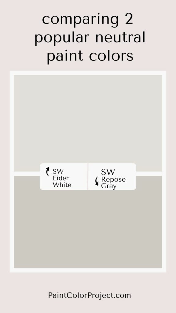
What is similar about Eider White vs Repose Gray?
These are both neutral, greige paint colors. They are a combination of gray and beige that is super popular for homes today.
Eider White is actually SW 7014 and Repose Gray SW 7015 (sequential on a color strip). Yes - Eider White is one shade lighter than Repose Gray!
It seems like they would have a lot in common. However, side by side you can really see the differences.
What is different about Eider White vs Repose Gray?
Honestly, beyond the surface, there is a LOT different about these two colors!
LRV - lightness
Eider White is WAY lighter than Repose Gray. The proof is in the LRV!
Light Reflective Value is the measurement of how much light a color bounces around. This is on a scale of 0 to 100 with 0 being pure black and 100 being pure white.
With an LRV of 73, Eider White is solidly in the light gray category. Repose Gray at 58 - there is nothing super light about that!
Repose Gray has a lot more color depth. This makes it less likely to be washed out by bright light, though it can look way darker, especially at night.
| Eider White | Repose Gray | |
| LRV | 73 | 58 |
| RBG | R:226 G:222 B:216 | R:201 G:201 B:192 |
| Undertones | Light gray color with warm undertones, often reads pink or even purple | Repose Gray is a gray with more green and blue undertones. |
Undertones
The difference in the undertones between these two colors is very evident when you put the swatches next to each other.

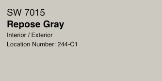
Eider White has pink and almost purple undertones. There is heavy debate over whether it is cool or warm toned (many people say the purple makes it cool, but to the eye it usually reads as warm to me).
On the other hand, Repose Gray has yellow and even green undertones. These are basically the opposite of pink and purple!
These undertones will vary in appearance depending on your lighting and the direction your room faces - Southern facing windows let in more warm light that warms a color compared to Northern facing windows letting on cool light.
This is why it is SUPER important to test colors in your home before committing to them!
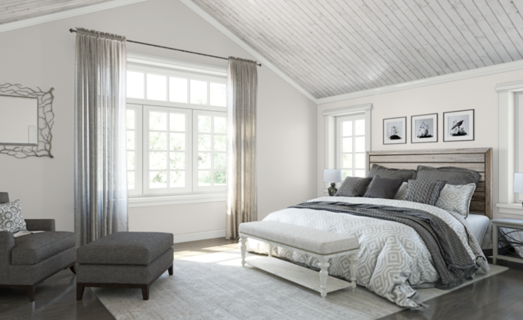
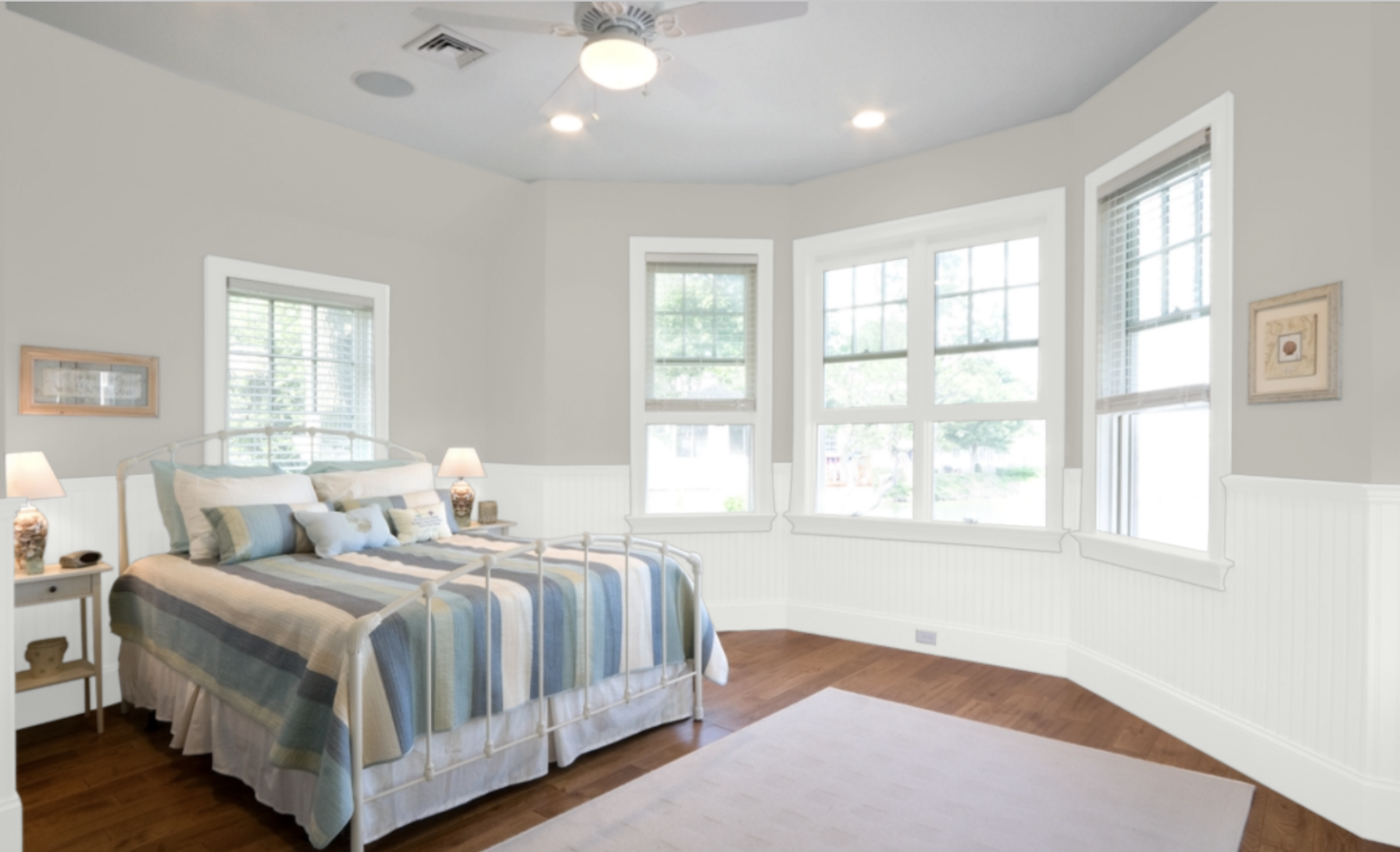
How do I decide between these two colors?
If you want a super light gray - Repose Gray is probably too dark for you. Eider White would be better and is more light and bright.
But also watch the undertones. Depending on your lighting, Eider White could pull very purple.
Repose Gray is more versatile - and works with more coordinating colors - but it is darker with that lower LRV.
Here are a ton of gray paint colors that I recommend!
Does eider white go with Repose Gray?
Eider White and Repose Gray have different undertones, but because the LRV is so different, I think they go together fine. I'd be cool using them for adjoining rooms. They are different enough that they don't look like a color mismatch, but instead layered texture of greige!
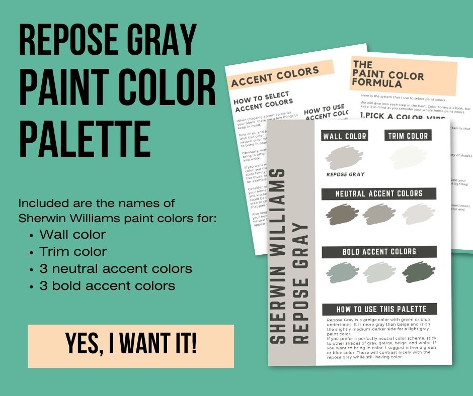
Sherwin Williams Repose Gray Color Palette
Want to use this paint color in your home? Instantly upgrade your home's aesthetic with our exclusive paint color palette. Unlock the perfect trim color and six stunning accent colors, a combination of neutrals and bold hues for an instantly harmonious space!
Get your perfect paint color palette by clicking here!
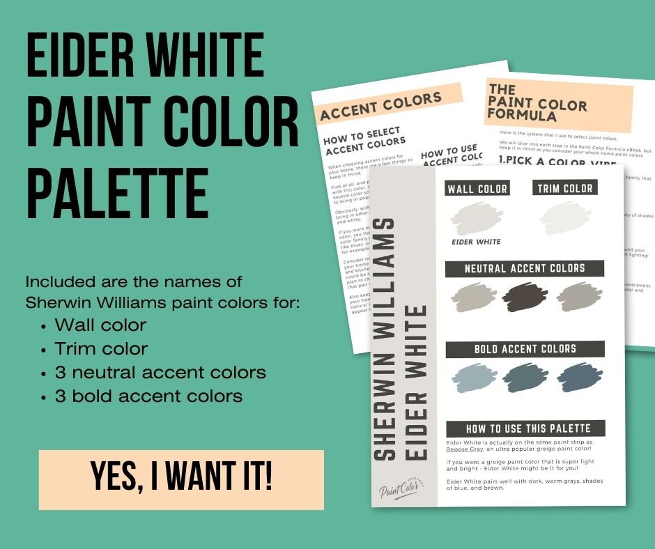
Sherwin Williams Eider White Paint Color Palette
Want to use this paint color in your home? Instantly upgrade your home's aesthetic with our exclusive paint color palette. Unlock the perfect trim color and six stunning accent colors, a combination of neutrals and bold hues for an instantly harmonious space!
Get your perfect paint color palette by clicking here!
Still unsure which paint color is right for your space?
Choosing paint doesn’t have to be stressful! My free Paint Color Planning Quick Start Guide walks you through the exact steps to confidently choose the perfect color — without the overwhelm, second-guessing, or endless swatch testing.
👉 Click here to download the free guide!

My Paint Color Formula course walks you through the painless process of expertly testing paint swatches to ensure you have the perfect color for your home.
The best way to sample paint? Samplize!
Get peel-and-stick removable and reusable paint samples here!
Thanks for reading!

Morgan is passionate about home decor and paint colors. She has been sharing DIY home decor tips since 2012 at CharlestonCrafted.com. From there, she learned to love paint colors, and the Paint Color Project was born in 2022!

