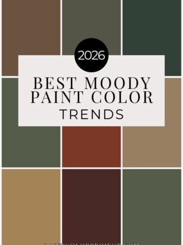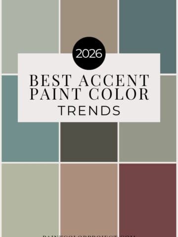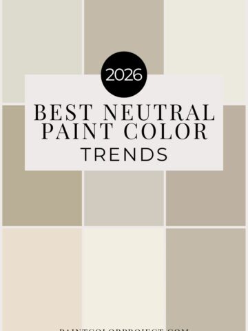
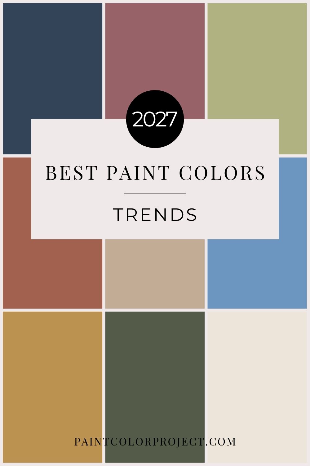
Wondering what's going to be big in home design in 2027? Here's a breakdown of the top paint color trends for 2027, forecasted by major paint brands including Sherwin-Williams, Benjamin Moore, Behr, Valspar, and Glidden.
If you're thinking about painting your home in the new year, you might be wondering what colors are trending. While you should always choose what works best for your space, it's fun to see where design trends are headed, especially if you're looking for a color that feels fresh but will still look beautiful for years to come.
Each year, major paint brands release their Color of the Year selections and curated color palettes. These shades give us a glimpse into what homeowners and designers are gravitating toward.
And for 2027, one thing is especially clear: green is having a major moment!
From rich, traditional greens to soft, herbal shades and earthy olives, nature-inspired colors are everywhere. But we're also seeing warm browns, sophisticated blues, muted pinks, and a return to more colorful, personality-filled interiors.
Let's take a closer look at the biggest 2027 paint color trends and how you can use them in your own home.
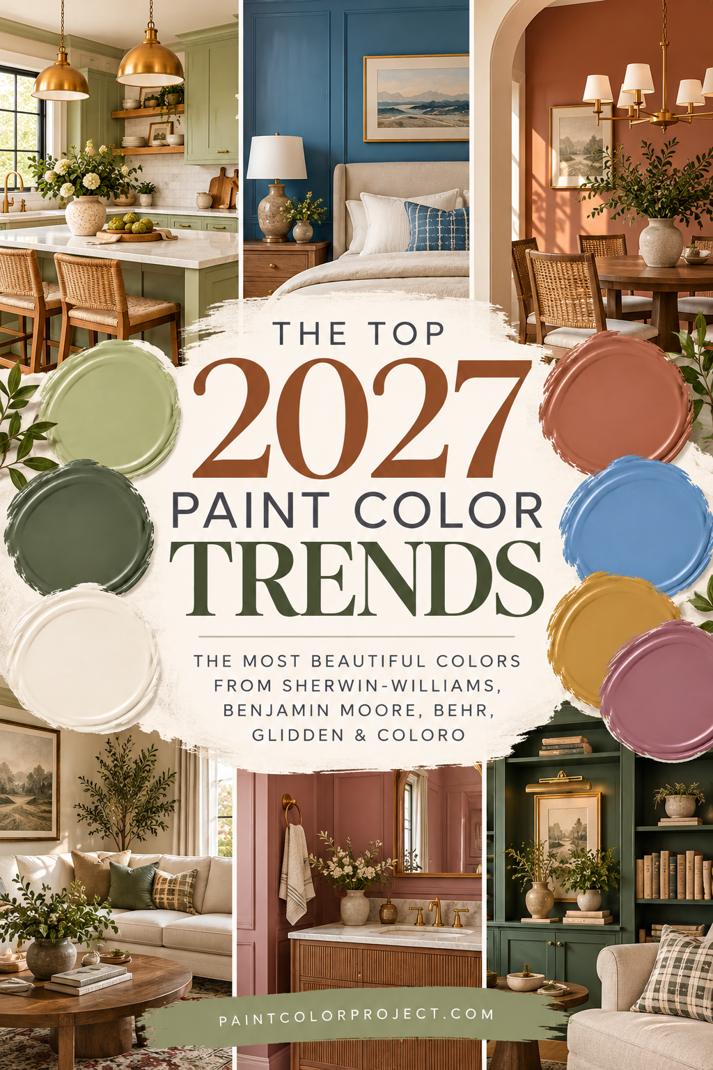
2027 Paint Color Trends Overview
This year's paint color trends are all about bringing warmth, personality, and a connection to nature into our homes.
While previous years leaned heavily into soft neutrals and muted earth tones, 2027 is introducing a little more confidence and color.
We're seeing a mix of traditional shades, earthy midtones, and unexpected pops of color that make homes feel collected, comfortable, and personal.
Across the board, 2027 colors are:
- Nature-inspired: Greens, blues, and earthy shades continue to dominate.
- Warm and welcoming: Creamy whites, golden tans, and rich browns are replacing cooler neutrals.
- Classic with personality: Traditional colors are getting a fresh, modern update.
- Rich without feeling overwhelming: Moody midtones bring depth while still feeling livable.
- More expressive: Homeowners are embracing colors that reflect their personal style rather than sticking to safe neutrals.
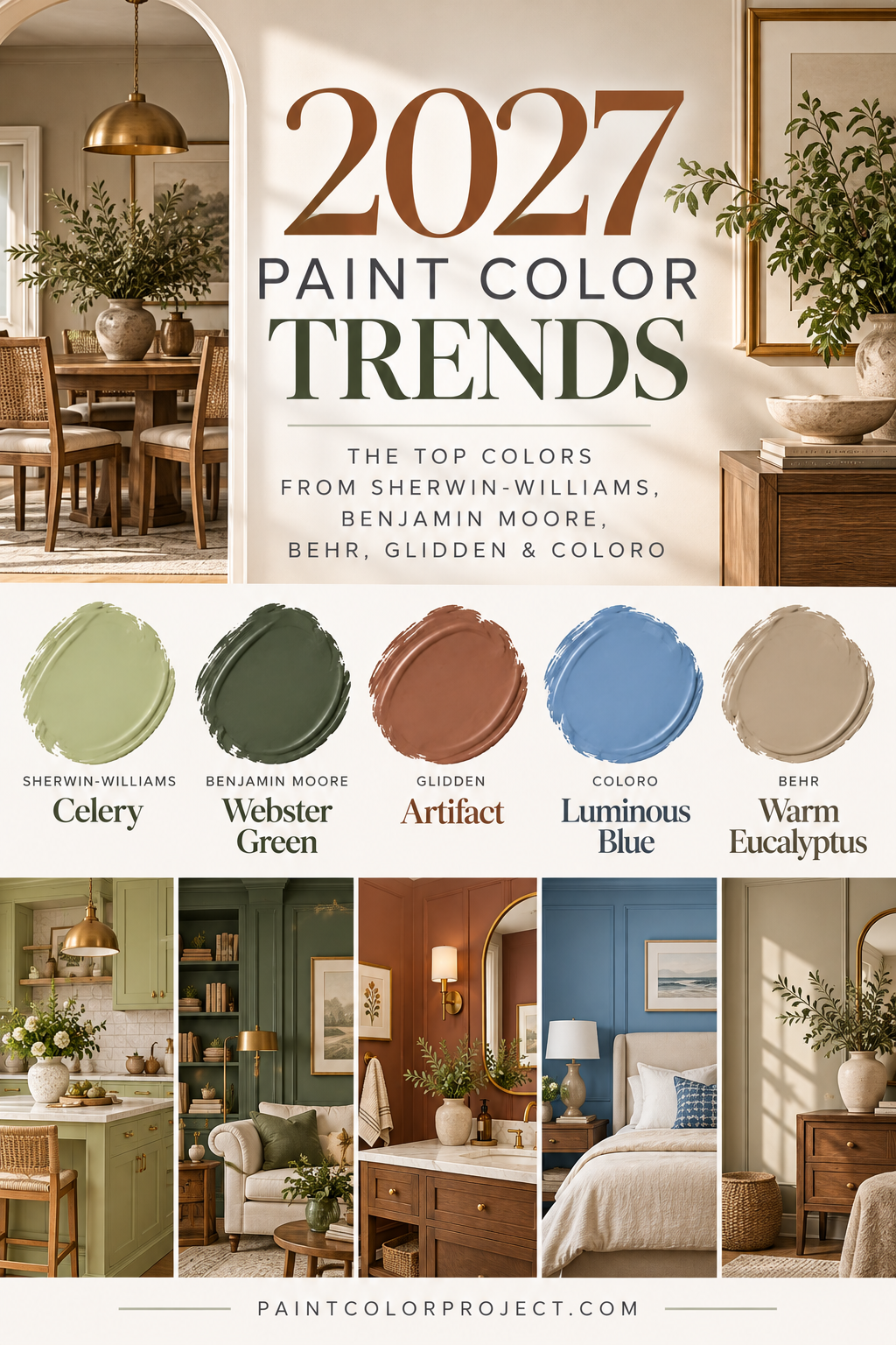
Perhaps the biggest takeaway is that we're moving away from homes that feel overly coordinated or impersonal.
Instead, 2027 is all about choosing colors that make a space feel like home.
From Benjamin Moore's classic Webster Green to Behr's earthy Grounded and Valspar's calming Cottage Door, this year's selections show that you can embrace color without sacrificing timelessness.
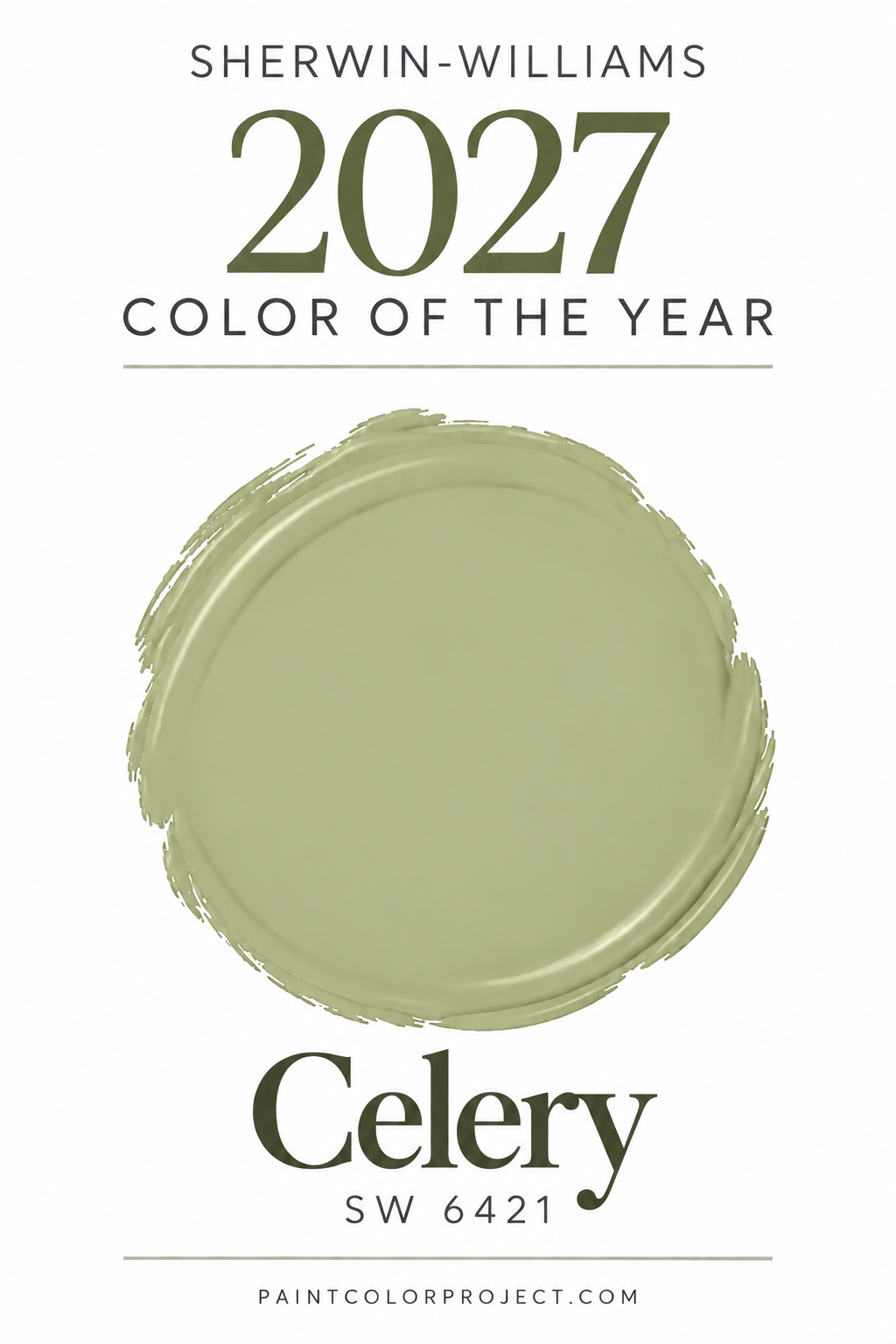
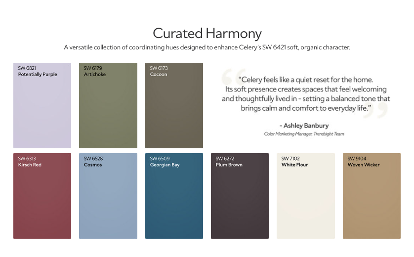
Sherwin-Williams' 2027 Color of the Year: Celery
Sherwin-Williams has officially named Celery SW 6421 as its 2027 Color of the Year, and it's a fresh take on the nature-inspired greens that have been growing in popularity.
Celery is a soft, muted yellow-green that feels cheerful, earthy, and inviting.
Unlike the deep olive and forest greens that have been trending in recent years, Celery brings a lighter, more playful approach to decorating with green.
It has enough warmth to feel cozy while still bringing a fresh pop of color into your home.
I especially love the idea of using Celery in:
- Kitchens: Create a fresh, welcoming space with creamy white countertops, warm wood accents, and brass hardware.
- Bedrooms: Bring a soft, nature-inspired feeling to the room with neutral bedding and natural textures.
- Bathrooms: Add a cheerful pop of color alongside white tile and warm wood details.
- Laundry rooms: Make a functional space feel bright and full of personality.
- Kitchen cabinets: Try Celery on a kitchen island or lower cabinets for a subtle but unexpected touch of color.
Celery pairs beautifully with warm whites, creamy neutrals, natural wood tones, and earthy browns.
It also works particularly well with organic textures and vintage-inspired decor, making it a great choice if you love a cozy, collected home that still feels fresh and inviting.
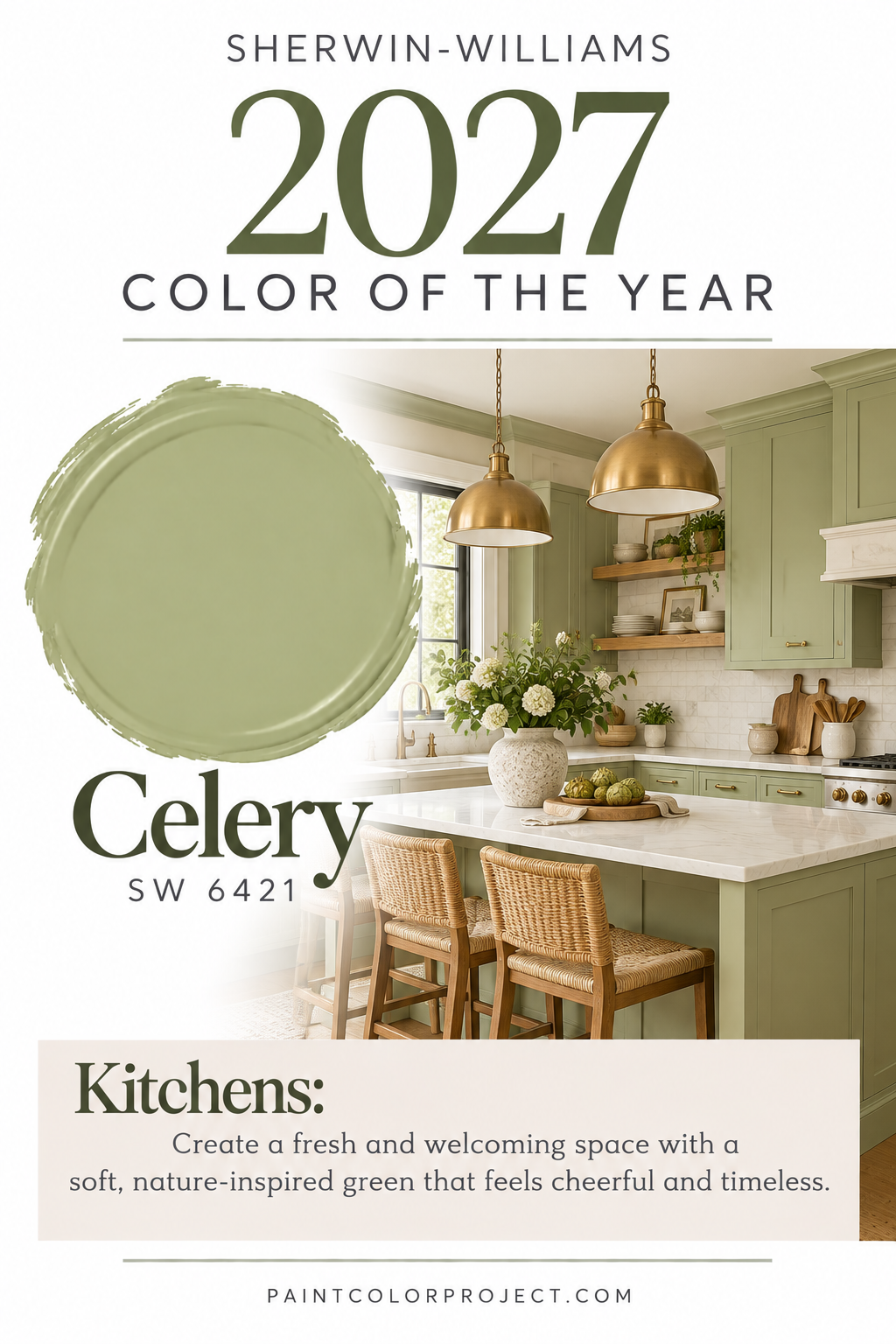
Sherwin-Williams' 2027 Colormix Forecast: Rewild
Sherwin-Williams has introduced its 2027 Colormix Trend Forecast, called Rewild, and it's all about reconnecting with nature, embracing creativity, and using color in more personal ways.
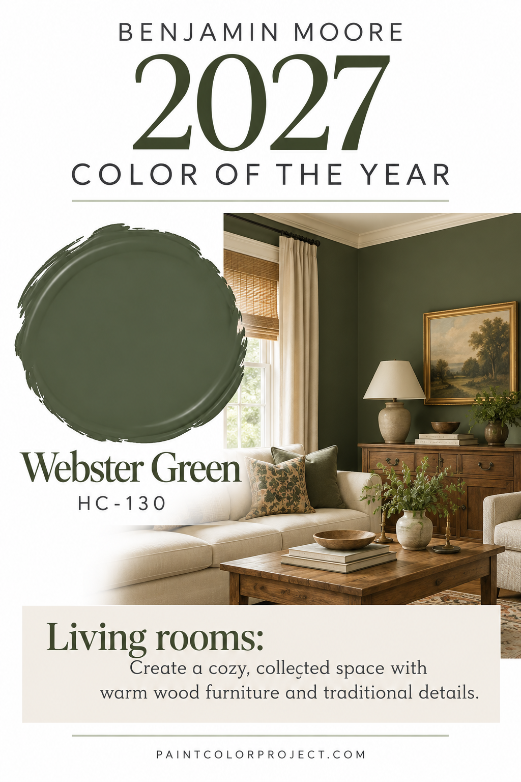
Rather than focusing on one perfectly coordinated palette, Sherwin-Williams has released a collection of 48 colors designed to encourage mixing, matching, and experimenting.
The collection draws inspiration from natural materials, traditional colors, and the freedom to create spaces that feel unique.
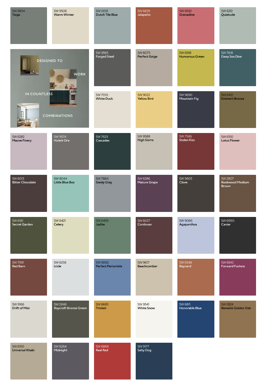
One of the most interesting additions this year is the introduction of 10 Continuity Colors — shades that Sherwin-Williams believes have the versatility and staying power to work beautifully beyond a single trend cycle.
These colors range from warm neutrals and earthy reds to deep greens, soft blues, and rich charcoals.
Sherwin-Williams 2027 Continuity Colors
Here are the 10 featured Continuity Colors from the Rewild forecast:
- Cordovan – A deep, warm reddish-brown with classic appeal.
- Red Barn – A rich, earthy red that feels rustic and welcoming.
- High Sierra – A warm, grounded neutral inspired by natural materials.
- White Duck – A soft, creamy off-white that works beautifully throughout a home.
- Celery – A fresh, light green with subtle yellow undertones.
- Icicle – A delicate, cool-toned shade that brings a sense of lightness.
- Dutch Tile Blue – A sophisticated blue inspired by traditional decorative tile.
- Roycroft Bronze Green – A deep, historic green with plenty of character.
- Clove – A warm, rich brown that adds depth and coziness.
- Forged Steel – A dramatic, dark charcoal with a modern edge.
What I love about this collection is that it doesn't feel overly trendy.
Colors like White Duck and Roycroft Bronze Green already have a timeless quality, while shades like Celery and Dutch Tile Blue offer a fresh way to introduce color.
If you're planning a whole-house color palette, these are great shades to explore because they offer a balance of neutrals, accents, and deeper statement colors.
My favorite takeaway from Sherwin-Williams' forecast? You don't need to choose between timeless and interesting. A well-chosen color can be both!
Benjamin Moore's 2027 Color of the Year: Webster Green
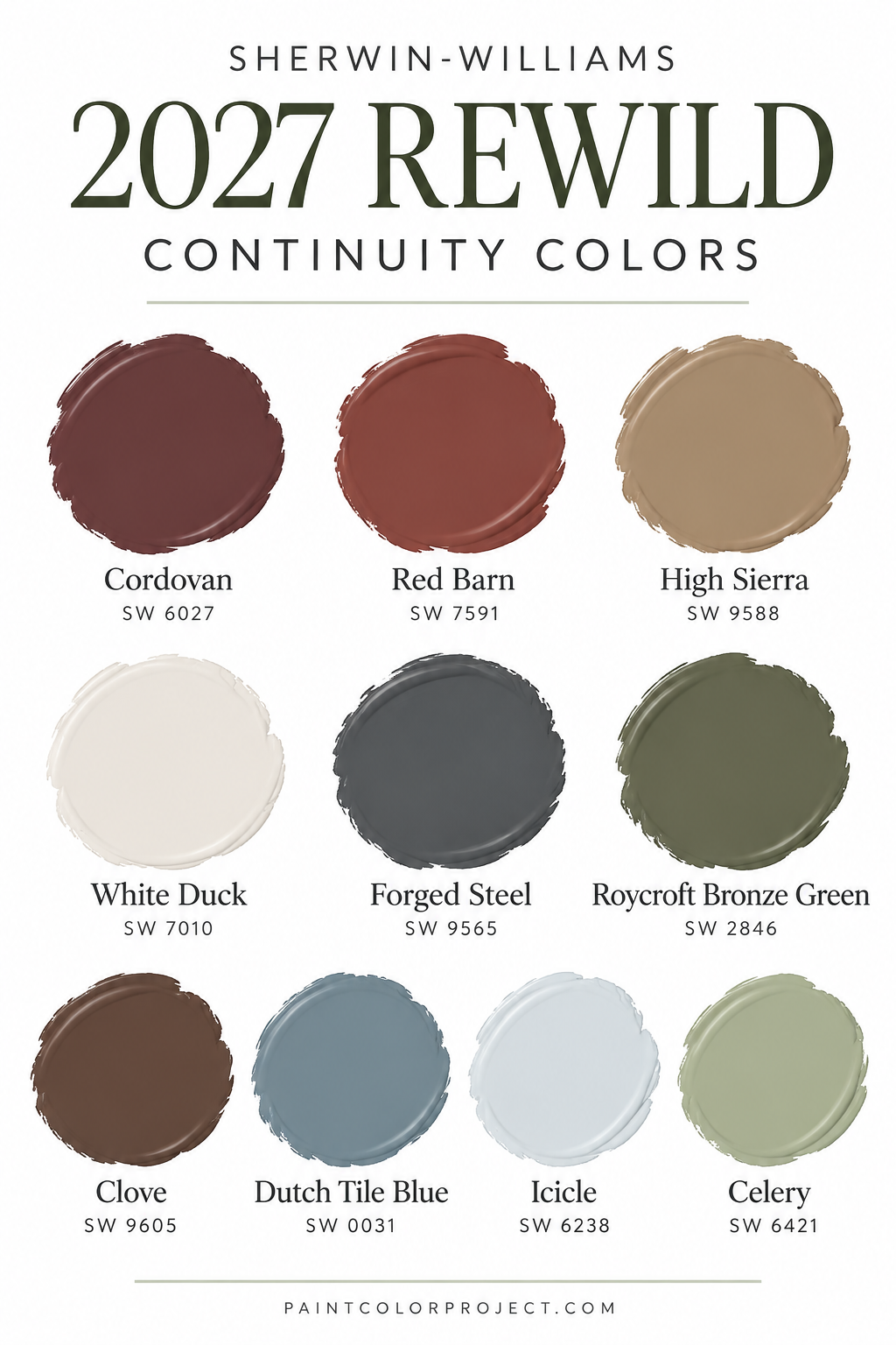
Benjamin Moore has officially named Webster Green HC-130 as its 2027 Color of the Year, and it's a beautiful example of the return to rich, classic paint colors.
Webster Green is a sophisticated mid-tone green that feels traditional without looking dated.
Unlike the soft, gray-green shades that have dominated in recent years, Webster Green has more noticeable color and personality.
It's rich enough to make a statement but balanced enough to work with a variety of decorating styles.
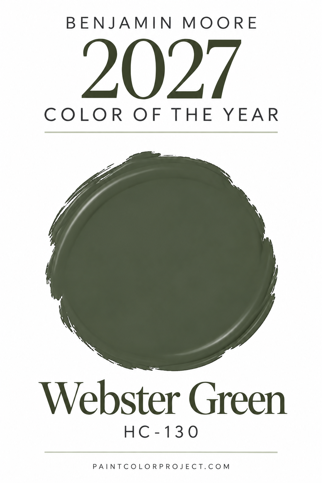
I especially love the idea of using Webster Green in:
- Living rooms: Create a cozy, collected space with warm wood furniture and traditional details.
- Kitchen cabinets: Add personality without committing to an overly bright or trendy color.
- Home offices: Bring a sophisticated, library-inspired feeling to the room.
- Built-ins: Highlight architectural details with a rich pop of green.
- Front doors: Create a welcoming entrance with classic curb appeal.
Webster Green pairs beautifully with creamy whites, warm wood tones, antique brass, and natural textures.
It also works particularly well with traditional furniture and vintage-inspired decor, making it a great option if you love the collected, lived-in look.
The Benjamin Moore 2027 Color Trends Palette
Alongside Webster Green, Benjamin Moore released a curated palette of eight colors that blend classic sophistication with modern warmth.
The collection includes soft pastels, warm neutrals, and deeper, more dramatic hues that can be layered together for a cohesive look.
Benjamin Moore Color Trends 2027 Palette:
- Webster Green HC-130 – A rich, classic mid-tone green and the 2027 Color of the Year.
- White Down OC-131 – A soft, creamy off-white with a welcoming feel.
- Nelson Blue CW-635 – A delicate, watery blue that feels peaceful and refined.
- Shakespeare Tan 228 – A warm golden tan that adds subtle richness.
- Antique Copper 1169 – A sophisticated brown with warm, spiced undertones.
- Wild Aster 1240 – A soft, muted pink with gentle gray undertones.
- Durango 2137-30 – A deep, earthy neutral with olive influences.
- Townsend Harbor Brown HC-64 – A rich burgundy-brown with traditional character.
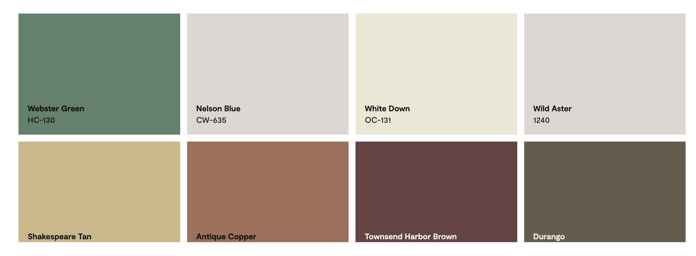
Together, these shades create a palette that feels warm, collected, and full of personality.
What makes this collection especially interesting is the combination of lighter, softer colors with deeper traditional shades.
For example, you could pair White Down walls with Webster Green cabinetry or use Nelson Blue in a bedroom with warm wood furniture.
Wild Aster also offers a softer, more romantic option for anyone who wants to embrace color without going too bold.
This collection is a great reminder that traditional paint colors don't have to feel old-fashioned. When paired with modern furnishings and natural textures, they can feel incredibly fresh.
Behr's 2027 Color of the Year: Grounded
Behr has officially announced Grounded T27-01 as its 2027 Color of the Year, and it's another beautiful example of the growing popularity of earthy greens.
Grounded is a rich olive-moss green with subtle brown undertones that give it a warm, natural appearance.
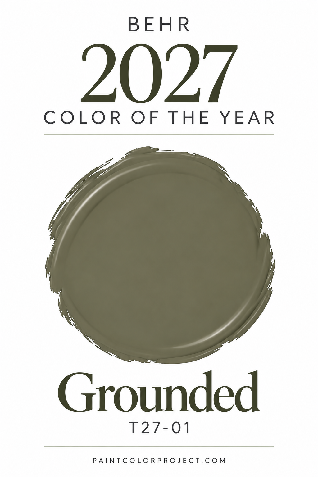
Unlike cooler sage greens, Grounded feels deeper and more organic, almost like a color you'd find in a shaded forest.
It's a great option for creating rooms that feel cozy, peaceful, and connected to nature.
I especially love this type of color for bedrooms, dining rooms, home offices, and kitchen cabinetry.
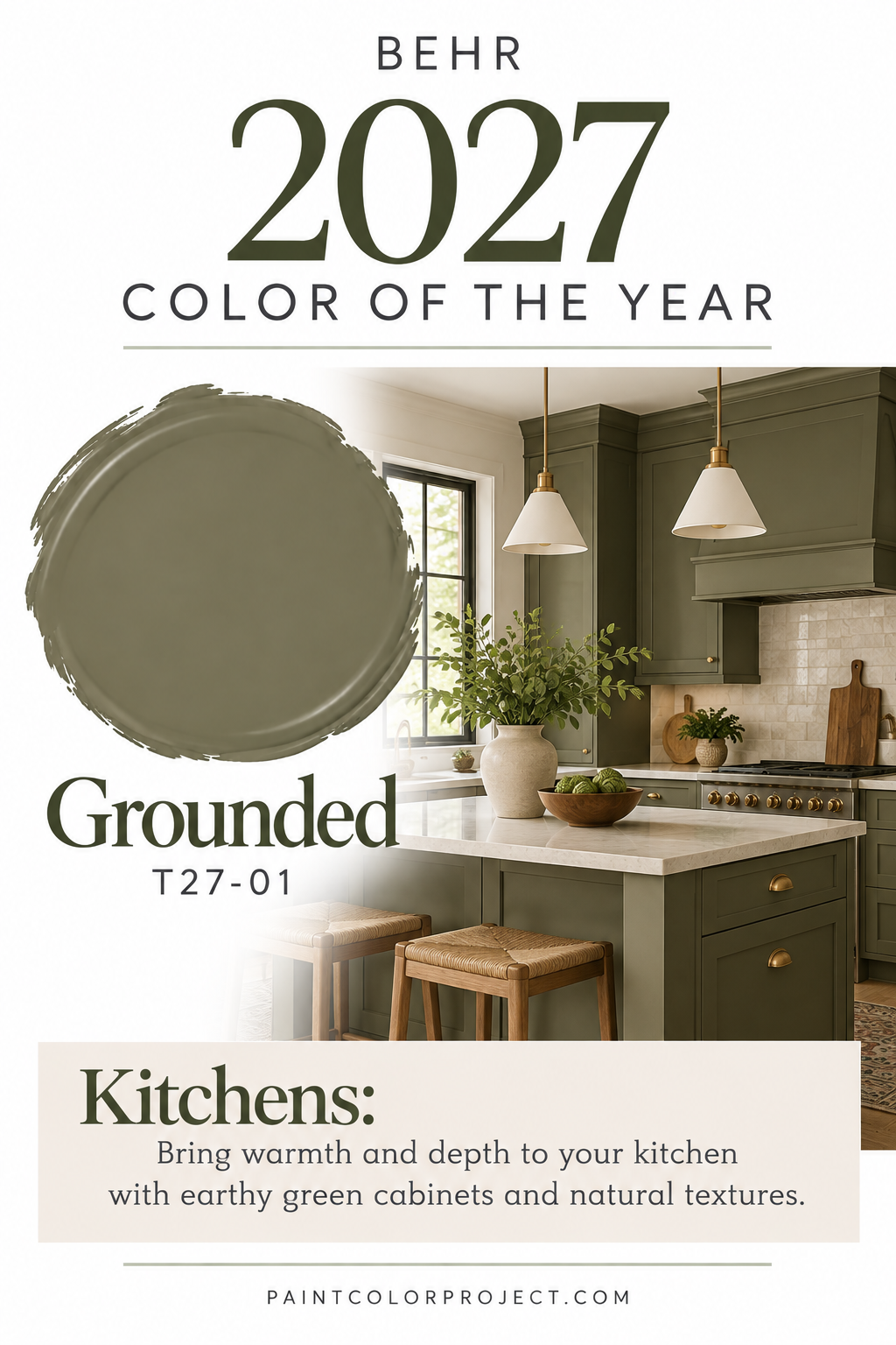
Grounded would look beautiful paired with natural oak, creamy whites, warm stone, and antique brass.
It can also create a dramatic look when used on walls and trim together, especially in rooms where you want a cozy, enveloping feeling.
One thing to keep in mind is that Grounded is a fairly dark color, with an LRV of just 9.
That means it absorbs quite a bit of light, so it may look especially deep in rooms with limited natural light.
Be sure to sample it before committing, particularly if you're considering it for an entire room.
The Behr 2027 Color Trends Palette
Alongside Grounded, Behr released a complete collection of 21 colors designed to complement its nature-inspired Color of the Year.
The palette includes warm neutrals, soft blues, earthy greens, clay tones, muted pinks, and rich accent colors.
Behr also brought back several shades from its color archives, giving classic colors a fresh place in modern interiors.
Behr Color Trends 2027 Palette:
- Grounded T27-01
- Environmental PPU11-09
- Coastal Beige PPU7-13
- Wheat Grass PPU9-11
- Laurel Tree S390-5
- Hidden Gem N430-6A
- Nightfall T27-04
- Blue Moon Bay S480-5
- Fresh Tone S430-2
- Denim Light PPU14-15
- Smokey Claret HDC-AC-28
- Mozart PPU15-02
- Tuscan Terra T27-02
- Cocoa Nutmeg S190-5
- Sedona Pink S190-3
- Hayloft MQ2-22
- Introspective T27-03
- Sarsaparilla HDC-AC-26
- Ancient Root PPU4-20
- Radiance MQ4-07
- Frittata M290-2
This is a particularly versatile collection because it includes colors for almost every type of space.
If you love light, neutral interiors, shades like Coastal Beige and Hayloft offer a warm foundation.
For something more colorful, Blue Moon Bay and Denim Light introduce calming blue tones, while Sedona Pink and Tuscan Terra add warmth and personality.
And if you prefer deeper, moodier colors, Grounded, Nightfall, and Smokey Claret offer plenty of inspiration.
I love that Behr is showing how earthy colors can work together throughout an entire home rather than treating each room as a separate project.
Valspar's 2027 Color of the Year: Cottage Door
Valspar has selected Cottage Door 8004-38E as its 2027 Color of the Year, and it's a beautiful change of pace from the green-heavy selections we're seeing from other brands.
Cottage Door is a soft, grayed-out blue with warm undertones that keep it from feeling too cold.
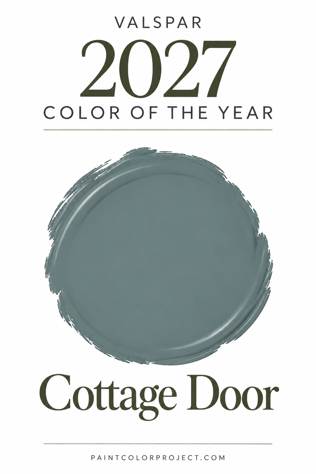
It's calming, welcoming, and just colorful enough to give a room personality without overwhelming the space.
If you love blue paint colors but don't want anything too bright or coastal-looking, this is a great shade to consider.
Cottage Door feels especially suited to:
- Bedrooms: Create a relaxing atmosphere with creamy bedding and warm wood furniture.
- Nurseries: Add a gentle touch of color that doesn't feel overly themed.
- Bathrooms: Pair with white tile and natural materials for a fresh, peaceful look.
- Kitchen cabinetry: Introduce soft color while keeping the space classic.
- Exteriors: Create a welcoming look that pairs beautifully with natural landscaping.
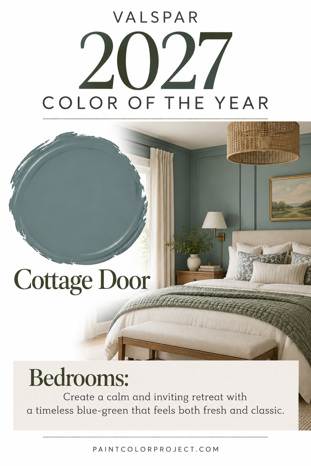
One thing I particularly like about Cottage Door is that it feels like a bridge between the cooler blue-grays that were popular several years ago and the warmer, earthier colors we're seeing now.
It's still soft and calming, but the warmer undertones make it feel more inviting.
Pair it with creamy whites, warm beige, natural wood, and soft brass finishes for a look that feels current without being overly trendy.
Glidden's 2027 Color of the Year: Artifact
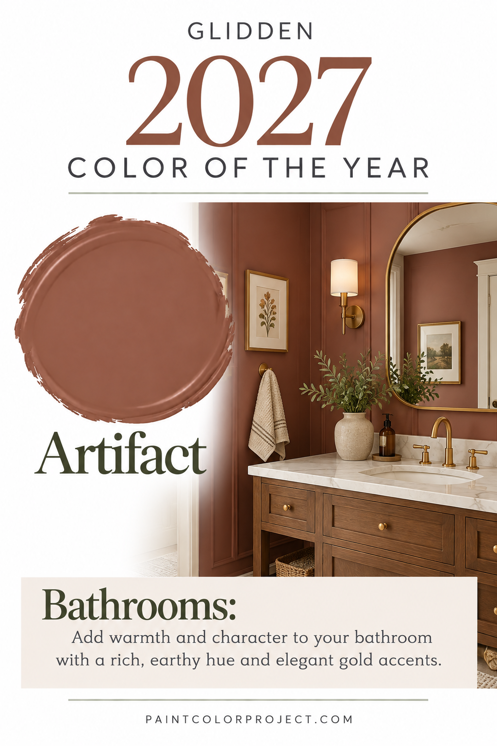
Glidden has announced Artifact PPG10-16 as its 2027 Color of the Year, and this soft, smoky blue brings a fresh perspective to the year's color trends.
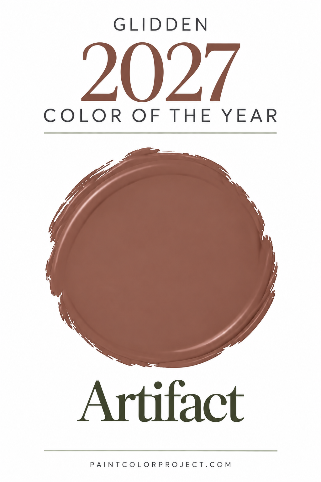
Artifact is a muted blue with gray and subtle aqua influences, giving it a calm, sophisticated appearance.
It's the kind of color that adds personality to a room without demanding too much attention.
If you've been drawn to blue-gray paint colors but want something that feels a little more current, Artifact is definitely worth exploring.
I could see it working beautifully in bedrooms, bathrooms, living rooms, and even on cabinetry.
Pair it with warm whites, natural wood tones, and earthy accents to keep the room feeling balanced rather than overly cool.
Glidden's 2027 Color Trends Palette
Glidden has also introduced nine coordinating colors to complement Artifact.
The collection combines cool blues with warm neutrals, earthy greens, and rich accent shades.
Glidden 2027 Color Trends Palette:
- Artifact PPG10-16 – A soft, smoky blue with subtle aqua influences.
- Airy PPG1238-1 – A pale, airy blue that feels fresh and light.
- Smoky Slate PPG1028-4 – A muted, earthy gray-green.
- Autumn Fern PPG1114-7 – A rich, olive-inspired green.
- Toffee Crunch PPG1207-4 – A warm, golden tan.
- Clam Shell PPG1023-6 – A soft, earthy neutral.
- Capuccino PPG16-04 – A warm brown with a natural feel.
- Juniper Berry PPG1145-6 – A deep, muted blue-green.
- Carob Chip PPG1047-7 – A rich, dark brown with subtle red undertones.
- Warm Mahogany PPG1060-7 – A deep, warm reddish-brown that was Glidden's 2026 Color of the Year.
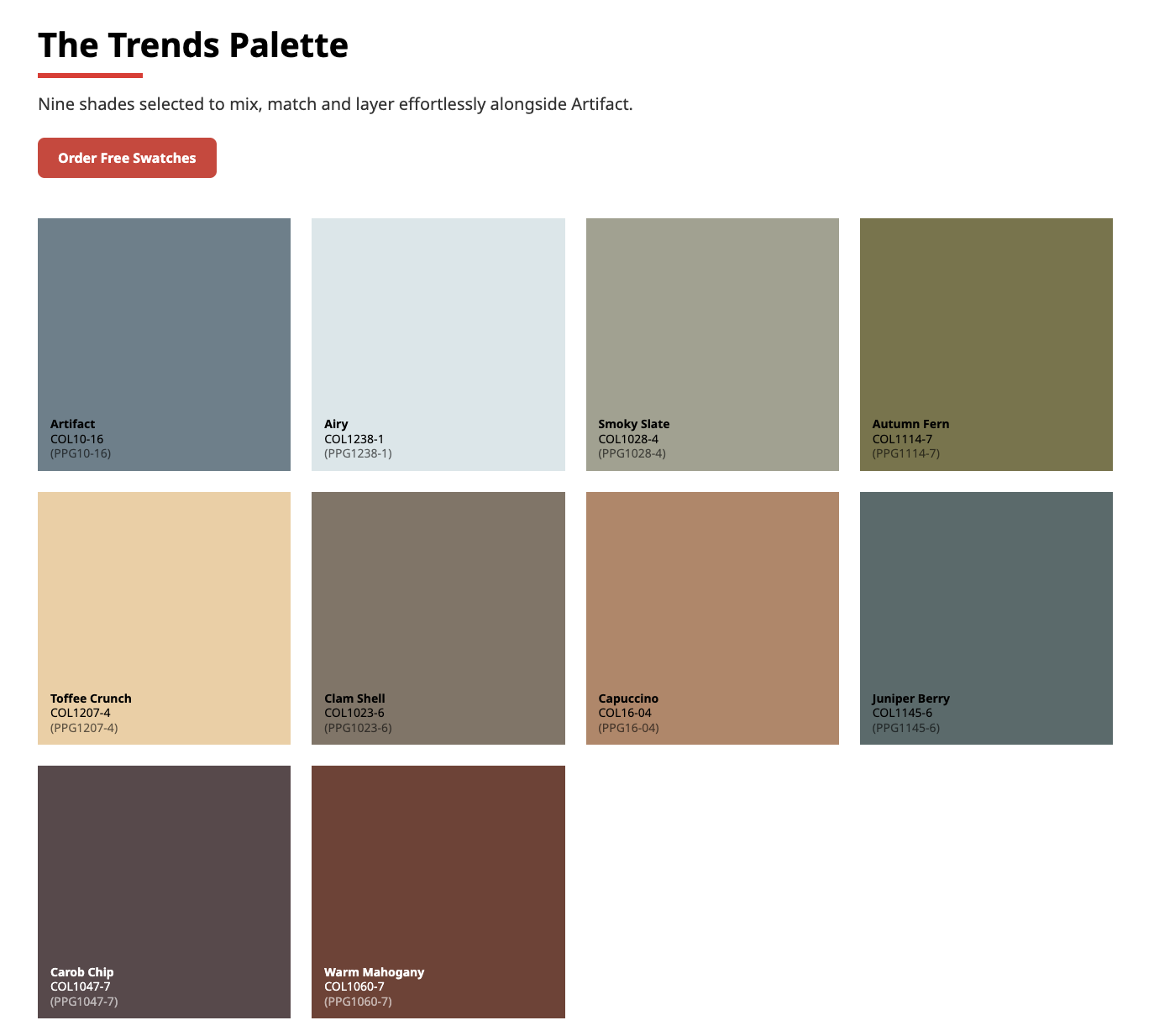
What I love about this collection is the balance between cool and warm colors.
Artifact and Airy bring a peaceful, fresh feeling, while shades like Toffee Crunch and Warm Mahogany add warmth and depth.
This is a great example of how blue doesn't have to make a room feel cold.
When paired with warm neutrals, wood tones, and earthy accents, blue can feel just as cozy and welcoming as green or beige.
Coloro's 2027 Color of the Year: Luminous Blue
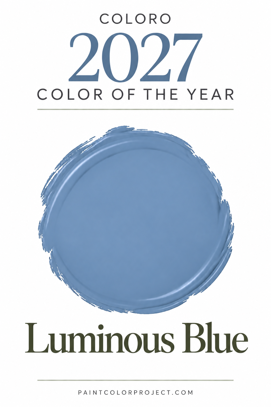
Global trend forecasters Coloro and WGSN have selected Luminous Blue as their Color of the Year for 2027, and it's a much bolder direction than many of the major paint brands.
Unlike the soft, muted blues and earthy greens we've seen so far, Luminous Blue is a vibrant, electric blue that makes a statement.
It's energetic, expressive, and designed to stand out.
While this isn't a traditional paint-brand Color of the Year, it's an interesting indication of where broader design trends may be headed.
We're seeing more interest in personality-filled interiors, and that includes the return of brighter, more saturated colors.
Luminous Blue could be especially fun in smaller doses, such as:
- A statement piece of furniture
- A bold accent wall
- A colorful home office
- Decorative accessories or artwork
- A playful powder room
You don't necessarily need to paint an entire room electric blue to embrace this trend.
Even a few colorful accents can bring a fresh, unexpected element into an otherwise neutral space.
Coloro's Key Colors for Spring/Summer 2027
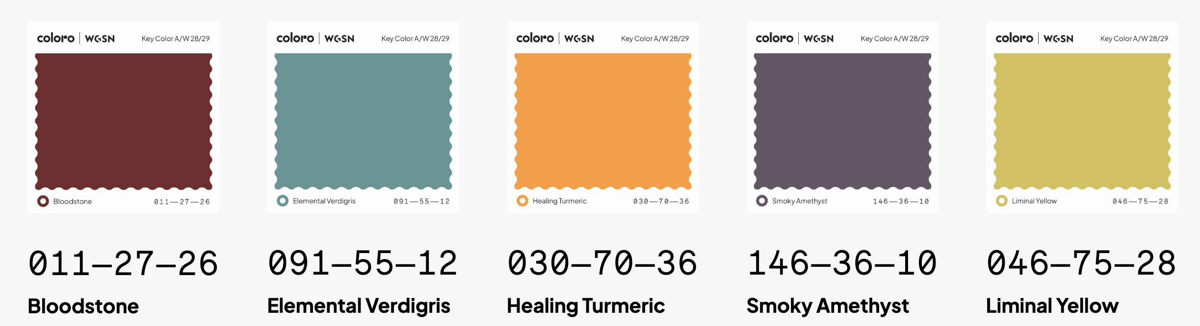
Alongside Luminous Blue, Coloro and WGSN announced five key colors for Spring/Summer 2027.
These shades reflect a combination of natural influences, creativity, and playful expression.
- Luminous Blue: A vibrant, electric blue that feels energetic and expressive.
- Energy Orange: A bold, bright orange that brings warmth and excitement.
- Pop Pink: A cheerful, saturated pink that adds a playful touch.
- Meadowland Green: A fresh, natural green that feels restorative and peaceful.
- Clay: A warm, pink-toned earthy neutral with a soft, grounded quality.
While some of these colors are bolder than what most homeowners would choose for an entire room, they offer plenty of inspiration for accents and smaller projects.
For example, Clay could translate beautifully into a warm, muted wall color, while Meadowland Green fits right into the growing popularity of natural greens.
And for anyone who loves a little personality in their decorating, Pop Pink or Energy Orange could be fun accent colors.
Our Predictions for 2027 Paint Color Trends
Looking at all of these official announcements together, there are some clear themes emerging.
While every brand has its own interpretation, these are the color families I expect we'll be seeing more of throughout 2027.
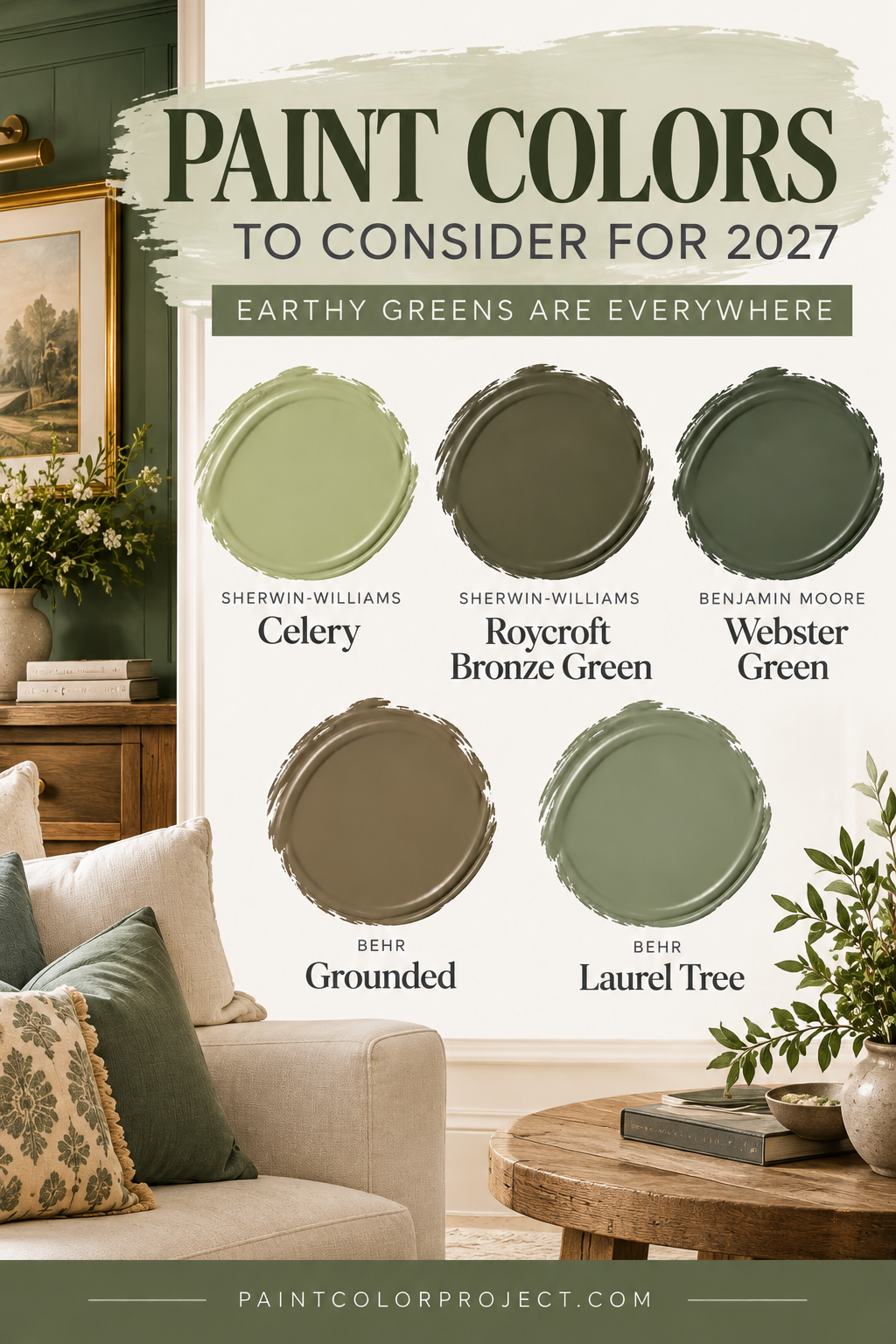
1. Earthy Greens Are Everywhere
If there's one standout paint color trend for 2027, it's green.
From Benjamin Moore's classic Webster Green to Behr's earthy Grounded and Sherwin-Williams' fresh Celery, green is showing up in just about every form.
We're seeing everything from soft, yellow-leaning herbal greens to rich olives and traditional midtone shades.
The best part is that green can work with so many different decorating styles.
Soft greens feel fresh and calming, while deeper greens bring sophistication and warmth.
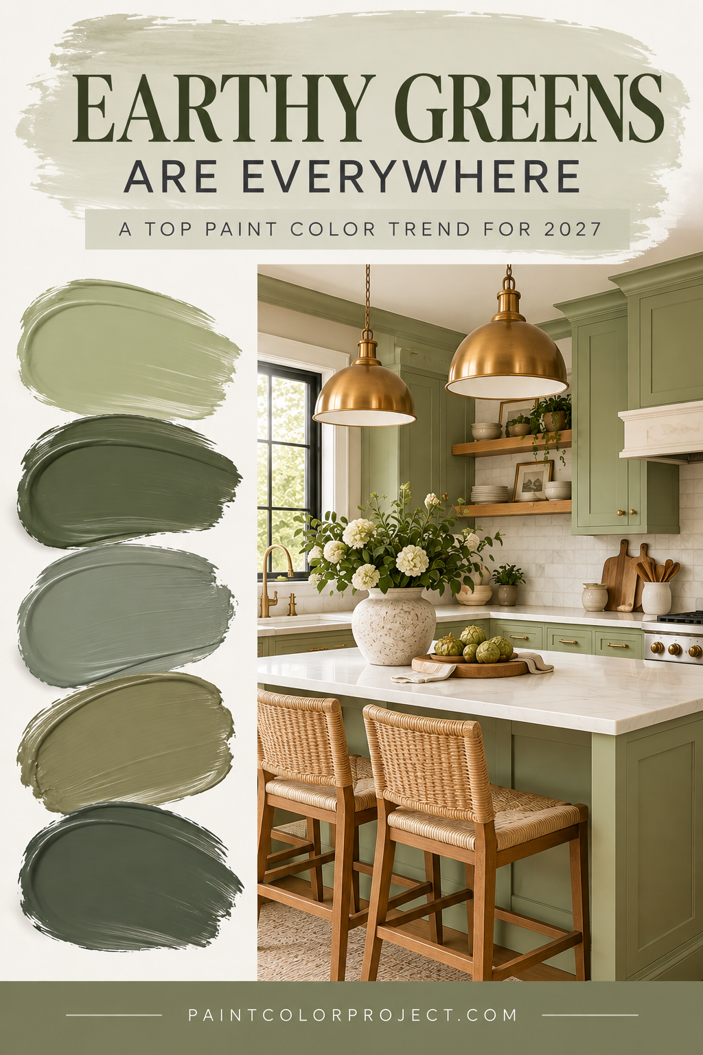
Paint colors to consider:
- Sherwin-Williams Celery
- Sherwin-Williams Roycroft Bronze Green
- Benjamin Moore Webster Green
- Behr Grounded
- Behr Laurel Tree
2. Warm Browns and Earthy Neutrals
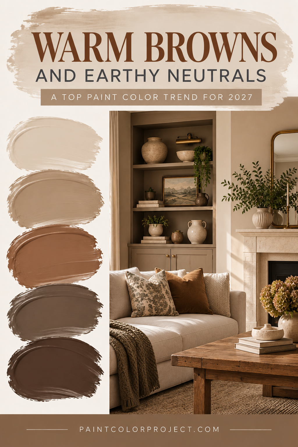
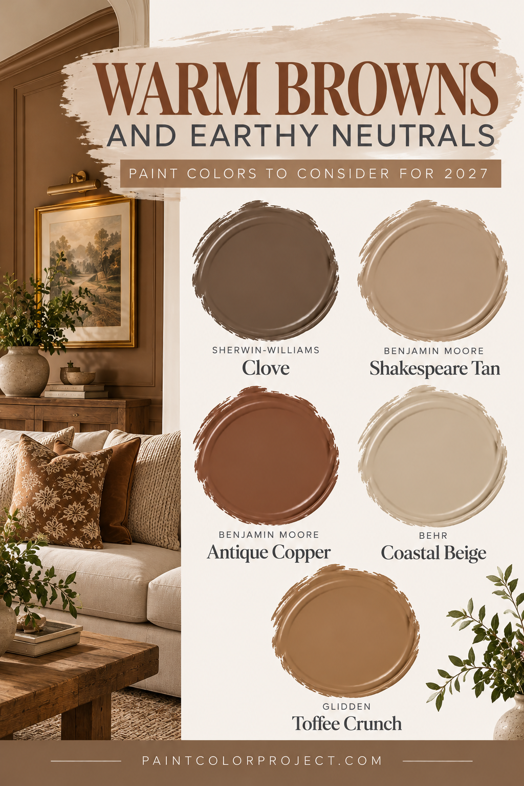
Cool grays have been fading from the spotlight for several years, and 2027 continues the movement toward warmer, more natural neutrals.
We're seeing rich browns, golden tans, mushroom tones, and earthy shades that add warmth without feeling too bold.
These colors pair beautifully with natural wood, stone, and traditional furnishings.
They're also a great way to make a room feel cozy without choosing a particularly dark or dramatic color.
Paint colors to consider:
- Sherwin-Williams Clove
- Benjamin Moore Shakespeare Tan
- Benjamin Moore Antique Copper
- Behr Coastal Beige
- Glidden Toffee Crunch
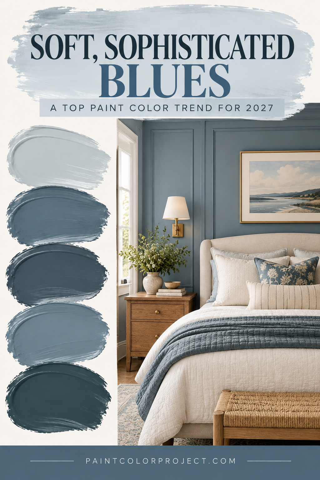
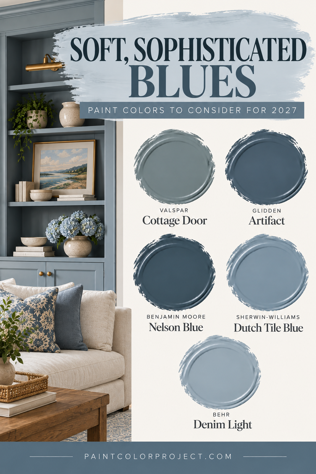
3. Soft, Sophisticated Blues
Blue isn't going anywhere, but the shades we're seeing for 2027 feel a little softer and more nuanced.
Instead of bright coastal blues or icy blue-grays, we're seeing muted blues with warmer undertones and slightly smoky finishes.
These colors feel peaceful and timeless, making them especially appealing for bedrooms, bathrooms, and living spaces.
Paint colors to consider:
- Valspar Cottage Door
- Glidden Artifact
- Benjamin Moore Nelson Blue
- Sherwin-Williams Dutch Tile Blue
- Behr Denim Light
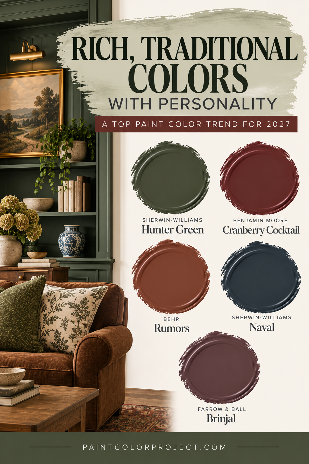
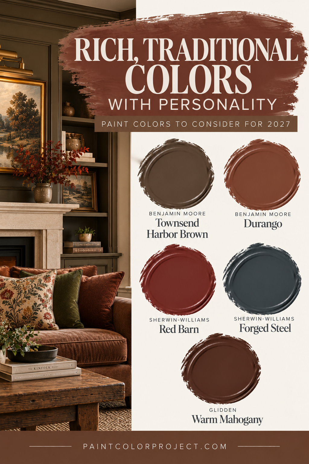
4. Rich, Traditional Colors With Personality
Another major trend for 2027 is the return of classic, heritage-inspired colors.
Think deep greens, burgundy browns, warm reds, and sophisticated charcoals.
These shades bring depth and personality to a space, especially when paired with traditional furnishings, vintage accents, and natural materials.
They're particularly beautiful in dining rooms, libraries, home offices, and other spaces where you want a cozy, collected feeling.
Paint colors to consider:
- Benjamin Moore Townsend Harbor Brown
- Benjamin Moore Durango
- Sherwin-Williams Red Barn
- Sherwin-Williams Forged Steel
- Glidden Warm Mahogany
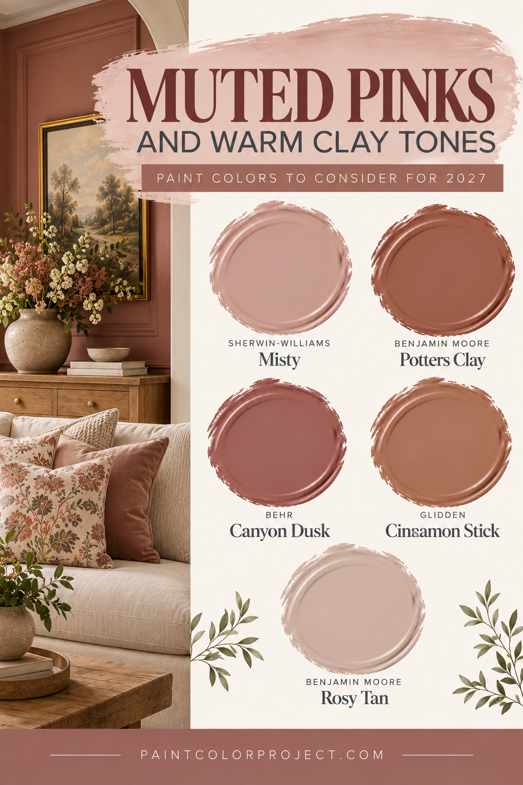
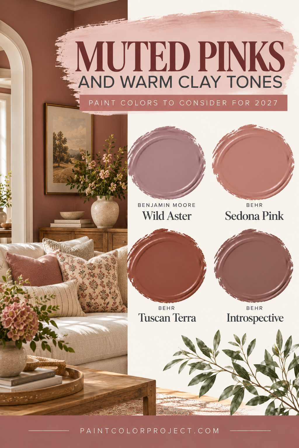
5. Muted Pinks and Warm Clay Tones
Pink is also getting a more sophisticated update for 2027.
Instead of bright bubblegum pink, we're seeing softer, earthier shades with gray, beige, or terracotta influences.
These colors can feel surprisingly neutral, especially when paired with warm whites, wood furniture, and natural textures.
They're a beautiful option for bedrooms, nurseries, and even living rooms.
Paint colors to consider:
- Benjamin Moore Wild Aster
- Behr Sedona Pink
- Behr Tuscan Terra
- Behr Introspective
6. Creamy Whites Are Still Going Strong
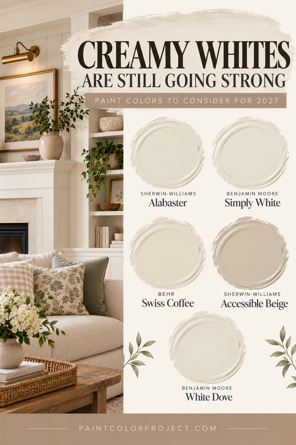
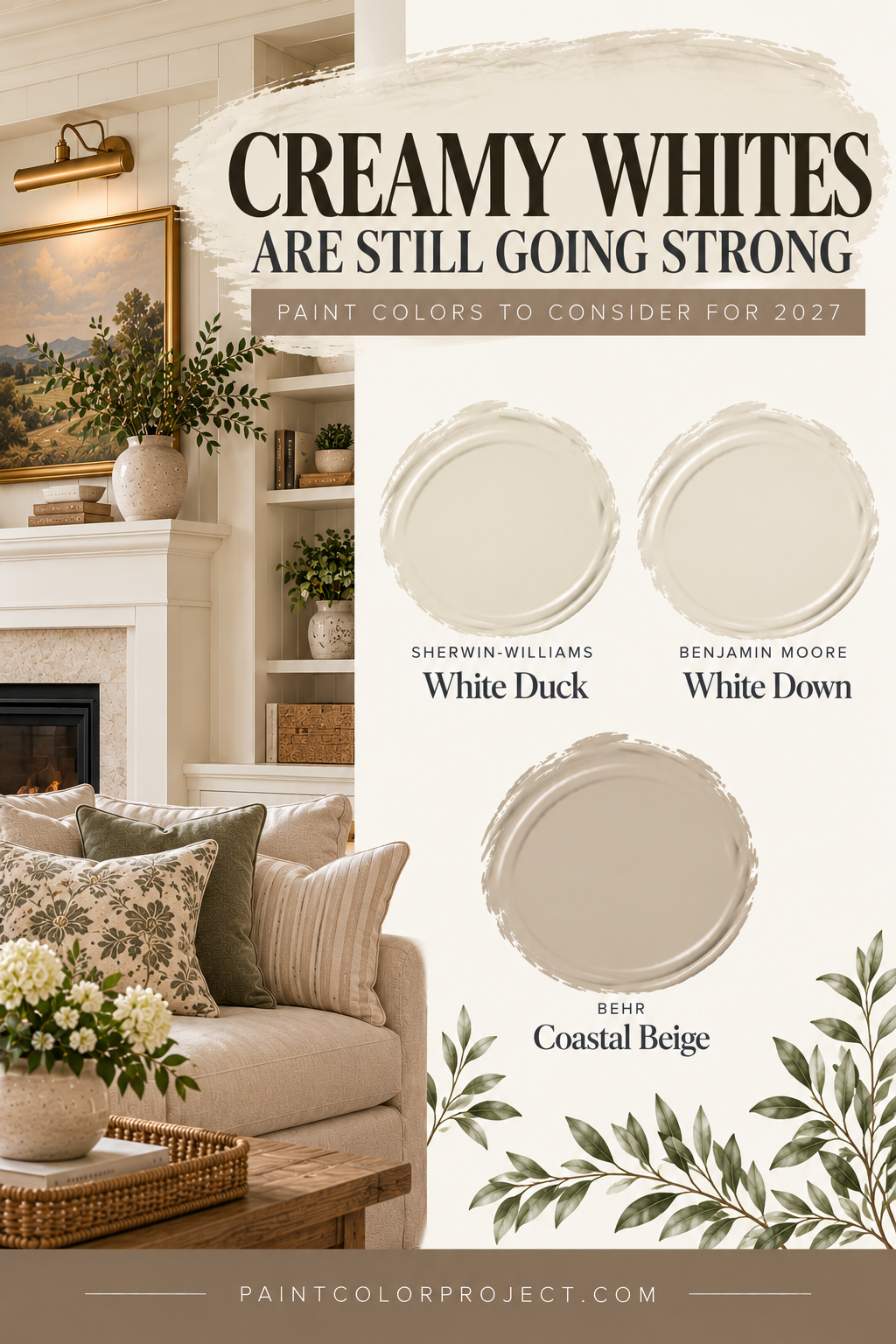
Even with all of the color we're seeing for 2027, warm whites are still an important part of the conversation.
But instead of crisp, stark whites, the trend continues toward softer shades with creamy, beige, or warm undertones.
These colors create a welcoming foundation and pair beautifully with the richer greens, browns, and blues we're seeing this year.
If you're not ready to commit to a bold paint color, a warm white can still make your home feel fresh and current.
Paint colors to consider:
- Sherwin-Williams White Duck
- Benjamin Moore White Down
- Behr Coastal Beige
How to Use 2027 Paint Color Trends in Your Home
You don't have to repaint your entire house to embrace a new color trend.
In fact, some of the best ways to incorporate trending colors are through smaller projects or carefully chosen accent colors.
Here are a few ideas:
- Try a colorful front door. A rich green like Webster Green can add personality and curb appeal without changing your entire exterior.
- Paint a piece of furniture. An old dresser, side table, or bookshelf is a great place to experiment with a deeper or brighter color.
- Update kitchen or bathroom cabinetry. Earthy greens and sophisticated blues can bring new life to a space without a complete renovation.
- Create a cozy room with color drenching. Painting the walls, trim, and even ceiling the same shade can make a room feel intentional and inviting.
- Use trending colors as accents. Pillows, artwork, curtains, and accessories are easy ways to try a new color before committing to paint.
And remember, just because a color is trending doesn't mean it's right for every room.
A deep green might look beautiful in a bright living room but feel much darker in a small bedroom with limited natural light.
Likewise, a soft blue might look perfectly balanced in one home but pull cooler than expected next to warm flooring or cabinetry.
That's why sampling is always such an important step.
Should You Paint With a Trending Color?
Trendy colors can be fun, and sometimes they're exactly what your home needs.
But don't feel like you have to choose a Color of the Year just because a major paint brand says it's popular.
The best paint color for your home is one that works with your space and makes you happy every time you walk into the room.
Before choosing a trending paint color, make sure it:
- Works with your room's natural and artificial lighting.
- Complements your flooring, countertops, cabinets, and other existing finishes.
- Coordinates with the colors in nearby rooms.
- Fits your personal decorating style.
- Makes your home feel the way you want it to feel.
And most importantly, always sample your paint colors before committing!
I love using Samplize peel-and-stick paint samples because they're easy to move around your room.
You can place them next to your flooring, cabinets, countertops, and furniture to see how the colors work with everything you already own.
Move them to different walls and check them throughout the day, too. Paint colors can look surprisingly different in morning sunlight versus evening artificial lighting.
It's a simple step that can save you from choosing a color you don't love.
Final Thoughts on 2027 Paint Color Trends
The biggest paint color trends for 2027 are all about warmth, personality, and creating spaces that feel comfortable and collected.
Green is definitely the standout color family, but we're also seeing beautiful blues, rich browns, warm neutrals, and softer, more expressive accent colors.
What I love most about this year's trends is that they encourage homeowners to choose colors they genuinely enjoy rather than trying to create a perfectly neutral space.
Whether you're drawn to a deep, traditional green, a calming blue, or a simple creamy white, there's plenty of inspiration to help you find a color that feels right for your home.
And remember, the goal isn't to have the trendiest house on the block.
It's to create a home you love.
Need help picking a paint color?
✨ Grab my No-Fail Paint Color Jumpstart Guide — it walks you through exactly how to choose a paint color you'll love, with step-by-step guidance and practical examples to make the process easier.
Still unsure which paint color is right for your space?
Choosing paint doesn’t have to be stressful! My free Paint Color Planning Quick Start Guide walks you through the exact steps to confidently choose the perfect color — without the overwhelm, second-guessing, or endless swatch testing.
👉 Click here to download the free guide!
DIYing Your Paint Job? Start Here.
Choosing a paint color is only half the equation — the tools you use matter just as much. I’ve rounded up the painting supplies we rely on for clean lines, smooth finishes, and less frustration overall.

My Paint Color Formula course walks you through the painless process of expertly testing paint swatches to ensure you have the perfect color for your home.
The best way to sample paint? Samplize!
Get peel-and-stick removable and reusable paint samples here!
Thanks for reading!
Morgan is passionate about home decor and paint colors. She has been sharing DIY home decor tips since 2012 at CharlestonCrafted.com. From there, she learned to love paint colors, and the Paint Color Project was born in 2022!