Looking for the perfect fisherman aesthetic paint colors? This guide shares the best blues, neutrals, whites, and greens to bring a rugged coastal vibe into your space.
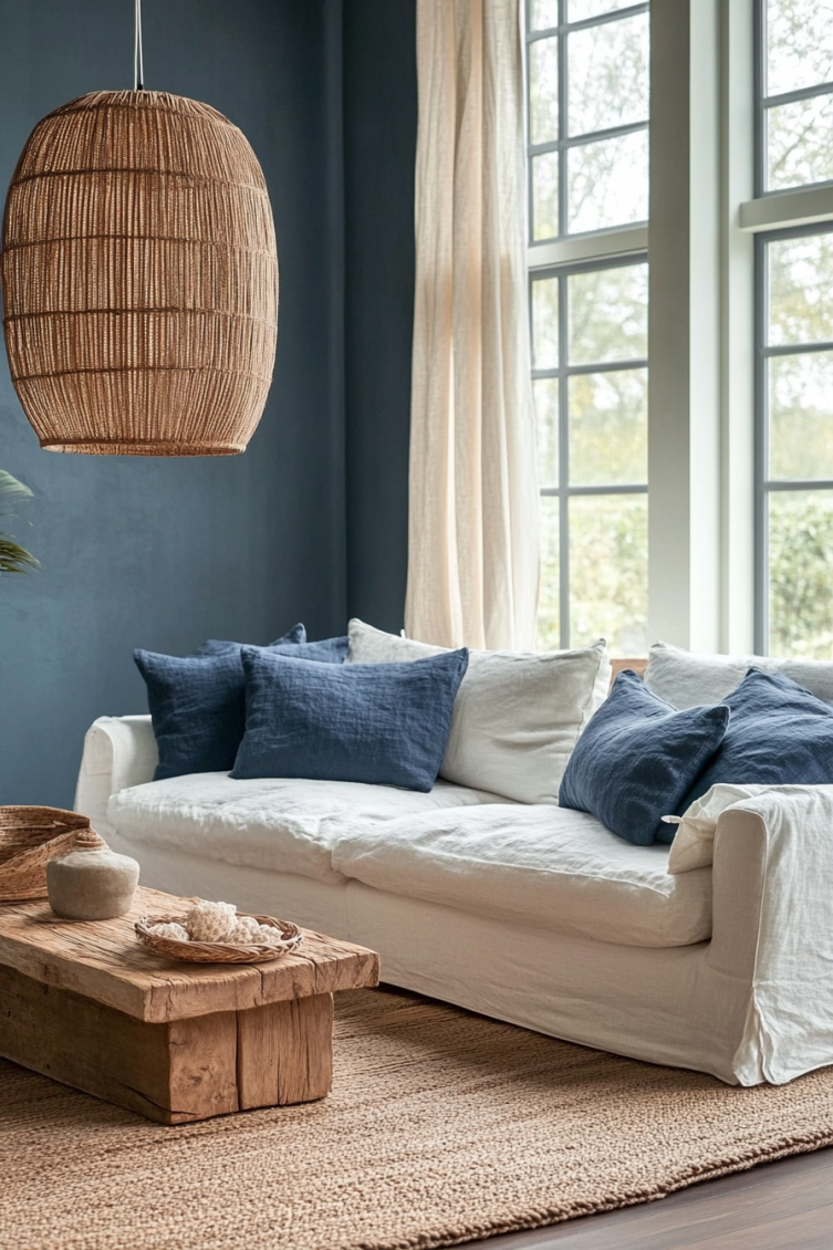
If you love salty air, weathered docks, and old raincoats hanging by the door, the fisherman aesthetic might be exactly what you are looking for.
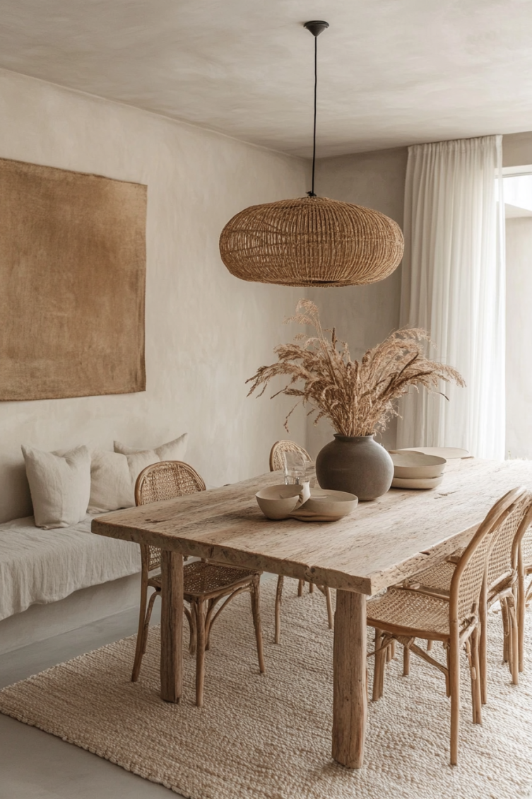
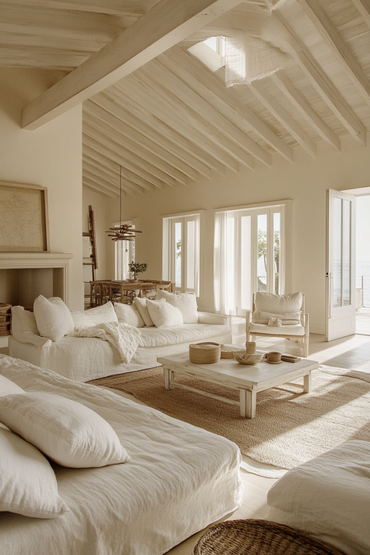
It is coastal, but not the polished, beachy kind. This look is all about texture, grit, and comfort.
When I picture it, I see a small fishing cottage in Maine or the cabin of a working boat, filled with chipped paint, faded wood, and the kind of warmth that only comes from years of living.
Paint is one of the easiest ways to create this feeling in your home.
You will want shades that feel a little aged: stormy blues, soft driftwood neutrals, foggy whites, and natural greens.
Nothing should feel too crisp or brand new. The goal is a space that feels relaxed, worn-in, and deeply connected to the outdoors.

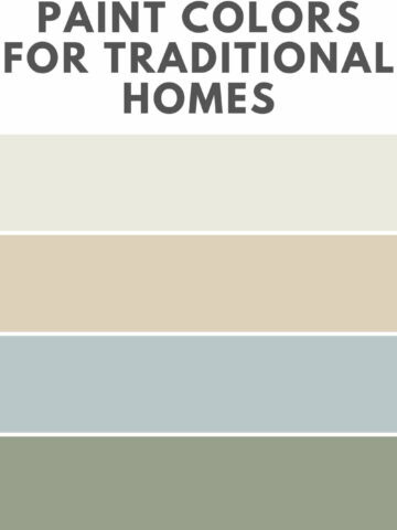
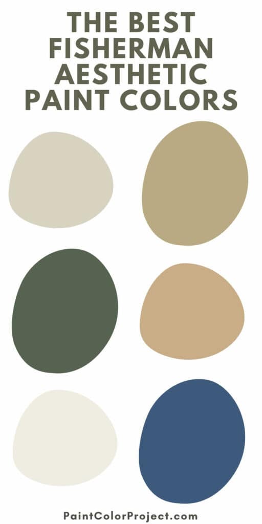
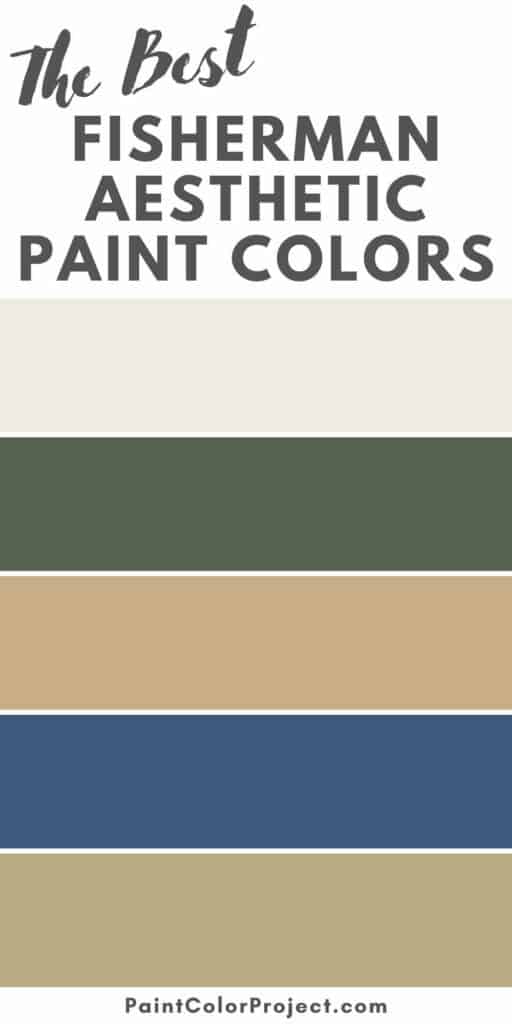
The Best Fisherman Aesthetic Paint Colors
I pulled together my favorite paints that fit this look. I grouped them by color family to make it easier for you to mix and match.
Stormy Blues & Faded Navy
Blues are a key part of the fisherman style. They bring that deep, weathered feeling of the ocean and the sky, helping create a cozy and grounded space.
- Charcoal Blue – Sherwin-Williams
A muted navy with cool undertones. It is bold but never overwhelming, perfect for built-ins, kitchen islands, or accent walls. - Hale Navy – Benjamin Moore
A rich, classic navy that adds depth without feeling too dark. It is one of those timeless shades that always looks right. - Admiral Blue – Behr
A traditional, slightly vintage blue that feels like an old raincoat or a boat hull faded by the sun.


Driftwood Neutrals
Driftwood neutrals keep the space soft and natural. They remind me of dried rope, sun-bleached decks, and weathered wooden piers.
- Edgecomb Gray – Benjamin Moore
A soft greige that shifts between gray and beige depending on the light. It is a flexible, easy neutral that works anywhere. - Natural Linen – Sherwin-Williams
A creamy oat color that brings warmth and an easygoing feel, like a worn canvas sail. - Perfect Tan – Behr
A sandy neutral with a little more depth. It pairs beautifully with navy or olive accents to create a relaxed coastal look.


Cloudy Whites
For this style, you want whites that feel soft and inviting. Stay away from anything too bright or sterile.
- White Dove – Benjamin Moore
A warm, creamy white that stays fresh without feeling cold. It is great for trim, walls, or even cabinetry. - Greek Villa – Sherwin-Williams
A neutral white that feels cozy and timeless. It looks beautiful next to natural wood and vintage textures. - Cotton Knit – Behr
A mellow off-white that feels like a well-loved fisherman’s sweater. It adds quiet warmth to any room.


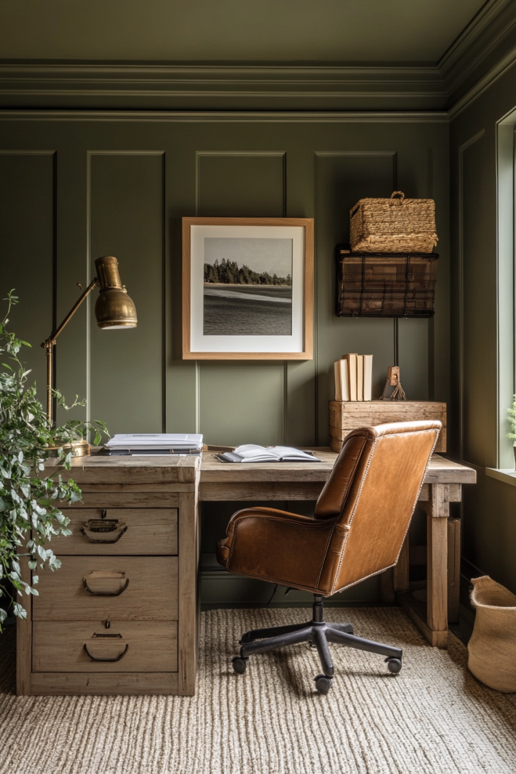
Mossy Greens & Dockside Olives
Greens bring in the rugged beauty of the outdoors. They make me think of marsh grass, raincoats, and misty mornings by the harbor.
- Ripe Olive – Sherwin-Williams
A deep olive green that pairs perfectly with creamy whites and weathered wood tones. - Backwoods – Benjamin Moore
A rich, mossy green that feels earthy and strong. It is perfect for accent walls, mudrooms, or kitchens. - Fennel Seed – Behr
A soft green-gray that adds a vintage touch. I love this shade for cabinetry or built-ins if you want something a little different.


Final Thoughts on Creating the Fisherman Aesthetic
The fisherman aesthetic is all about creating a home that feels easy, worn-in, and full of life.
You want it to feel like you just came in from a long day on the water, boots off, jacket hung up, coffee brewing on the stove.
Choosing the right colors is the first step. Pick shades that feel a little faded, a little softened by time, and you will instantly bring that salty, welcoming energy into your space.
Whether you paint a full room, add an accent wall, or even update a piece of furniture, these colors will help you create a home that feels natural, relaxed, and rich with stories.
I hope you find a few favorites here. Can't wait to see how you bring this look to life!
Need More Help?
Check out The No-Fail Paint Color Jumpstart—it’s the shortcut to confidently choosing the right paint color for your home, with way less second-guessing.
Still unsure which paint color is right for your space?
Choosing paint doesn’t have to be stressful! My free Paint Color Planning Quick Start Guide walks you through the exact steps to confidently choose the perfect color — without the overwhelm, second-guessing, or endless swatch testing.
👉 Click here to download the free guide!

My Paint Color Formula course walks you through the painless process of expertly testing paint swatches to ensure you have the perfect color for your home.
The best way to sample paint? Samplize!
Get peel-and-stick removable and reusable paint samples here!
Thanks for reading!

Morgan is passionate about home decor and paint colors. She has been sharing DIY home decor tips since 2012 at CharlestonCrafted.com. From there, she learned to love paint colors, and the Paint Color Project was born in 2022!