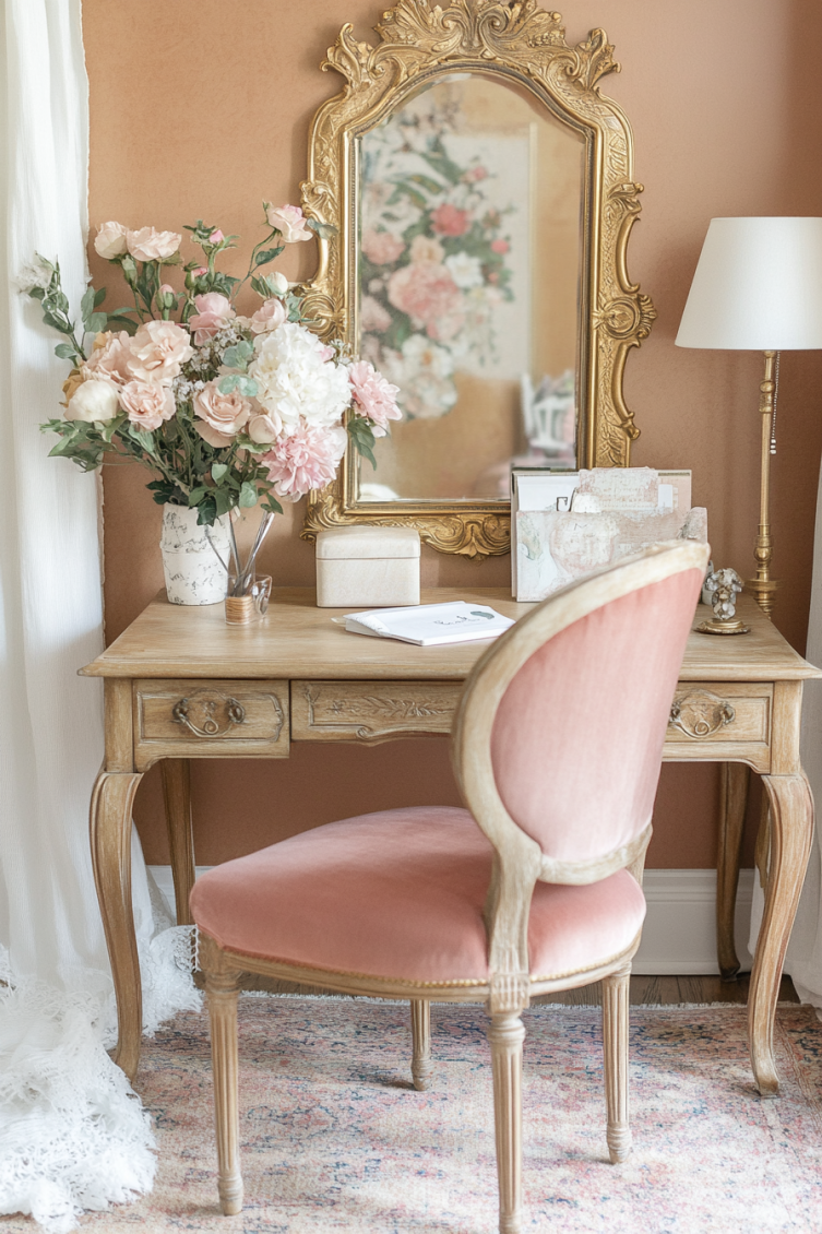
Coquette aesthetic paint colors are soft, feminine, and just a little flirty. They bring that dreamy, vintage-meets-modern charm into any room.
When I first heard “coquette aesthetic,” I’ll admit, I pictured lace gloves and TikTok teens twirling in tulle. But it’s more than that.
Coquette is all about soft femininity, romantic nostalgia, and a slightly vintage elegance with a modern twist.
Imagine if Marie Antoinette had a Pinterest board and a Paris apartment in the '90s. Toss in a little Lana Del Rey moodiness and a sprinkle of Taylor Swift romance, and that’s the vibe.
The colors? Think creamy whites, dusty pinks, muted lavenders, and sometimes a deeper tone or two to balance it all out.
If you love floral prints, antique mirrors, and that “found this at a Paris flea market” feel, then the coquette look will feel like home.
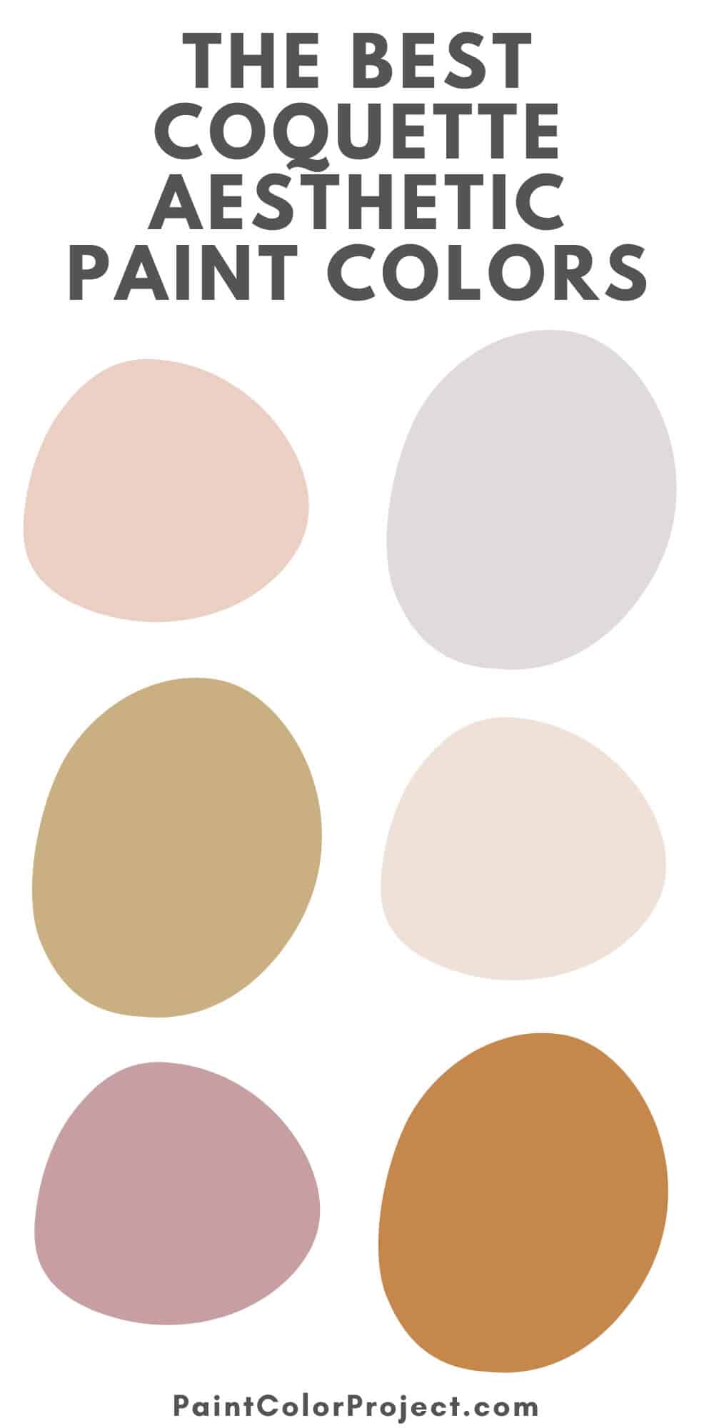
Coquette Aesthetic Paint Colors for Your Home
Here are my favorite paint colors to help you nail the coquette look, organized by color family.
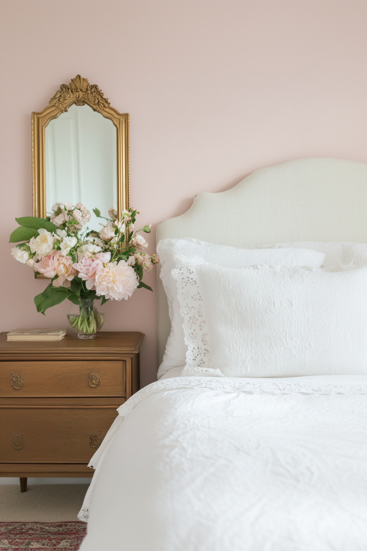
Soft Pinks & Blush Tones
The heart of the coquette palette — sweet, subtle, and always charming. These colors add that soft, rosy glow to a room without feeling too sugary.
I love them in bedrooms or bathrooms for a gentle, romantic feel.
- Sherwin Williams – Romance
A true soft pink that feels airy and delicate without being too sugary. Lovely on walls or even a ceiling. - First Light – Benjamin Moore
A very pale, barely-there pink with a clean, modern finish. A great way to nod to the aesthetic without going full bubblegum. - Intimate White – Sherwin-Williams
A creamy blush with a peachy undertone, it feels warm and flattering in just about any light. I love it in cozy spaces.


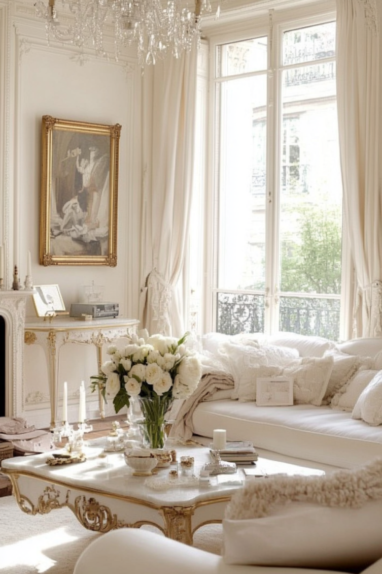
Creams & Ballet Neutrals
These warm, soft tones keep the palette grounded and pair beautifully with pinks and florals. They create that light, airy backdrop that makes everything else feel calm and cozy.
If you’re not sure where to start, this is a safe and timeless choice.
- Swiss Coffee – Behr
A creamy, slightly warm white that’s perfect for trim, walls, or furniture. It adds softness without washing out a room. - Alabaster – Sherwin-Williams
Cozy and versatile, this white has enough softness to feel romantic but still works as a neutral backdrop. - Seashell – Benjamin Moore
A ballet slipper beige-pink that reads soft and sweet, with a vintage vibe.


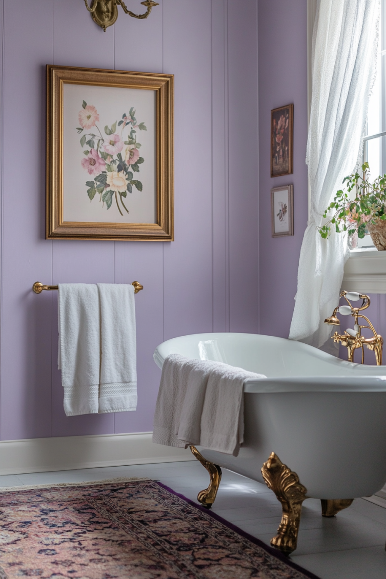
Dusty Lavender & Soft Mauve
These subtle purples bring a vintage femininity that feels both elegant and whimsical. They’re perfect if you want something romantic but not overly pink.
I used one of these shades in a guest room once, and it totally transformed the space.
- Misty Lilac – Benjamin Moore
A pale lavender with just enough gray to keep it calm. I love it in bedrooms or soft, spa-like bathrooms. - Hint of Violet – Benjamin Moore
A muted lavender that adds color without overwhelming. It pairs beautifully with gold and blush accents. - Lite Lavender – Sherwin-Williams
Cool-toned and calming, this shade brings just a touch of pastel charm.


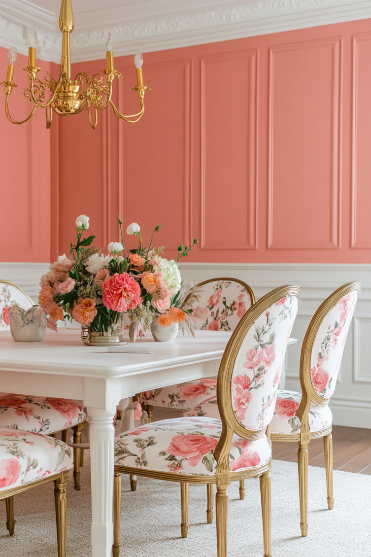
Rosy Corals & Peachy Pinks
For a slightly bolder, flirtier take on the aesthetic — still soft, but with a little more personality. These shades have a fresh, playful energy and look gorgeous with gold accents or vintage wood pieces.
- Rose Embroidery – Sherwin Williams
A peachy rose that’s perfect for an accent wall, front door, or even cabinetry. - Coral Dust – Benjamin Moore
A pink-coral hybrid that feels vintage and bright, like a 1950s lipstick. It’s great for small pops of color. - Pink Bliss – Benjamin Moore
A soft, sweet coral-pink that looks amazing paired with antique white furniture.


Antique Golds & Warm Accents
These deeper hues help ground the pastel palette and add a little richness and drama. A touch of gold or a warm accent wall can keep the room from feeling too delicate.
I’ve found they really make vintage furniture and floral fabrics pop.
- Tassel – Sherwin-Williams
A soft, golden ochre that adds warmth without stealing the show. It works beautifully with warm neutrals. - Perennial Gold – Behr
A muted antique gold that looks beautiful with blush, ivory, and brass fixtures. - Straw – Benjamin Moore
This sunny neutral brings a vintage warmth that fits right into the coquette vibe.


Before you go
Coquette paint colors are soft, romantic, and just plain pretty. They’re perfect if you want your space to feel a little vintage and a little flirty.
You don’t have to go all-in with pink walls either. Even just a hint of blush or lavender can totally change the vibe of a room.
Pair these shades with antique furniture, floral prints, or soft bedding, and you’ve got yourself a cozy, feminine escape.
Need More Help?
Check out The No-Fail Paint Color Jumpstart — it’s the shortcut to confidently choosing the right paint color for your home, with way less second-guessing.

Still unsure which paint color is right for your space?
Choosing paint doesn’t have to be stressful! My free Paint Color Planning Quick Start Guide walks you through the exact steps to confidently choose the perfect color — without the overwhelm, second-guessing, or endless swatch testing.
👉 Click here to download the free guide!

My Paint Color Formula course walks you through the painless process of expertly testing paint swatches to ensure you have the perfect color for your home.
The best way to sample paint? Samplize!
Get peel-and-stick removable and reusable paint samples here!
Thanks for reading!
Morgan is passionate about home decor and paint colors. She has been sharing DIY home decor tips since 2012 at CharlestonCrafted.com. From there, she learned to love paint colors, and the Paint Color Project was born in 2022!

