Thinking of trying a blue-gray paint color in your home? Let's look into Benjamin Moore Van Courtland Blue to see if it might be perfect for your space.
Many people's favorite color is blue. After all, blue is peaceful and calm, the color of the ocean, the color of blue jeans. Blue makes a lot of us happy!
That’s probably why blue is such a popular choice for walls. But some blues can feel a bit too bright or intense.
If you're worried about brightness, a great trick is picking a blue with some gray mixed in. A blue-gray gives you that color you love, without overwhelming your space.
Mid-toned blue-grays like Van Courtland Blue are especially nice. They add just enough color without feeling too bold or too loud.
The slight gray these colors helps to tone down the brightness of the blue, making it soothing and calming.
So if you're looking for a cheerful yet peaceful blue-gray, Van Courtland Blue might be just right.
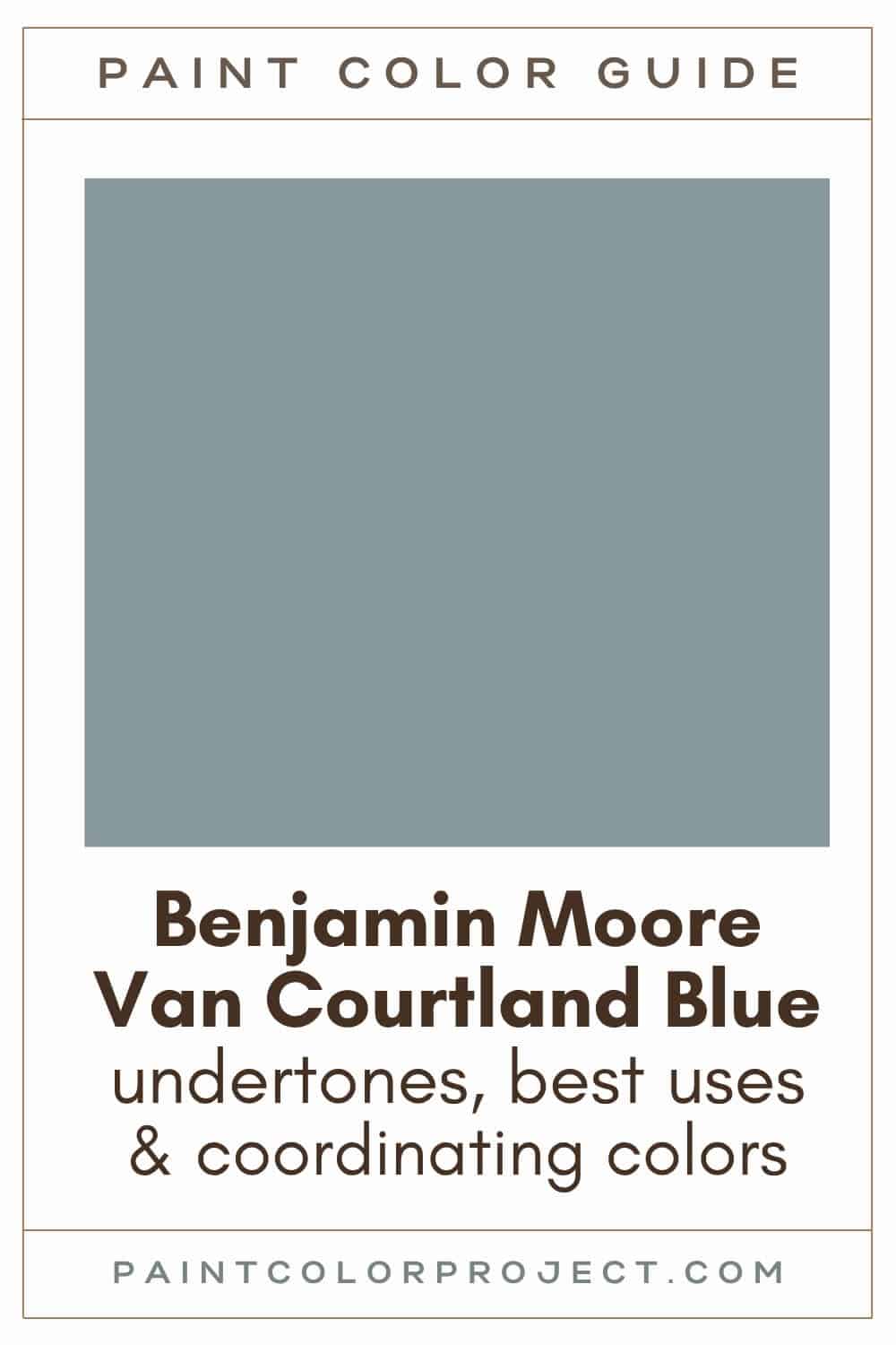
Van Courtland Blue, Benjamin Moore, CH-145
Van Courtland Blue is a mid-tone blue-gray with just a touch of green hiding inside. It’s soothing, cozy, and perfect if you love calm, coastal vibes or even something a bit more traditional.
Click here to get a peel and stick sample of Van Courtland Blue
Color Family
Van Courtland Blue falls into the neutral color family.
Light Reflectance Value
31
LRV, or Light Reflectance Value, shows how much light a paint color reflects. It runs from 0 (pure black) to 100 (pure white).
With an LRV of 31, Van Courtland Blue is comfortably in the middle. Not too dark, not too light, just a balanced medium shade. I find it perfect for bedrooms or living rooms when you want to feel relaxed but not overwhelmed by color.
RGB Colors
R: 134 G: 152 B: 158
RGB numbers show the amount of red, green, and blue mixed together. These numbers range from 0 to 255 and give you the exact formula to make this shade.
Hex Code
#86989E

Undertones
Van Courtland Blue has subtle green undertones beneath its blue-gray base.
In sunny, south-facing rooms, it looks warmer and lighter, with a touch of green that might lean slightly teal. In my own home, it added just the right cheerful pop in our bright dining area.
But in north-facing rooms or those without much natural light, Van Courtland Blue feels cooler, deeper, and more blue-gray.
Always try paint samples before painting a whole room. See how the color shifts from morning to night in your own space.
Click here to try easy, peel-and-stick paint samples of Van Courtland Blue.
Best Uses
Van Courtland Blue can be used for a whole room or as an accent color. I’d use it for:
- Living rooms, bedrooms, or dens
- Accent wall
- A focal point such as a fireplace or built-ins
- Home exterior
- Interior or exterior doors
- Cabinets
- Furniture
Similar Colors
- Benjamin Moore Province Blue
- Behr Rainy Season
- Sherwin Williams Morning at Sea
- Benjamin Moore Amsterdam
- Behr Lakeview
- Sherwin Williams Poolhouse
- Benjamin Moore Cloudy Sky
Click here to get a peel and stick sample of Van Courtland Blue
🤯 Too many color choices?
Download my free Paint Color Planning Quick Start Guide — it’s the exact method I use to help readers choose a color that works the first time.
📥 Grab it here!
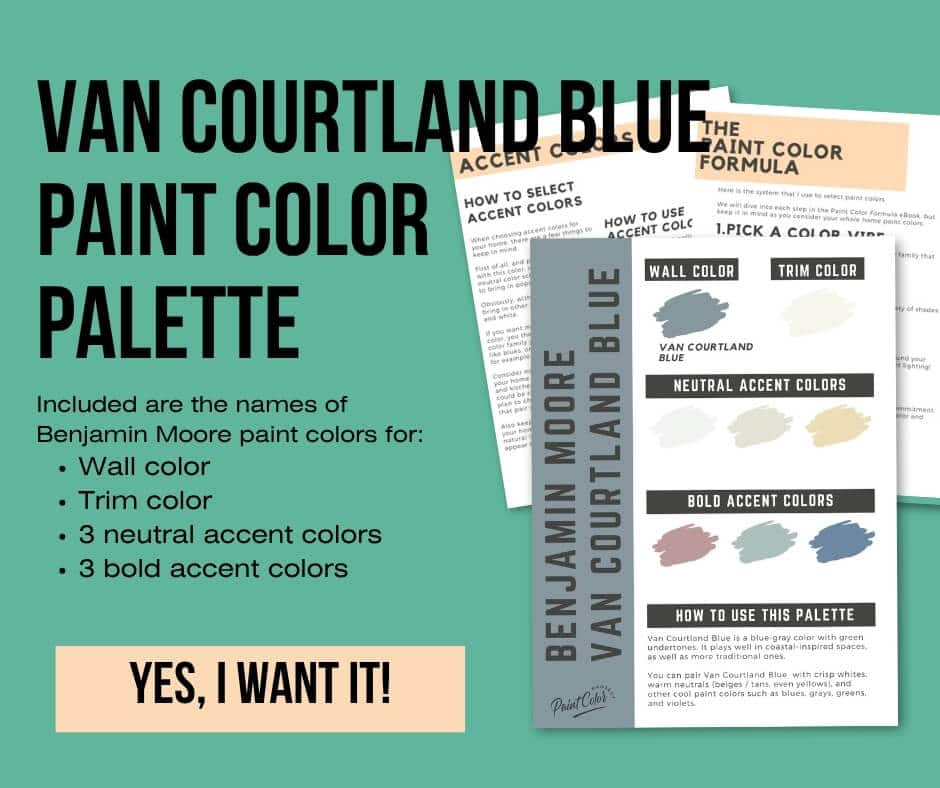
Coordinating Colors
Van Courtland Blue is super flexible. It works really well with crisp whites, warm neutrals like beige, tan, or even soft yellows. You can also pair it with other cool tones like gray, green, violet, or different shades of blue.
Mid-toned blues (lighter than Van Courtland Blue):
- Wedgewood Gray
- Rhine River
- Gossamer Blue
- Yarmouth Blue
- Paradiso
Crisp, soft whites:
- Simply White
- Mountain Peak White
- Cloud White
- Cotton Balls
- Snowfall White
Warm, almost-yellow neutrals:
- Coronado Cream
- Golden Straw
- Standish White
- Summer Harvest
- Consentino Chardonnay
Trim Colors
For trim, stick with a clean white. It makes Van Courtland Blue feel extra calm and cozy. I’ve used it with Benjamin Moore Simply White before, and the combo looked fresh without feeling cold.
- Benjamin Moore Simply White
- Sherwin Williams Extra White
- Behr Ultra Pure White
Van Courtland Blue Paint Color Palette
Want to use this paint color in your home? Instantly upgrade your home's aesthetic with our exclusive paint color palette. Unlock the perfect trim color and six stunning accent colors, a combination of neutrals and bold hues for an instantly harmonious space!
Get your perfect paint color palette by clicking here!
Click here to get a peel and stick sample of Van Courtland Blue
FAQs
Here are some common frequently asked questions about Van Courtland Blue.
What are the undertones of Van Courtland Blue?
Van Courtland Blue is a soft blue-gray with green undertones. It has a calming, coastal feel that looks great in all kinds of spaces.
In my experience, that tiny bit of green is what keeps it from feeling too cold. It adds just enough warmth to balance out the blue.
Is Van Courtland Blue warm or cool?
Van Courtland Blue is definitely a cool paint color. The gray and blue work together to give it that soft, relaxed vibe.
It’s great if you want a room that feels calm and peaceful.
What’s the difference: Water’s Edge vs Van Courtland Blue?
Here’s the fun part. Water’s Edge and Van Courtland Blue are actually the same exact color!
Benjamin Moore just gave them two different names. You might also see it listed as James River Gray. Three names, one paint.

What number is Van Courtland Blue?
The color code for Van Courtland Blue is CH-145.
You might also see it called Water’s Edge (1635) or James River Gray (AC-23). These are all the same shade, just different labels.
If you’re working on a digital project or design board, the hex code is #86989E. Super helpful for matching things online.
Are Van Courtland Blue and Water’s Edge the same color?
Yes, they are. Benjamin Moore uses both names for the same blue-gray with a hint of green.
You can’t go wrong with either name, just know you’re getting the same beautiful color.
What is the RGB for Van Courtland Blue?
The RGB mix is R: 134, G: 152, B: 158.
That just means it has a balanced blend of red, green, and blue to give it that soft, slightly muted look.
Is Van Courtland Blue a blue or a gray?
It’s really a mix of both. Benjamin Moore calls it a neutral, but I think of it more as a blue that’s been gently toned down with gray.
In rooms with lots of sunlight, it’ll look more blue. In darker spaces, the gray comes forward more.
I’ve used it in both kinds of rooms, and it shifts just enough to keep things interesting. That’s why it’s so important to test it in your own home first.
What’s the difference: Santorini Blue vs Van Courtland Blue?
Both are cool, coastal blues, but they’re not the same.
Van Courtland Blue has an LRV of 31, which makes it a bit darker than Santorini Blue, which sits at 45. Van Courtland Blue also has a touch of green and feels more muted.
Santorini Blue leans brighter and more blue. Van Courtland Blue is more laid-back and feels softer overall.
If you're torn between the two, swatching them side by side on your wall will make the choice much easier. You'll see the difference clearly in your own lighting, and that makes all the difference.

Before you go...
So, you've found the perfect paint color, but here's the thing — there's another big decision you have to make: picking the right paint sheen. Seriously, the level of glossiness can totally change how your color looks on the walls and how long the paint lasts!
Check out our complete guide to understanding paint sheens.
Still unsure which paint color is right for your space?
Choosing paint doesn’t have to be stressful! My free Paint Color Planning Quick Start Guide walks you through the exact steps to confidently choose the perfect color — without the overwhelm, second-guessing, or endless swatch testing.
👉 Click here to download the free guide!

My Paint Color Formula course walks you through the painless process of expertly testing paint swatches to ensure you have the perfect color for your home.
The best way to sample paint? Samplize!
Get peel-and-stick removable and reusable paint samples here!
Thanks for reading!

Meg Hemmelgarn is a freelance writer and home decor + DIY blogger who loves to talk about paint colors. She and her husband are currently renovating their third fixer upper. You can see their projects on her blog, Green With Decor.