Thinking about the perfect off-white for your space? Today I'm sharing all about Benjamin Moore Pristine and why it might just be the right pick for your home!
If you're searching for a cozy off-white that still feels fresh and neutral, warm off-whites are a great choice.
They hit that spot between clean simplicity and inviting warmth. I love them beacuse they instantly make a room feel much more inviting, like you actually want to spend time there.
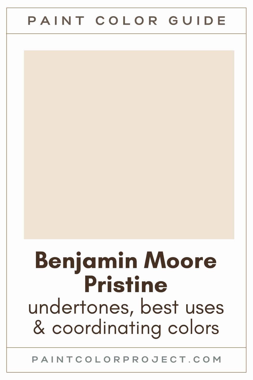
One of my favorite picks in this category is Benjamin Moore Pristine (OC-75). This isn't your average off-white, it's dusty peach undertone gives it a nice subtle depth and warmth.
I think it's actually quite an elegant choice, so let's learn more about BM Pristine in this post!
Benjamin Moore Pristine, Benjamin Moore, OC-75
Pristine is a warm, deeper off-white with a lovely dusty peach undertone. It nicely blends elegance with everyday comfort.
Click here to get a peel and stick sample of Pristine
Color Family
Pristine belongs to the white color family.
Light Reflectance Value
75
Light Reflectance Value (LRV) tells you how much light a paint color reflects. It ranges from 0 (pure black) to 100 (pure white).
Pristine’s LRV is 75, which means it reflects a good amount of light but still has some depth.
Most off-whites sit between 72 and 82, with anything above 82 being closer to a true white.
RGB Colors
R: 240 G: 226 B: 210
RGB represents how much red, green, and blue go into a color. Think of it as the exact recipe for creating this beautiful shade!
Hex Code
#F0E2D2

Undertones
Pristine carries a gentle, dusty peach undertone. Some describe it as reddish, but I find it softer, earthier, and pleasantly muted.
In bright, south-facing rooms with abundant natural light, Pristine appears warmer and sometimes even leans taupe. In darker or north-facing rooms, you'll notice it looks creamier and softer.
Lighting makes a huge difference, so I always suggest swatching it first. Test it thoroughly, day and night, to ensure you love how it looks in your home.
Click here to try easy-to-use, removable peel & stick samples!
Best Uses
This color is so versatile. You could honestly use it as a whole house paint color and not get tired of it. Here are some of my favorite spots:
- Living rooms
- Bedrooms
- Kitchens
- Bathrooms
- Home exterior
- Interior doors
- Cabinets
- Furniture
Similar Colors
Looking for something similar? These colors offer a comparable feel to Pristine:
- Benjamin Moore Gentle Repose
- Behr Chamois Cloth
- Sherwin Williams Alluring White
- Benjamin Moore Beautiful In My Eyes
- Behr Clay Dust
- Sherwin Williams Choice Cream
- Benjamin Moore French Manicure
Click here to get a peel and stick sample of Pristine
Coordinating Colors
As a neutral, Pristine pairs well with many other colors, including beiges, greiges, blues, bright whites and purples.
Muted mid-toned blues:
- Van Courtland Blue
- Province Blue
- Jamestown Blue
- Water's Edge
- Amsterdam
Medium beiges / browns:
- Pensive
- Hillsborough Beige
- Broken Arrow
- Truffle
- Brookline Beige
Peach-leaning neutrals:
- Lychee
- Collector's Item
- Opal
- October Sky
- Winter Sky
Trim Colors
For trim, I recommend pairing Pristine with bright whites. Soft whites can be a bit too yellowish, so a crisp, clean white is your best bet.
- Benjamin Moore Simply White
- Sherwin Williams Extra White
- Behr Ultra Pure White
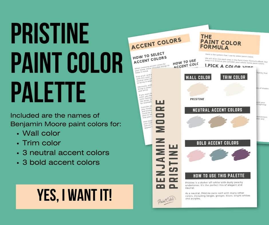
Pristine Paint Color Palette
Want to use this paint color in your home? Instantly upgrade your home's aesthetic with our exclusive paint color palette. Unlock the perfect trim color and six stunning accent colors, a combination of neutrals and bold hues for an instantly harmonious space!
Get your perfect paint color palette by clicking here!
Click here to get a peel and stick sample of Pristine
FAQs
Here are some common frequently asked questions about Pristine.
Are Benjamin Moore Pristine and Puppy Paws the same color?
Yes, Benjamin Moore Pristine (OC-75) and Puppy Paws (1156) are the same color: an off-white with dusty peach undertones.
Is Benjamin Moore Pristine off-white or taupe?
Benjamin Moore Pristine is a darker off-white with a dusty peach undertone.
Pristine will appear warmer and more taupe in rooms with lots of natural light. It will appear more neutral / off-white in darker spaces. Swatch it in your space, and see what you think, day and night!
Is Benjamin Moore Pristine warm or cool?
It’s definitely a warm paint color. The dusty peach undertones bring a cozy feel, without it being too pink or too yellow.
Can you use Pristine for trim if you're using it for walls?
Yes, absolutely. Just use a different finish for a tone-on-tone contrast. For example, use an eggshell finish for the walls and semi-gloss for the trim. That way, you get a soft contrast.
However, note that if you want to repaint the walls in your room at some point, you'll probably want to repaint the trim as well since Pristine is not a typical trim color, given that it's a darker off-white.
So if you're planning to repaint the walls eventually, you may want to stick with a more traditional trim color to avoid repainting the trim!
These are my favorite bright white trim colors:
- Benjamin Moore Simply White
- Sherwin Williams Extra White
- Behr Ultra Pure White
What's the difference: BM Pristine vs White Dove?
Both Pristine and White Dove are warm white-ish paint colors.
Pristine is a darker off-white with dusty peach undertones, often appearing as a warm taupe or an off-white.
White Dove is a creamy white with golden yellow undertones, often appearing as a creamy white.
Pristine leans more red / peach, and White Dove leans more yellow / beige.
Pristine is noticeably darker (LRV 75) than White Dove (LRV 83). Due to their LRV numbers, Pristine is considered an off-white and White Dove a true white.
Also, Pristine is more saturated, and White Dove is more muted.
If you’re stuck deciding, I recommend testing both in your space. Seeing them side by side will help you pick the one that feels right for your home.

Where should I use BM Pristine?
While Benjamin Moore Pristine is a darker off-white, it is still light and bright enough that it can be used as a whole house color, so you can use it virtually anywhere!
My favorite uses for Pristine are a living room, den or bedroom. It would also be a great color for a bathroom or piece of furniture.
Before you go...
So, you've found the perfect paint color, but here's the thing - there's another big decision you have to make: picking the right paint sheen. Seriously, the level of glossiness can totally change how your color looks on the walls and how long the paint lasts!
Check out our complete guide to understanding paint sheens.
Still unsure which paint color is right for your space?
Choosing paint doesn’t have to be stressful! My free Paint Color Planning Quick Start Guide walks you through the exact steps to confidently choose the perfect color — without the overwhelm, second-guessing, or endless swatch testing.
👉 Click here to download the free guide!

My Paint Color Formula course walks you through the painless process of expertly testing paint swatches to ensure you have the perfect color for your home.
The best way to sample paint? Samplize!
Get peel-and-stick removable and reusable paint samples here!
Thanks for reading!

Meg Hemmelgarn is a freelance writer and home decor + DIY blogger who loves to talk about paint colors. She and her husband are currently renovating their third fixer upper. You can see their projects on her blog, Green With Decor.